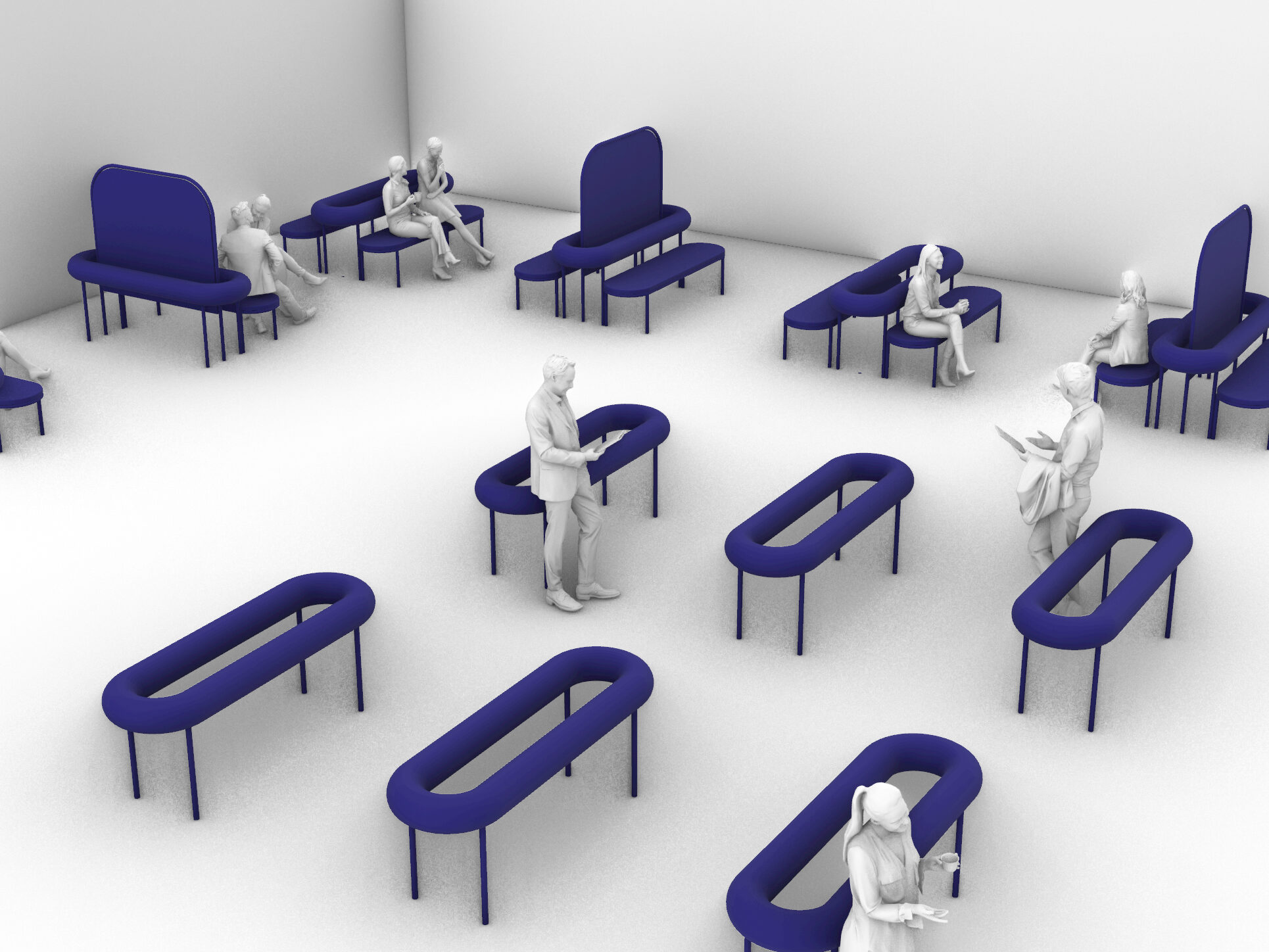
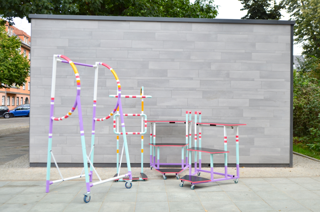
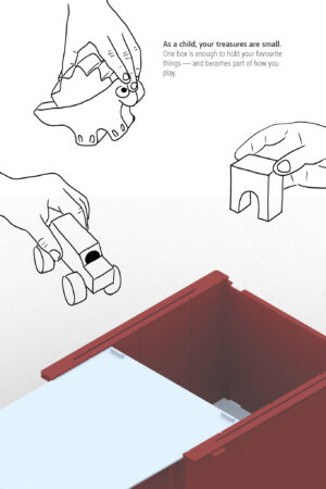
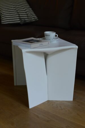
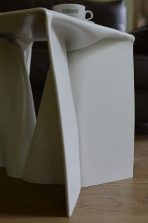
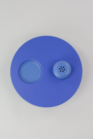
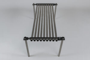
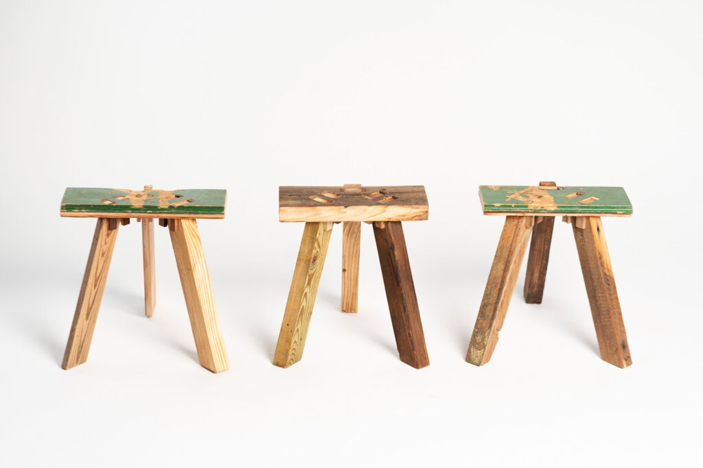
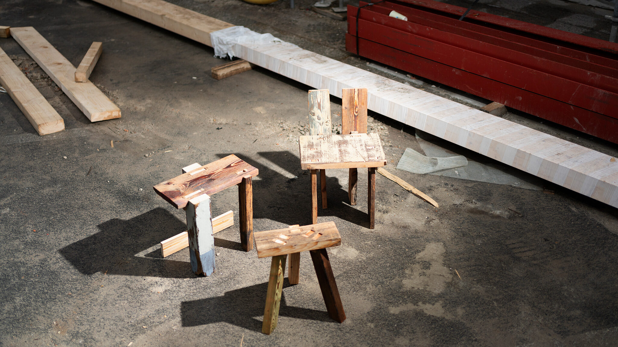
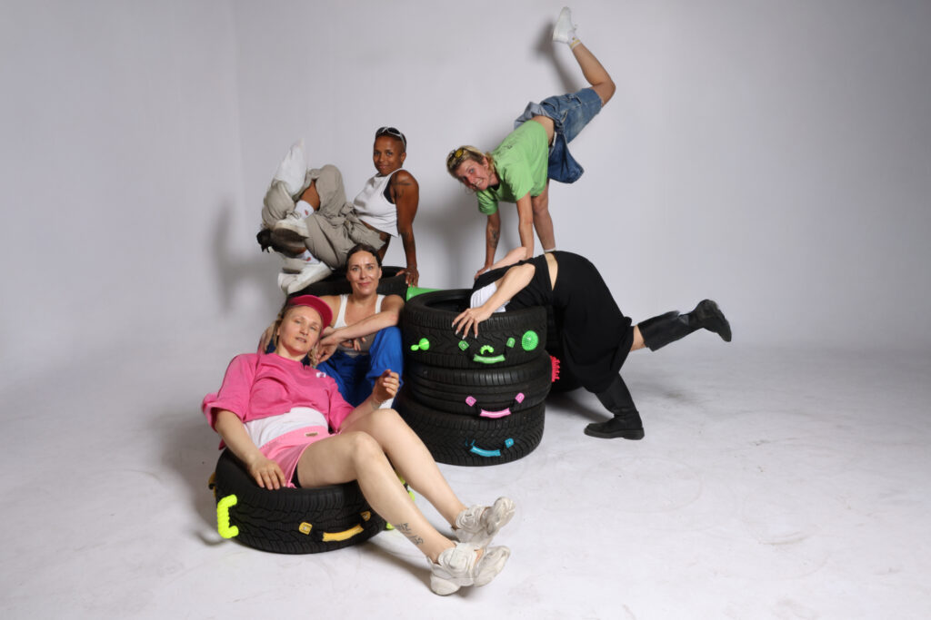
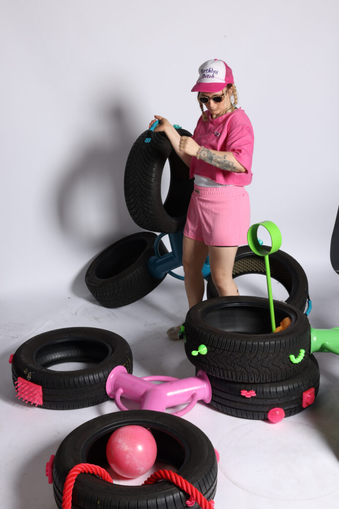
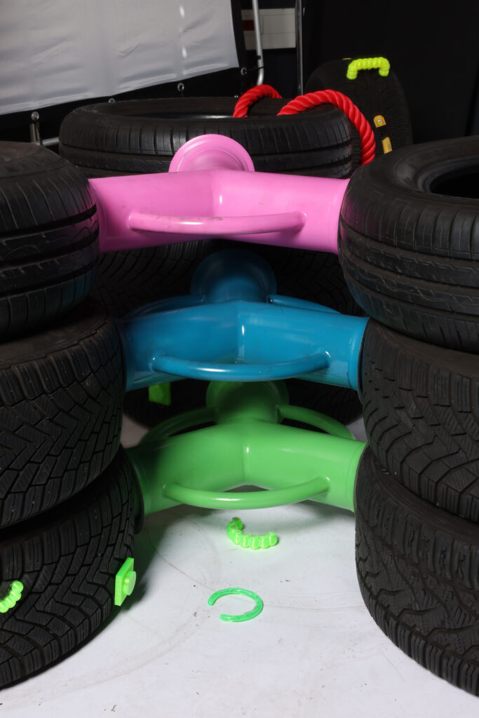
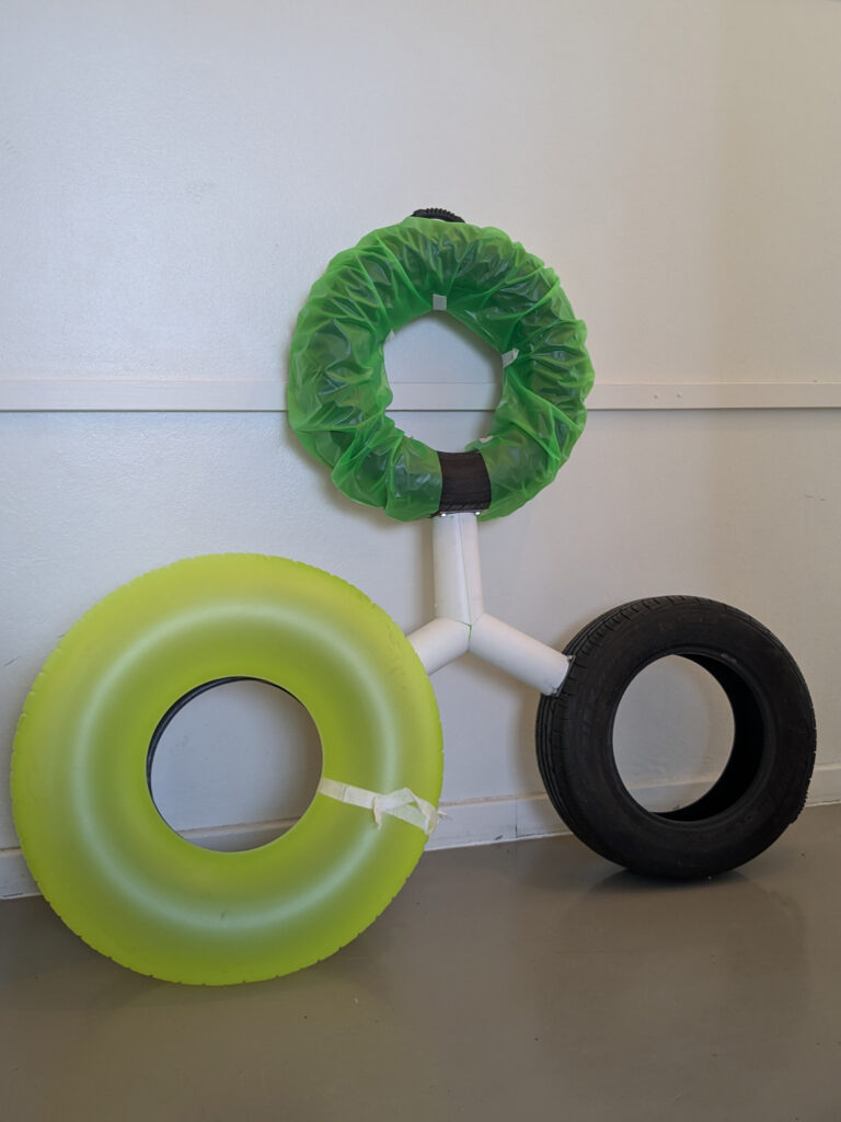
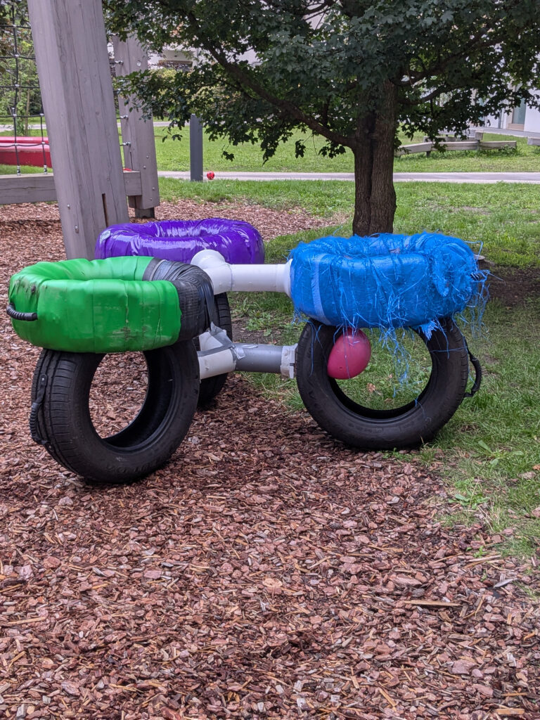
TANKE ist eine Play-Skulptur, die vertraute Elemente wie Autoreifen mit überraschenden Gimmicks kombiniert und zum Forschen und Entdecken einlädt. Wiederkehrende Formen schaffen neue Räume, die eingenommen, neu interpretiert und kombiniert werden können. Inmitten wachsender, voller Städte, die oft Ohnmacht vermitteln und wenig Mitgestaltung zulassen, eröffnet TANKE einen Gegenentwurf: einen Ort, an dem Spielkultur erfahrbar wird, Beziehungen neu entstehen und Nutzer*innen spielerisch oder ruhig aktiv Teil des Raums werden können.
TANKE is a play-sculpture that combines familiar elements, such as car tires, with surprising gimmicks, inviting exploration and discovery. Recurrent forms create new spaces that can be inhabited, reinterpreted, and combined. Amidst growing, crowded cities that often evoke powerlessness and allow little opportunity for participation, TANKE offers a counter-design: a place where play culture becomes tangible, where relationships can emerge anew, and where users can actively take part in the space, whether playfully or quietly.


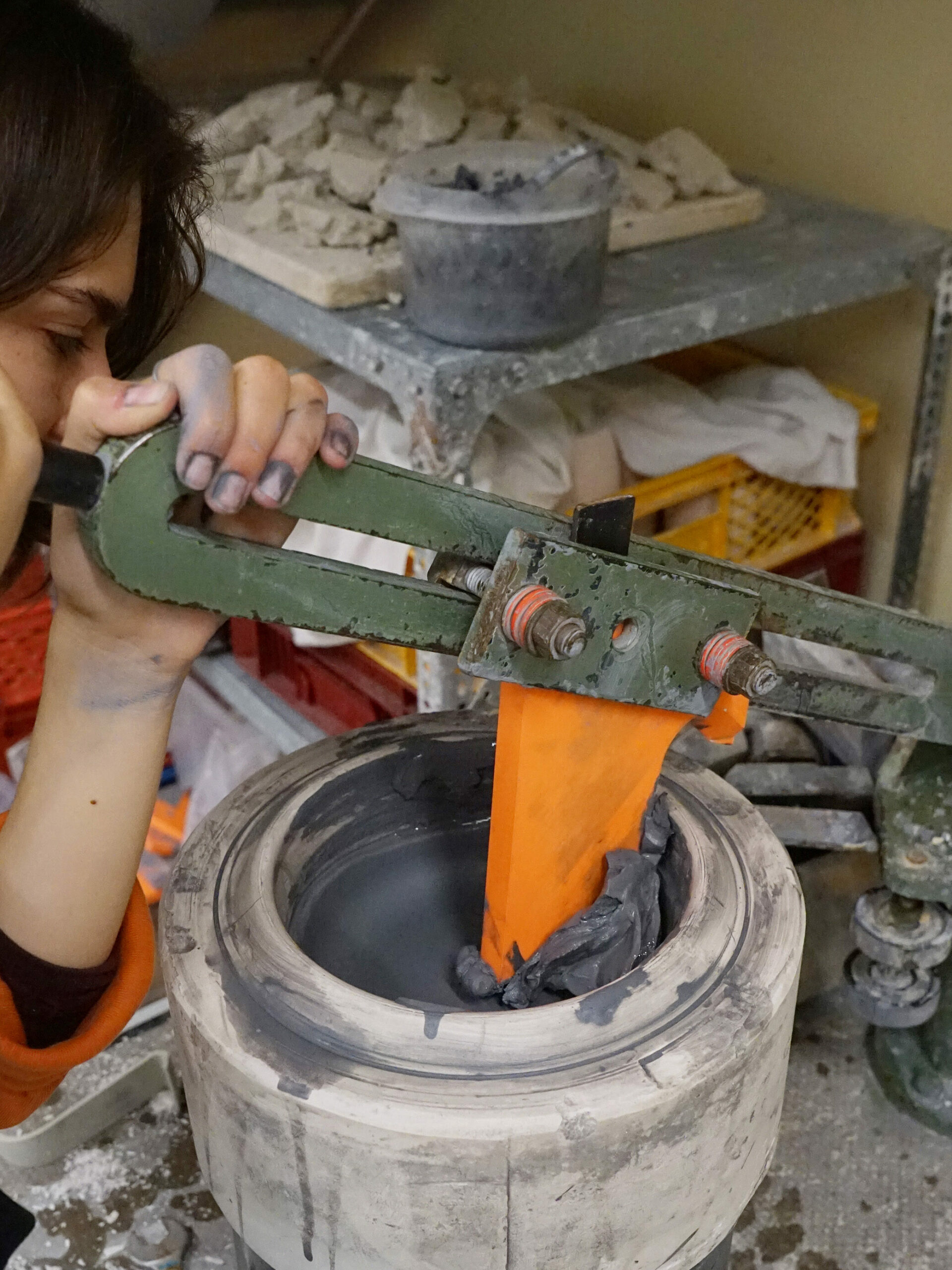
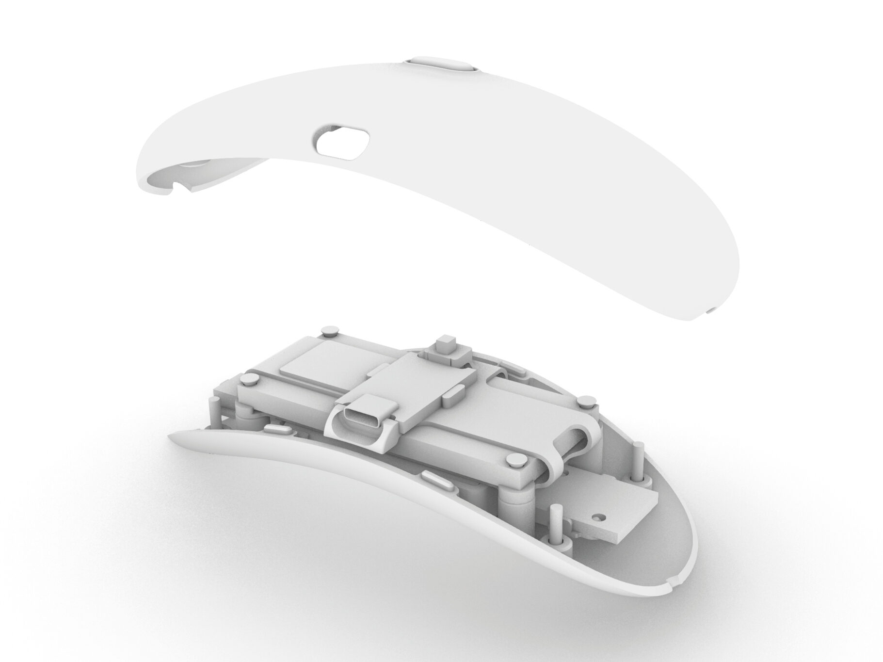
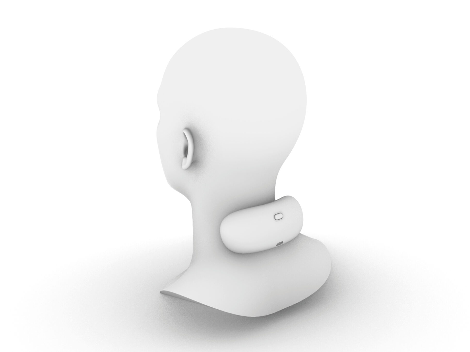
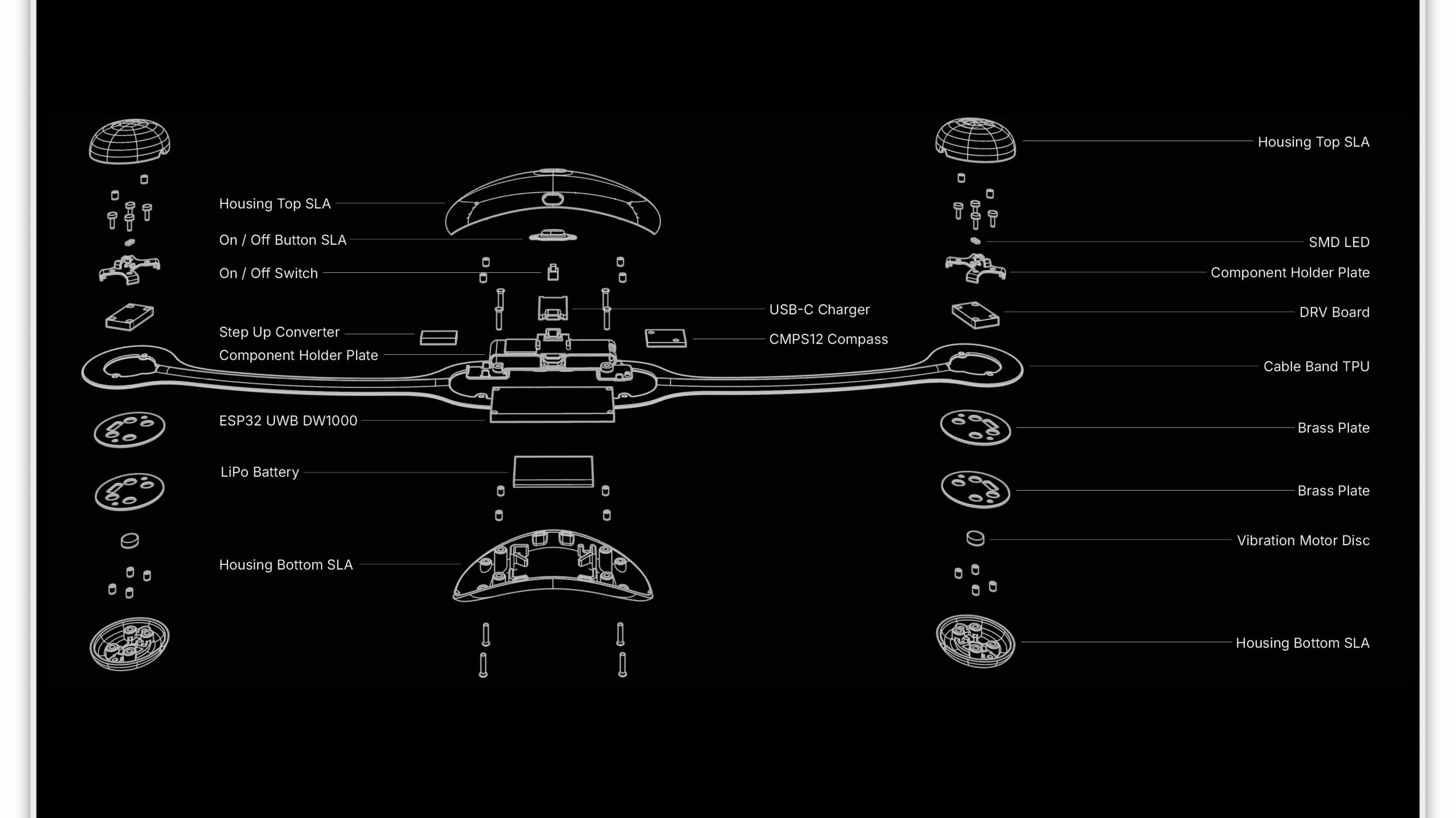
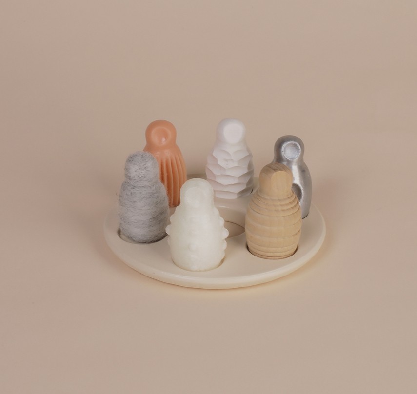
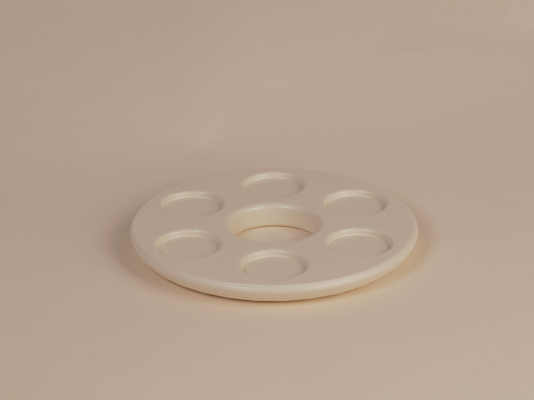
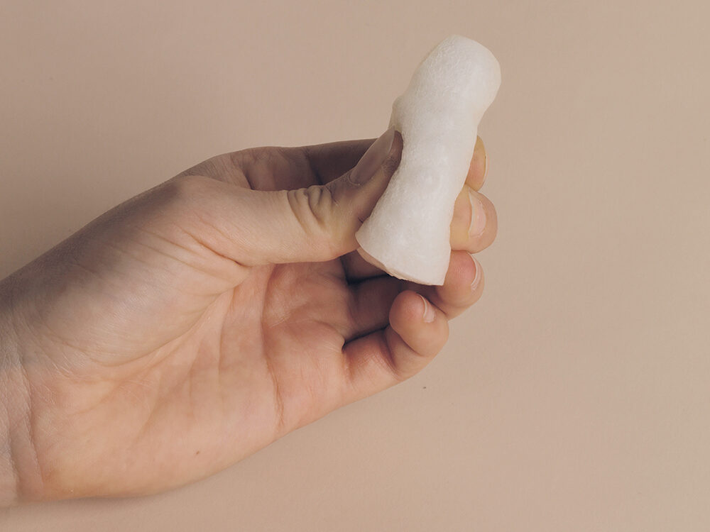
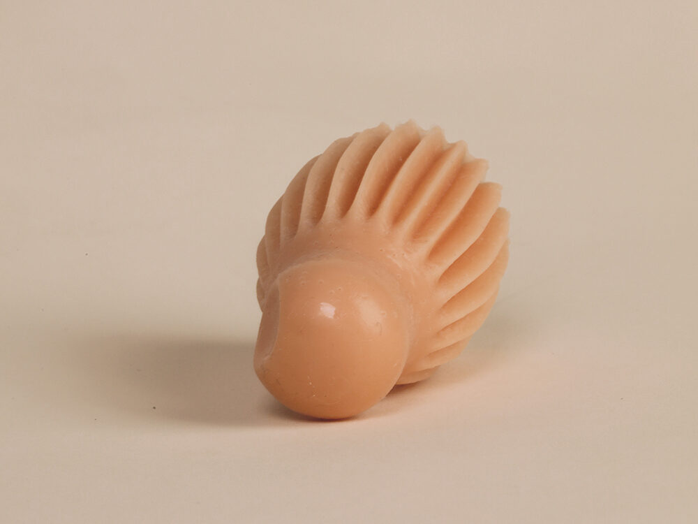
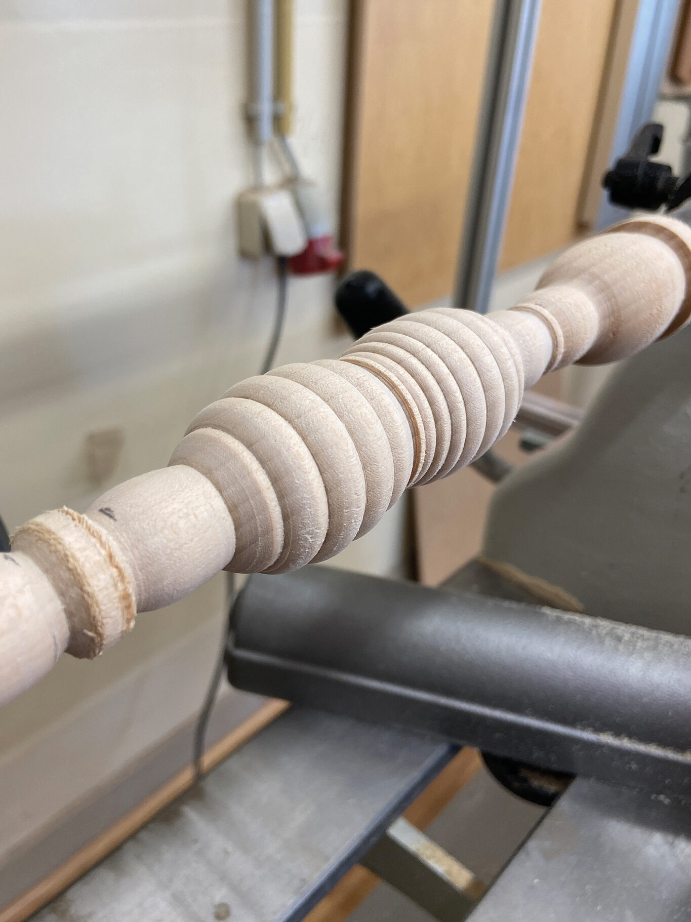
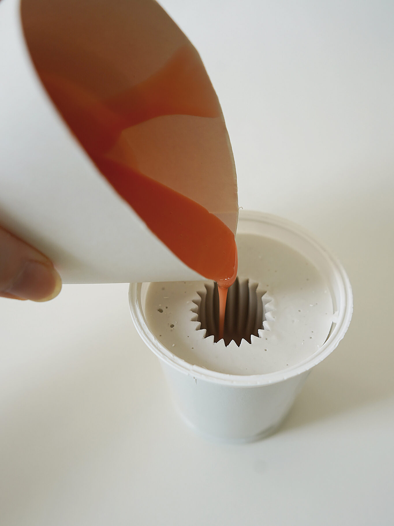
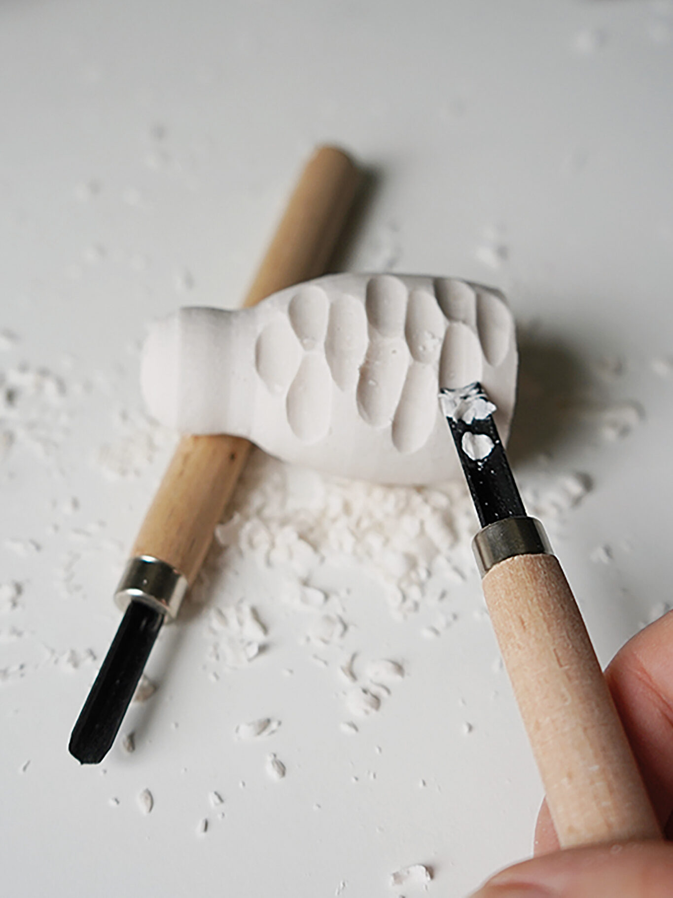
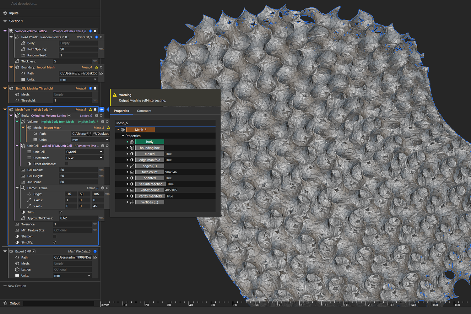
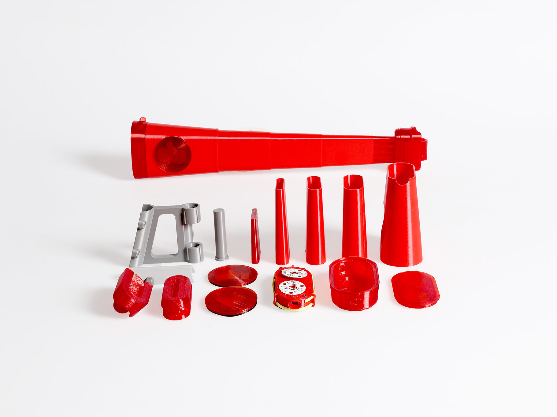
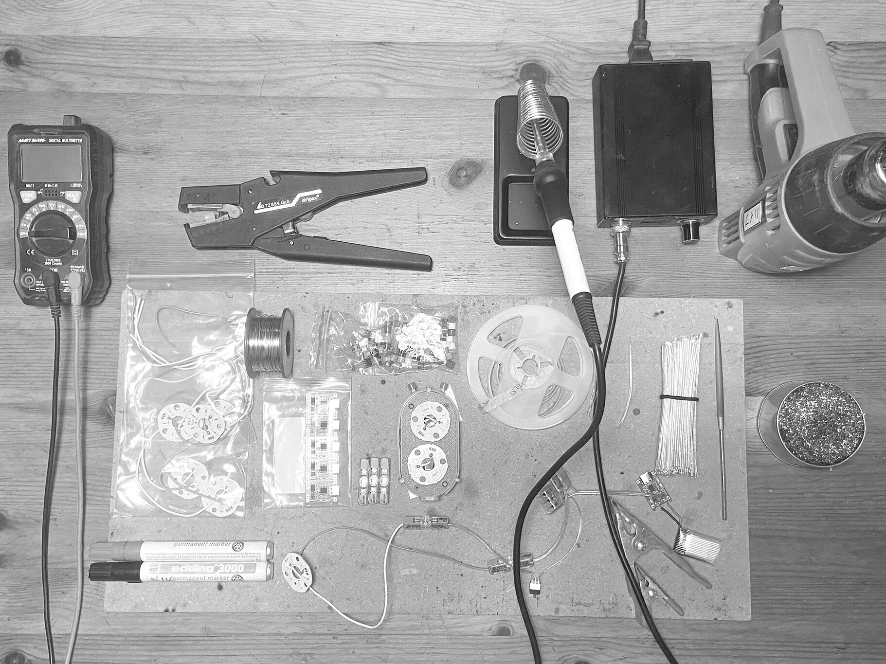
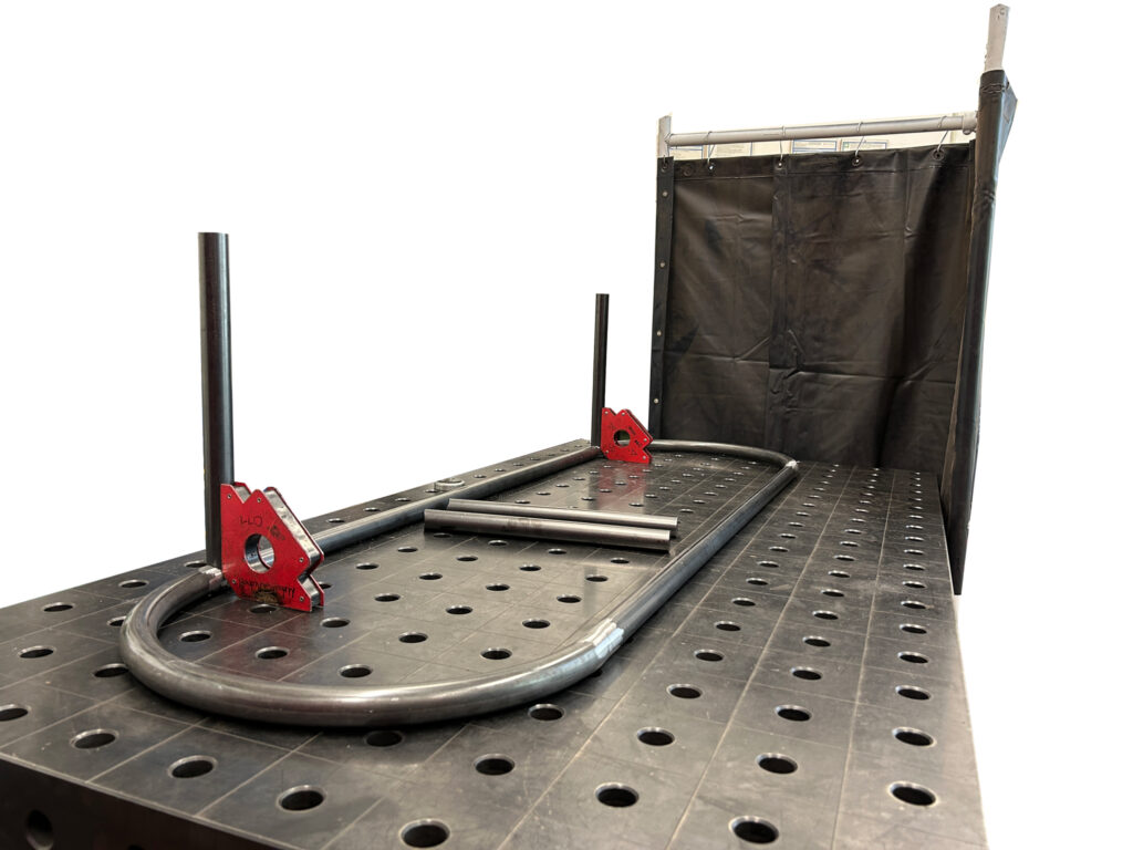
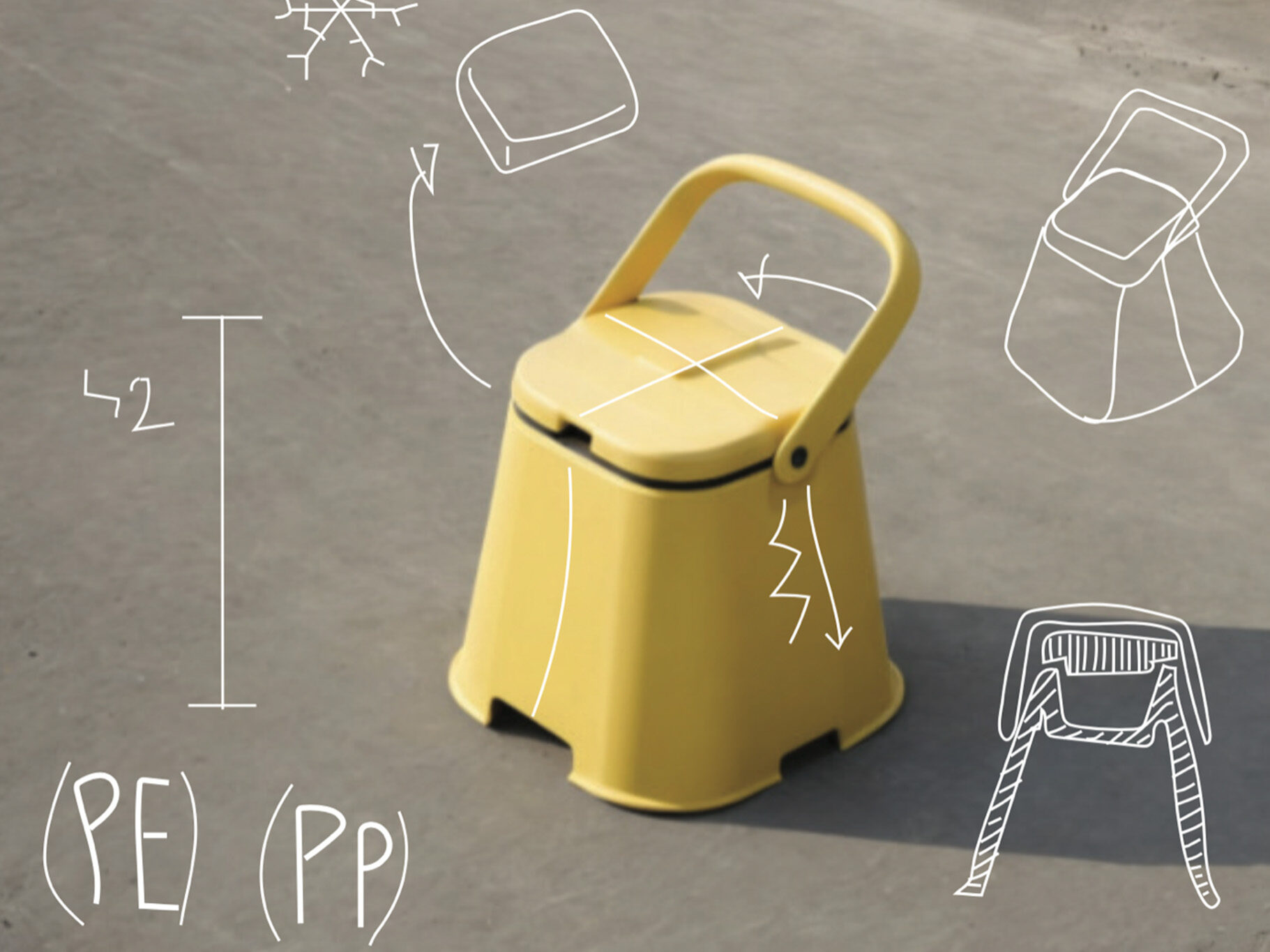
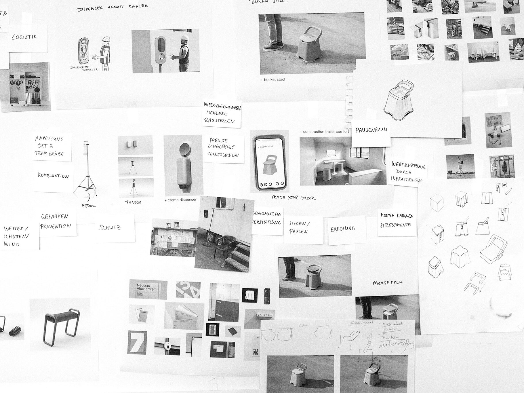
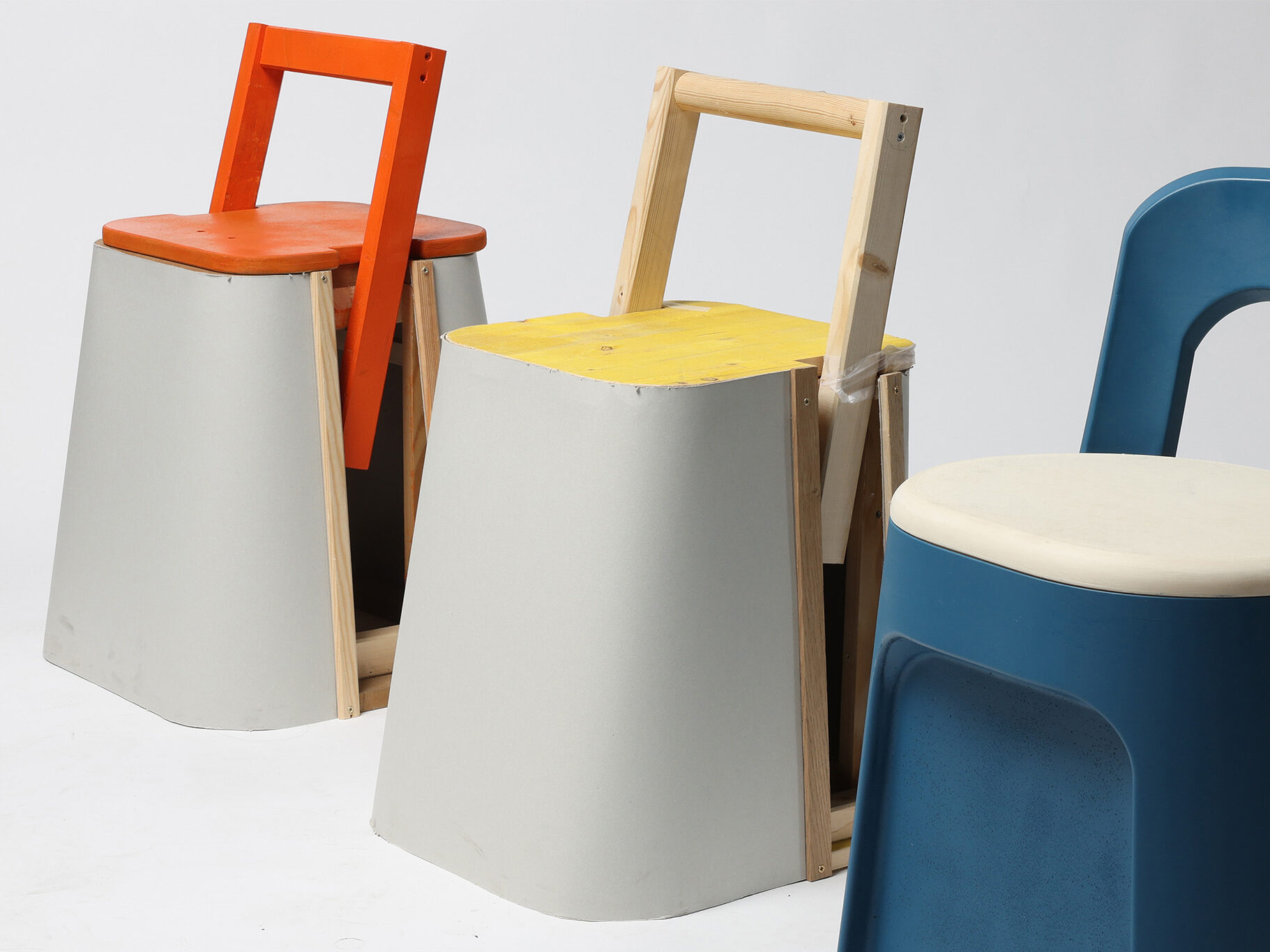
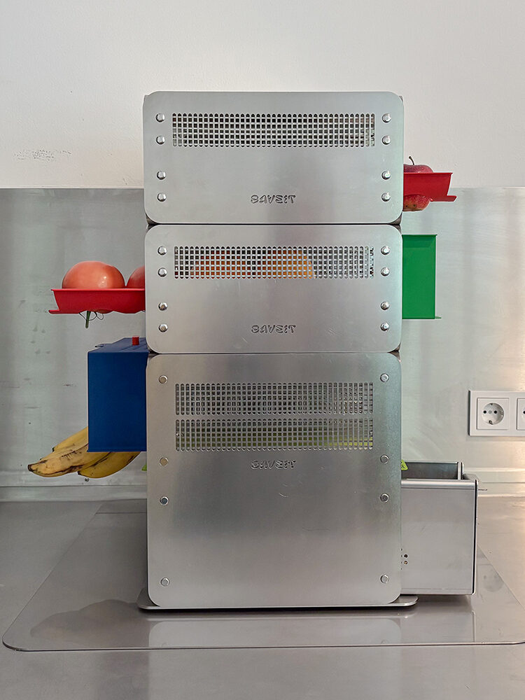
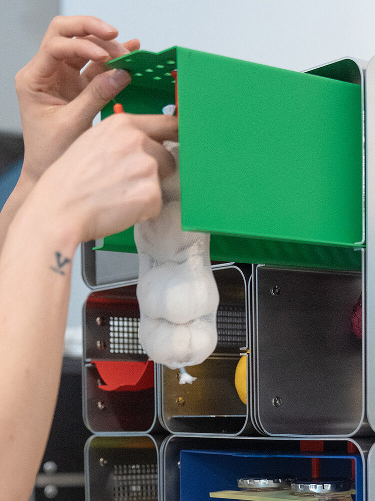
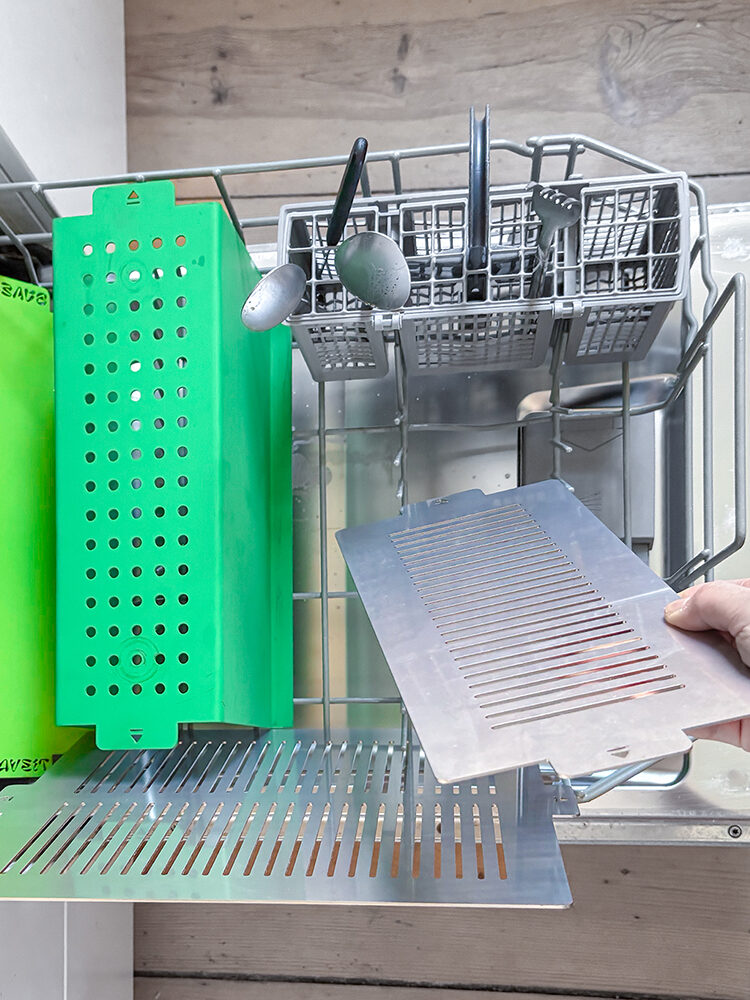
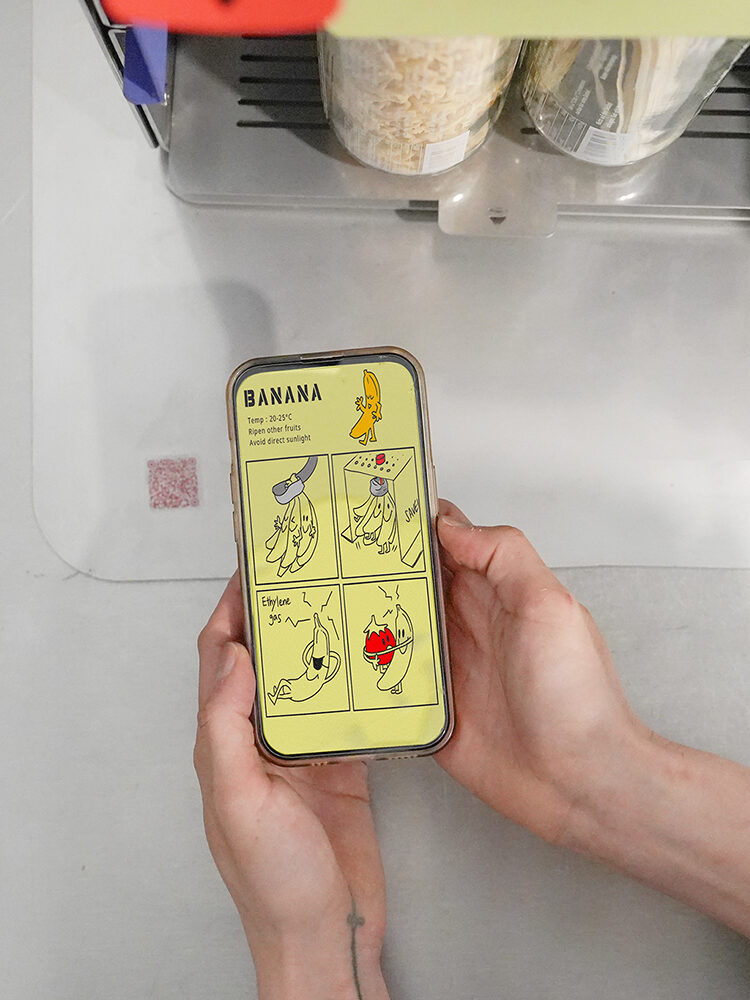
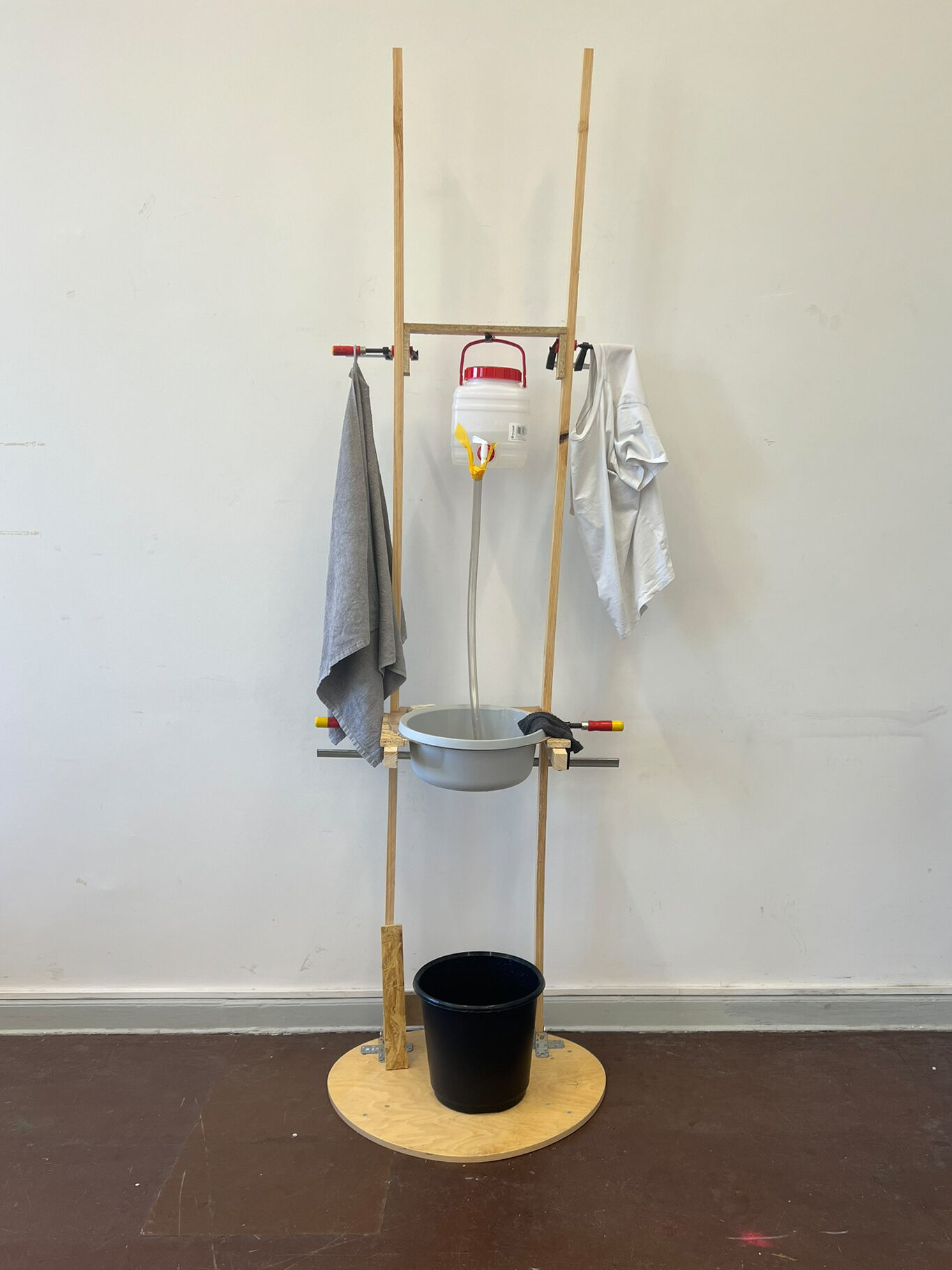
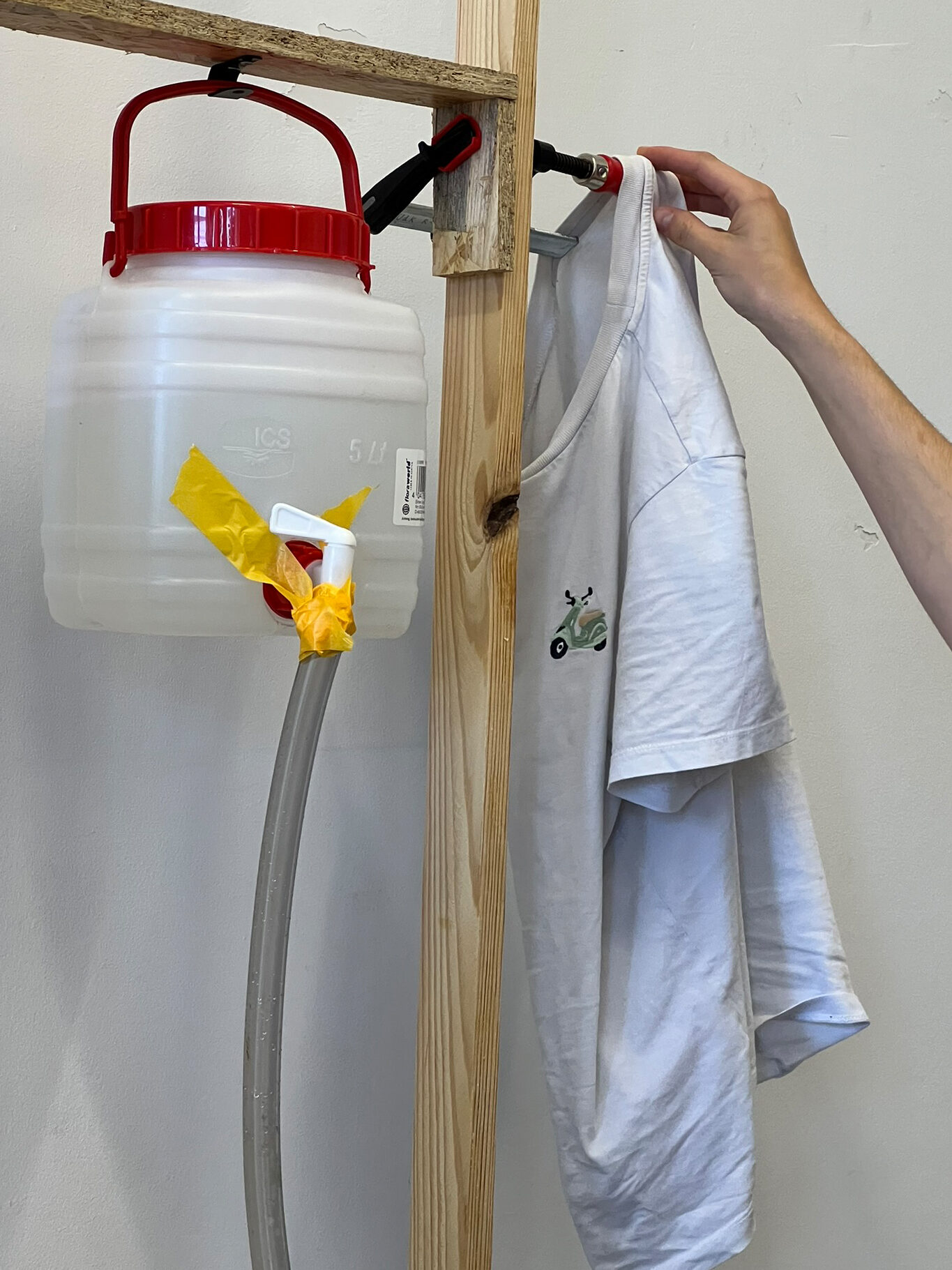
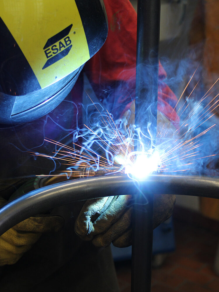
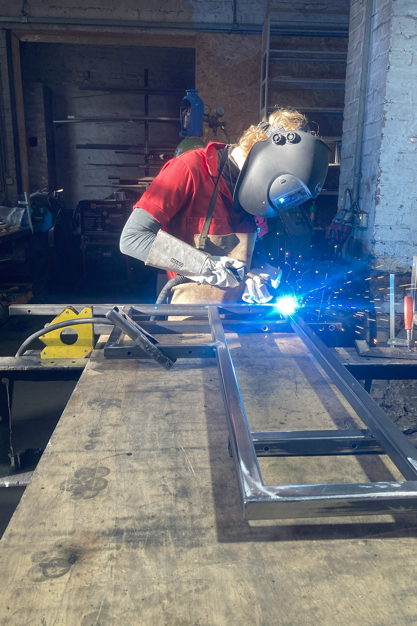
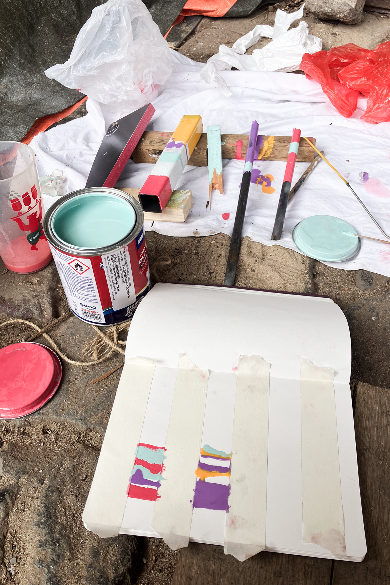
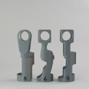
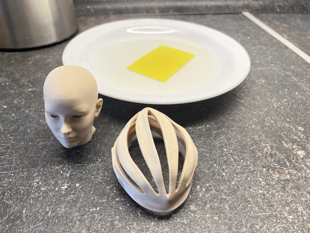
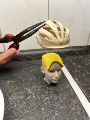
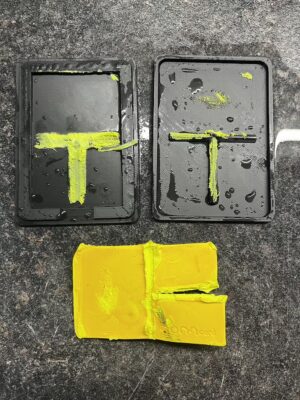
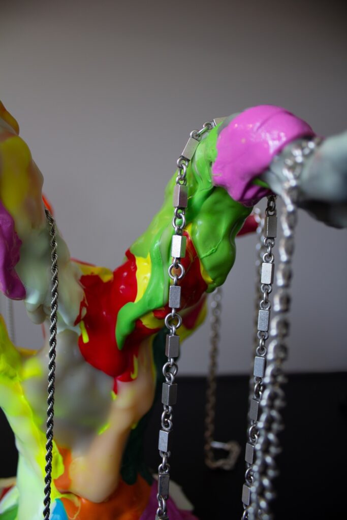
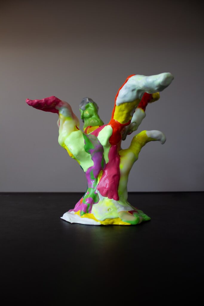
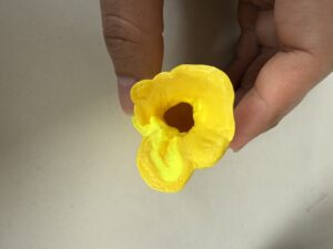
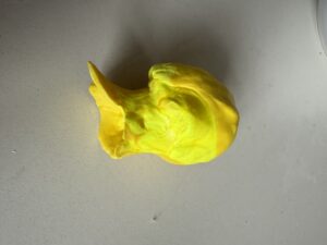
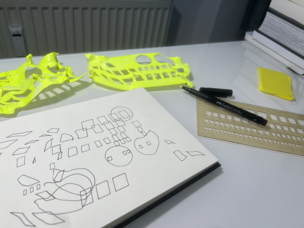
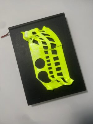
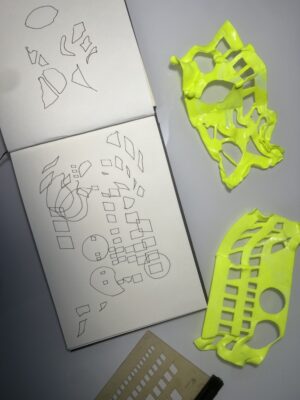
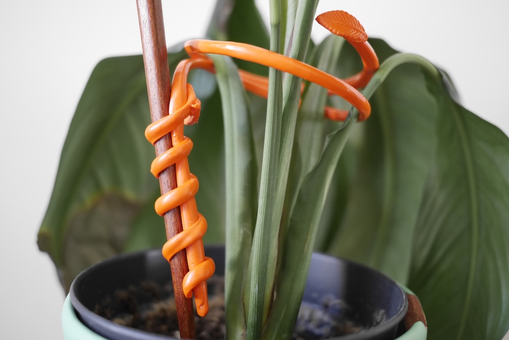
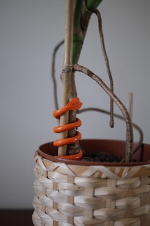
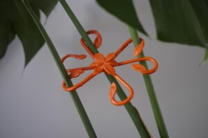
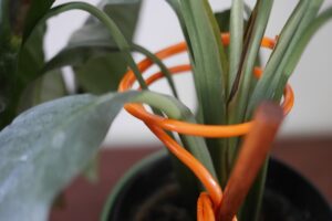
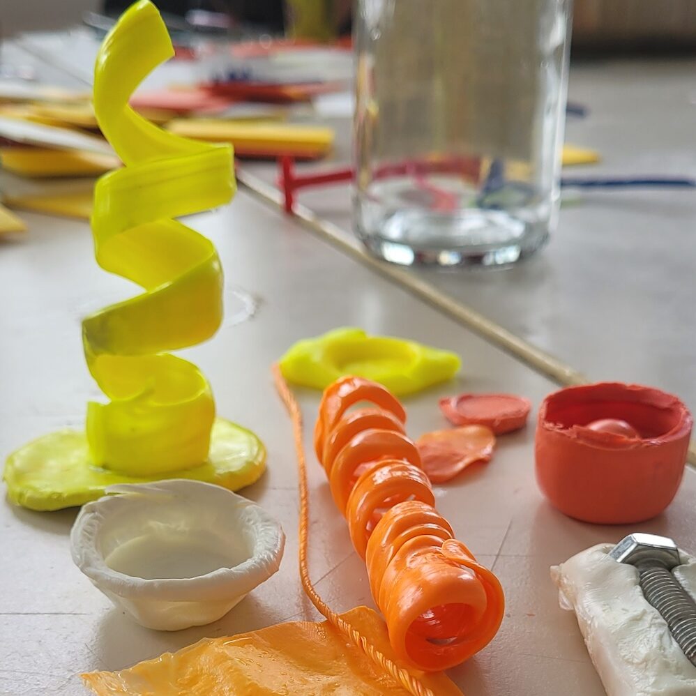
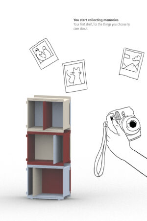
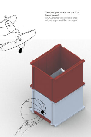
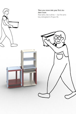
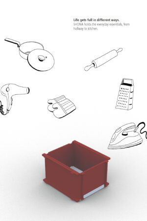
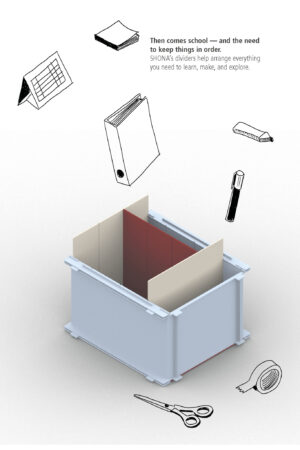
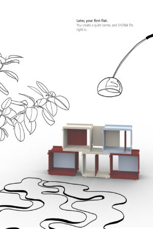
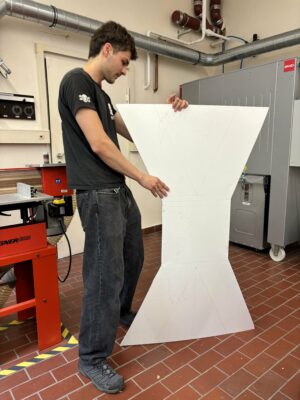
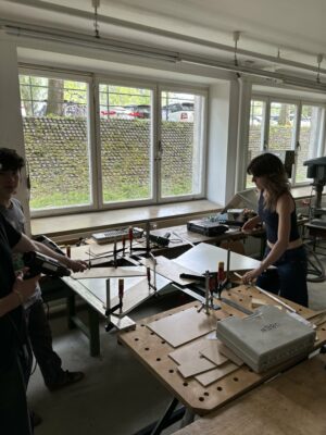
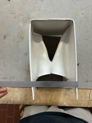
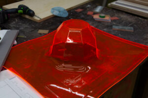
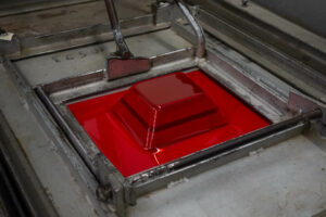
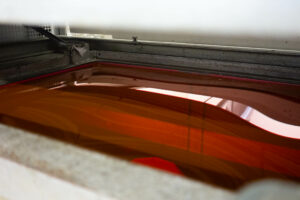
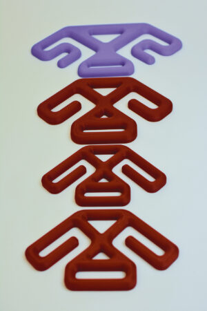
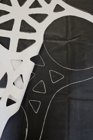
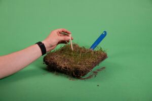
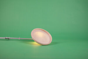
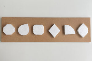
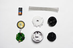
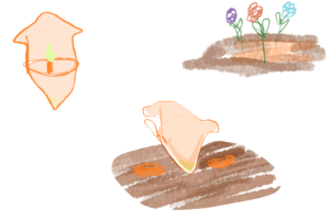
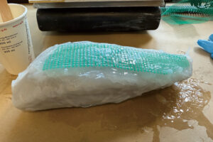
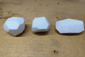
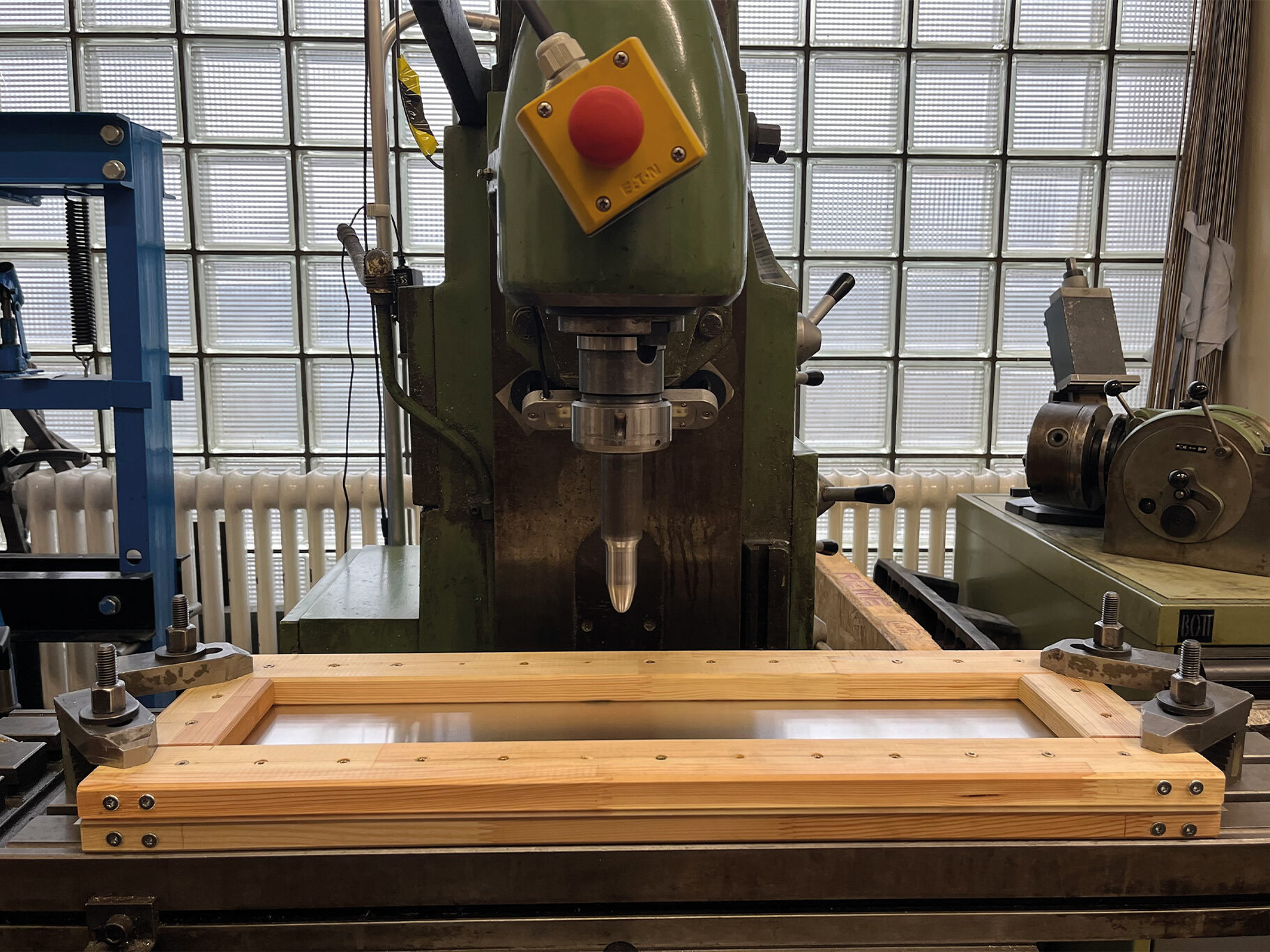
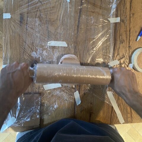
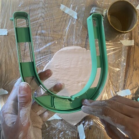
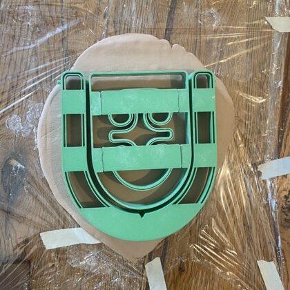
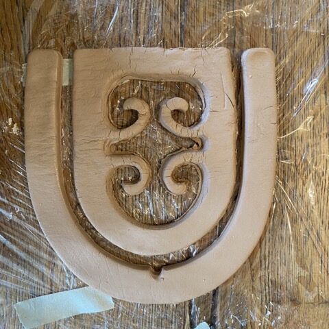
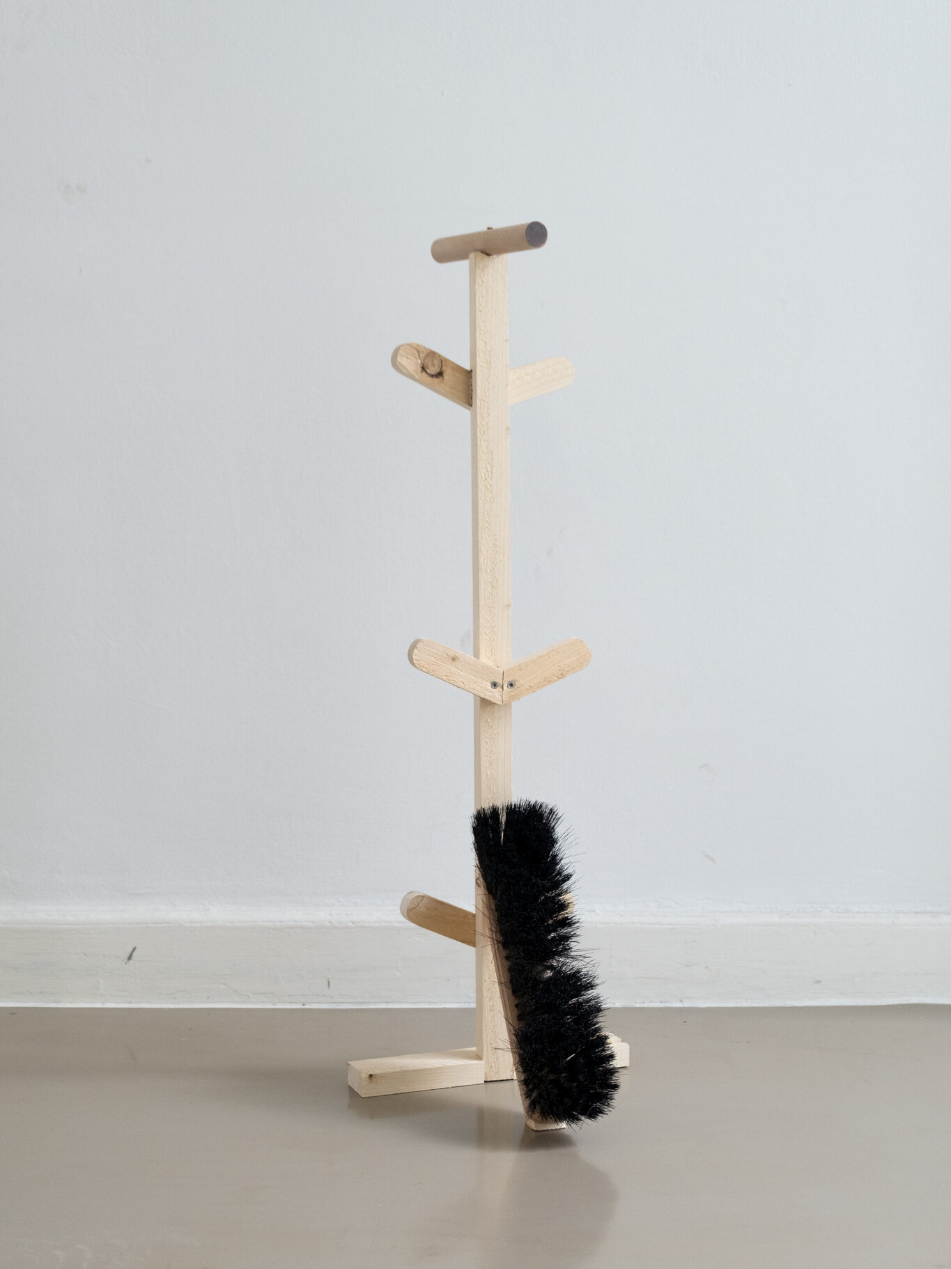
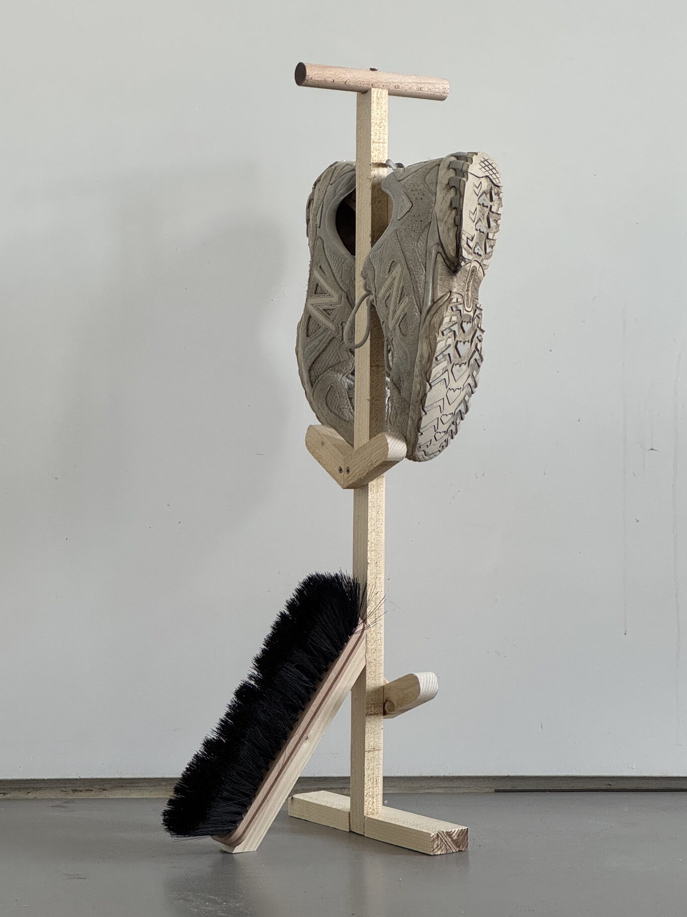
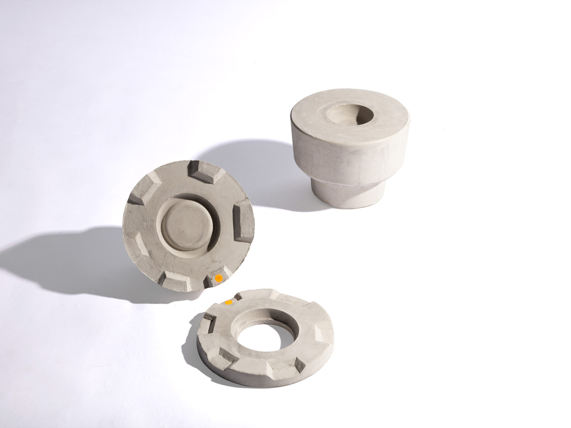
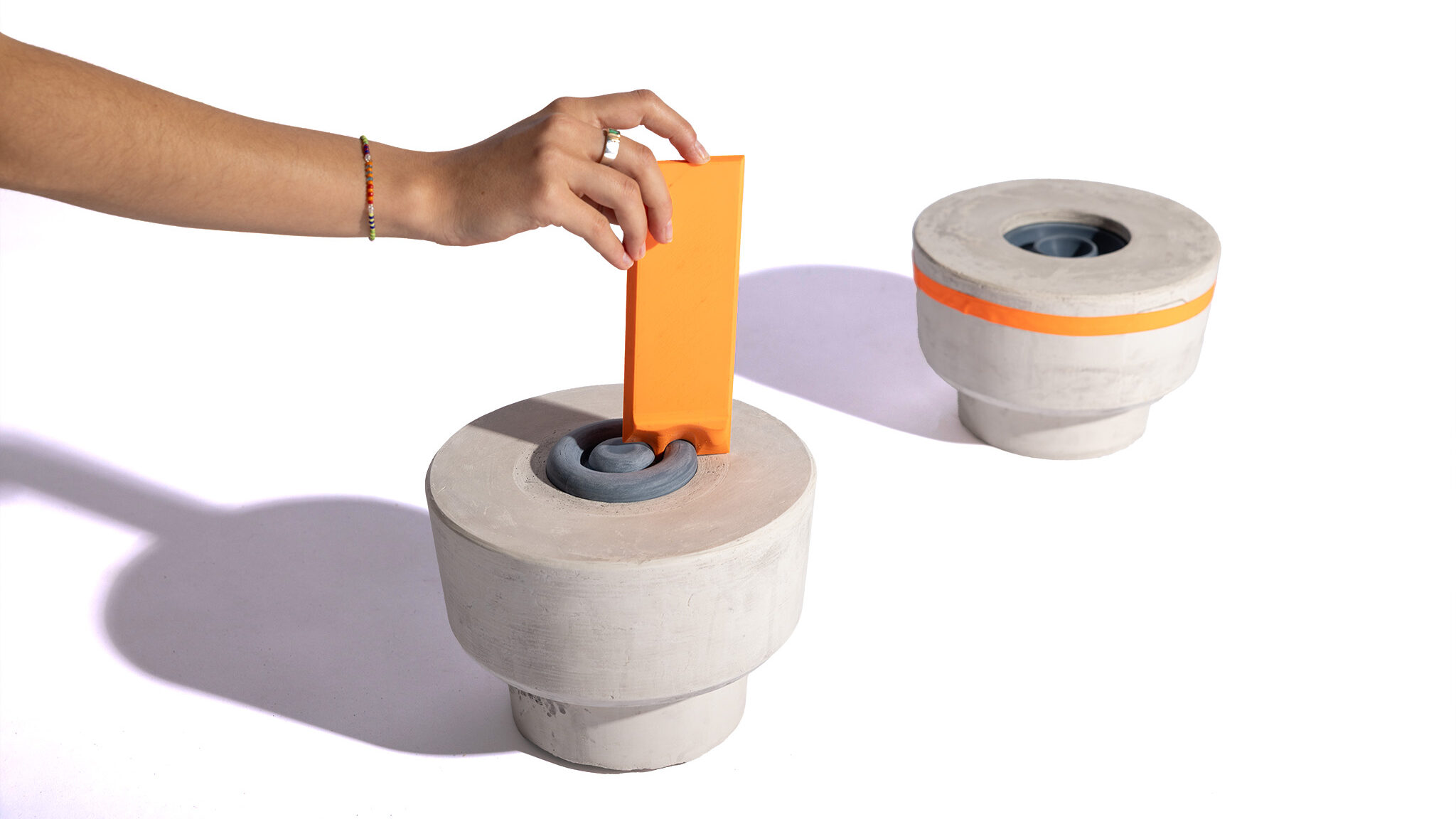
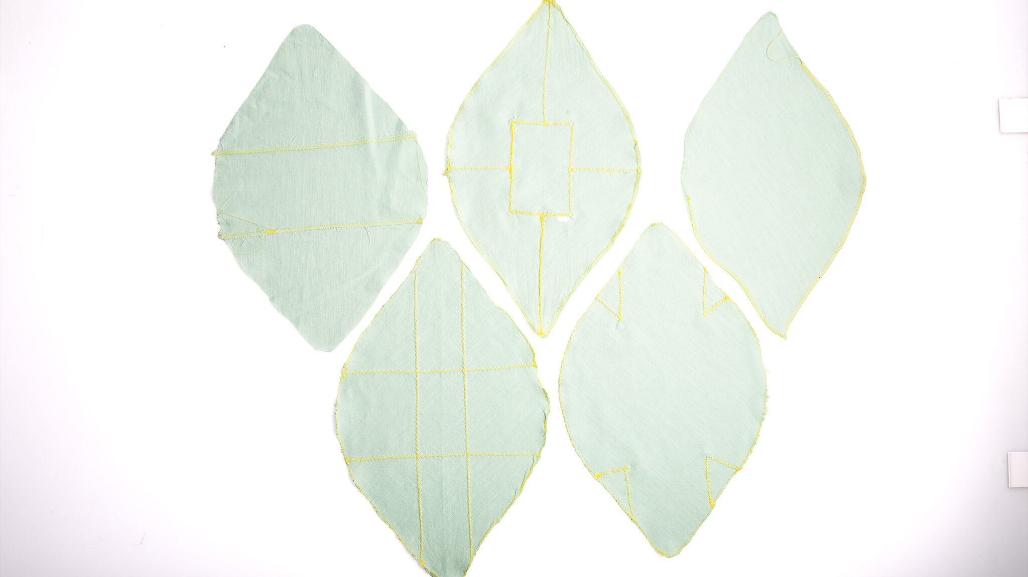
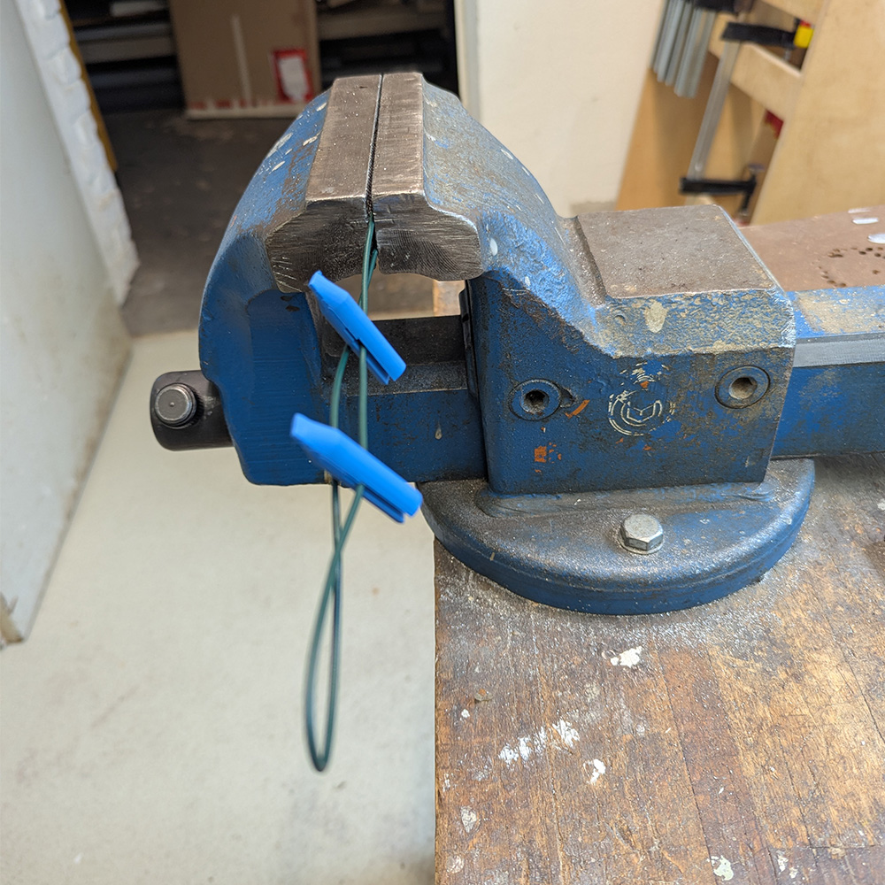
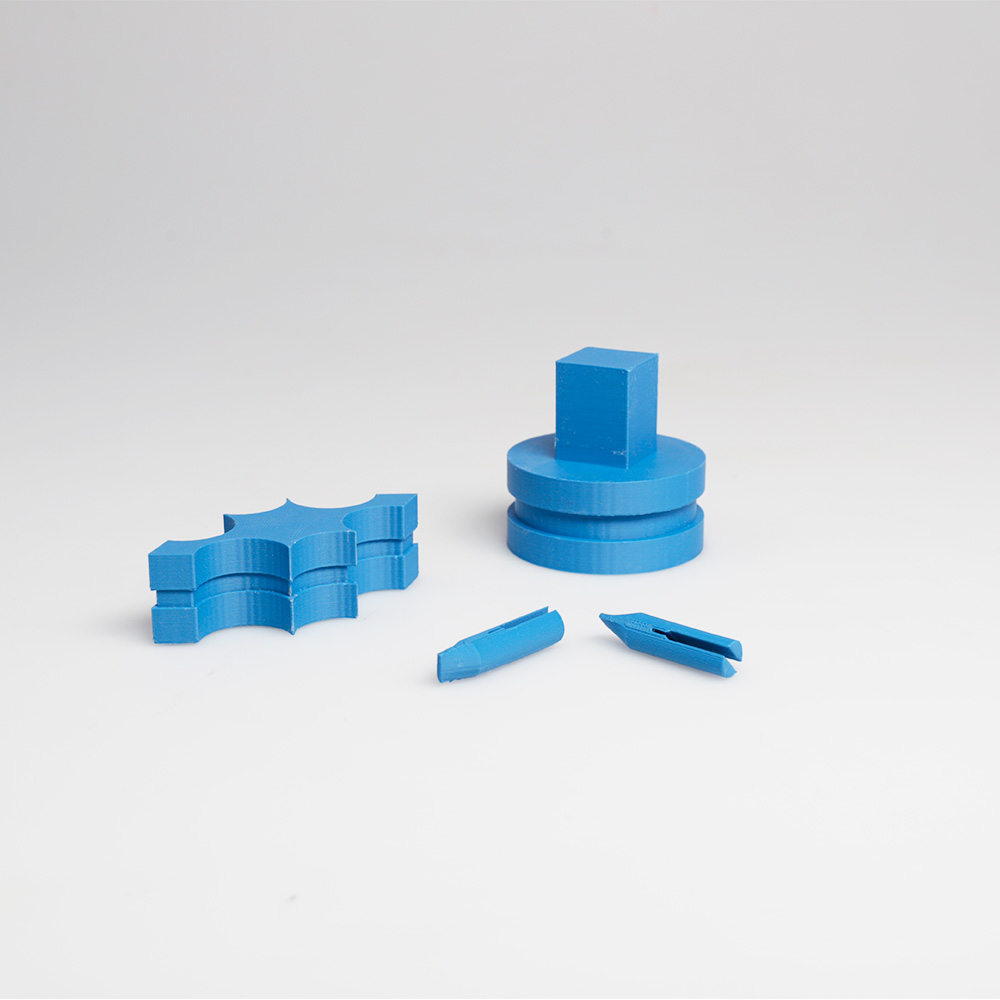
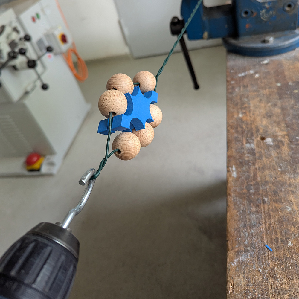
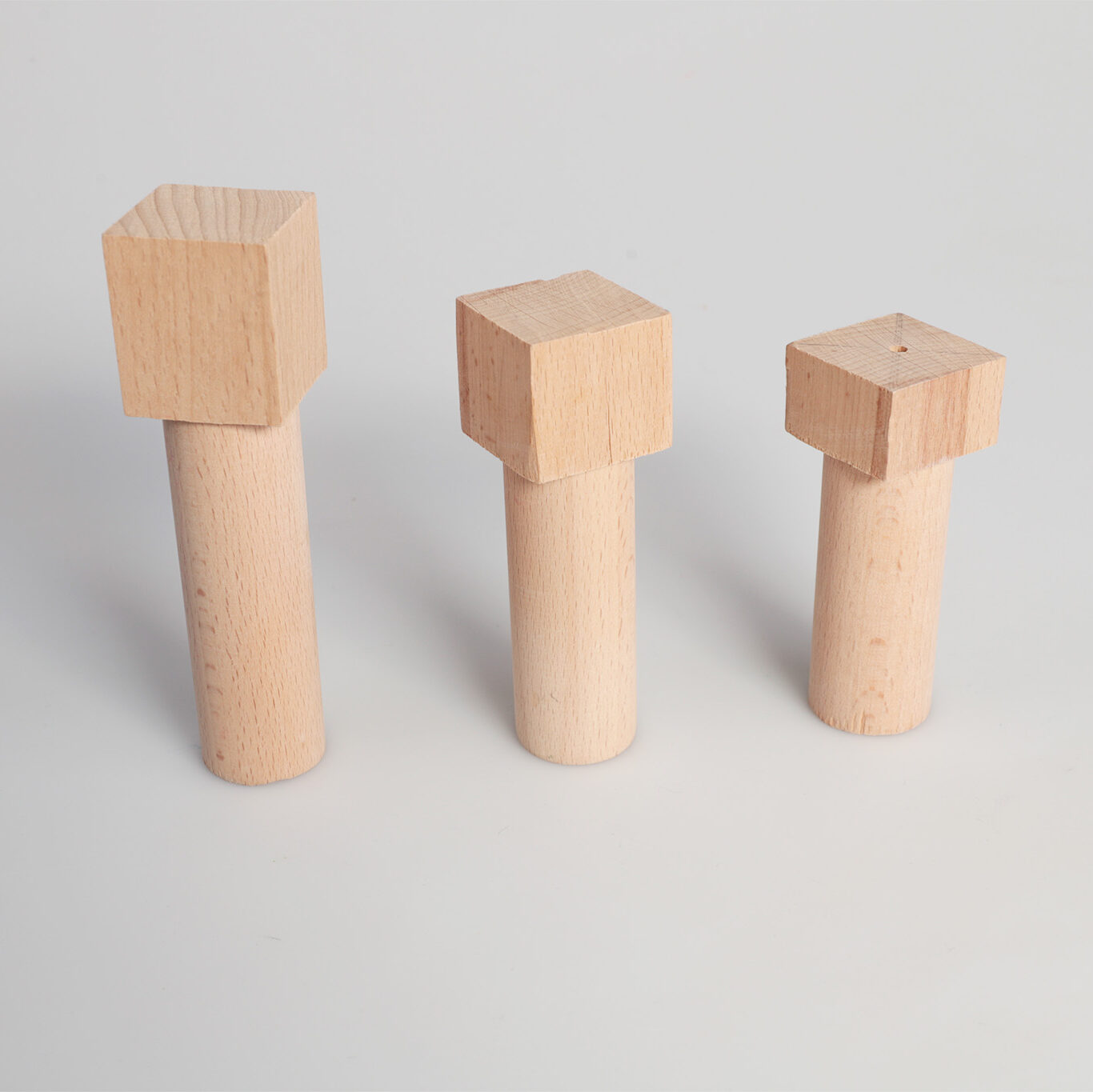
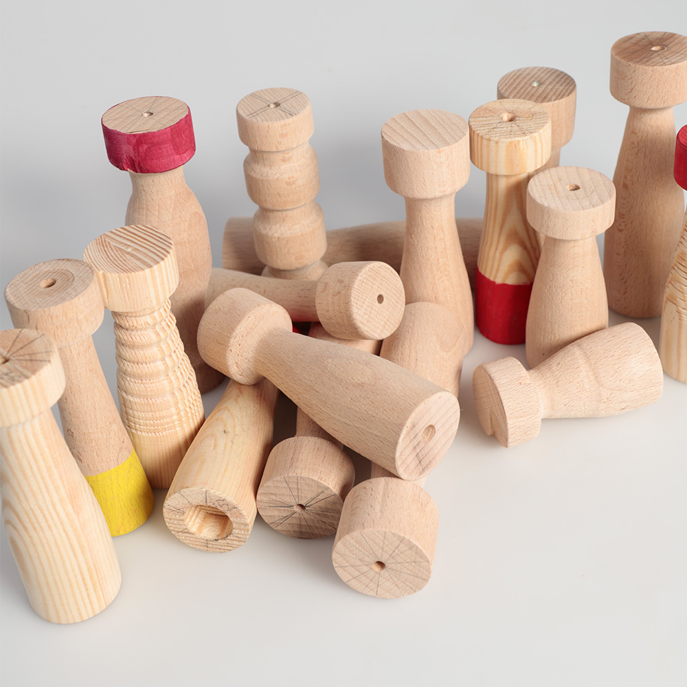
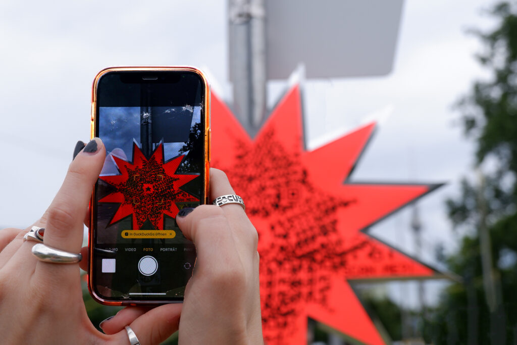
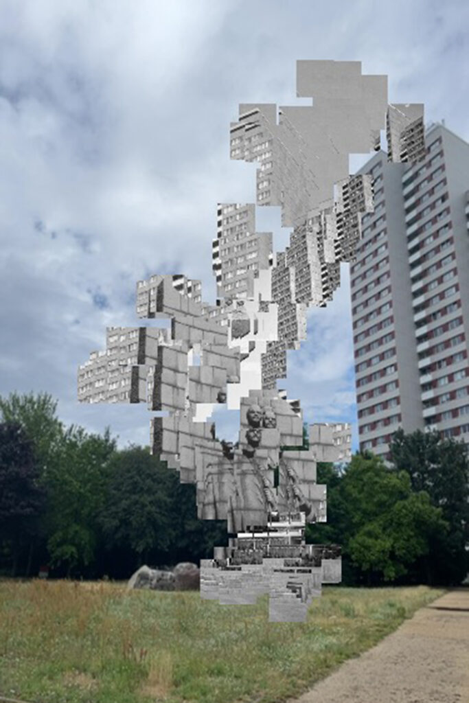
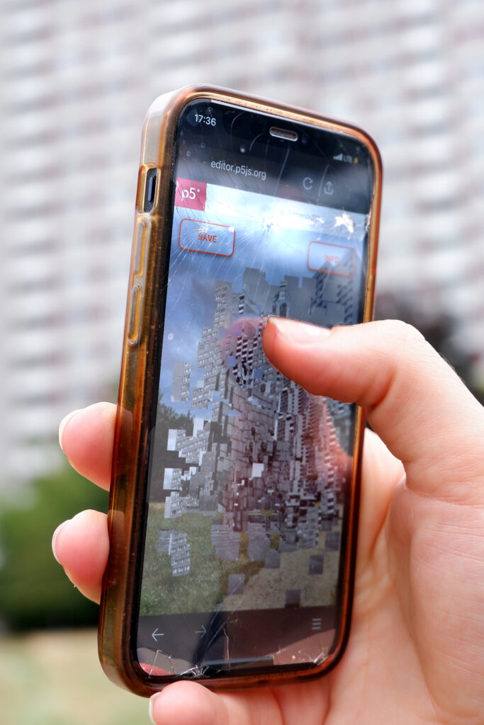
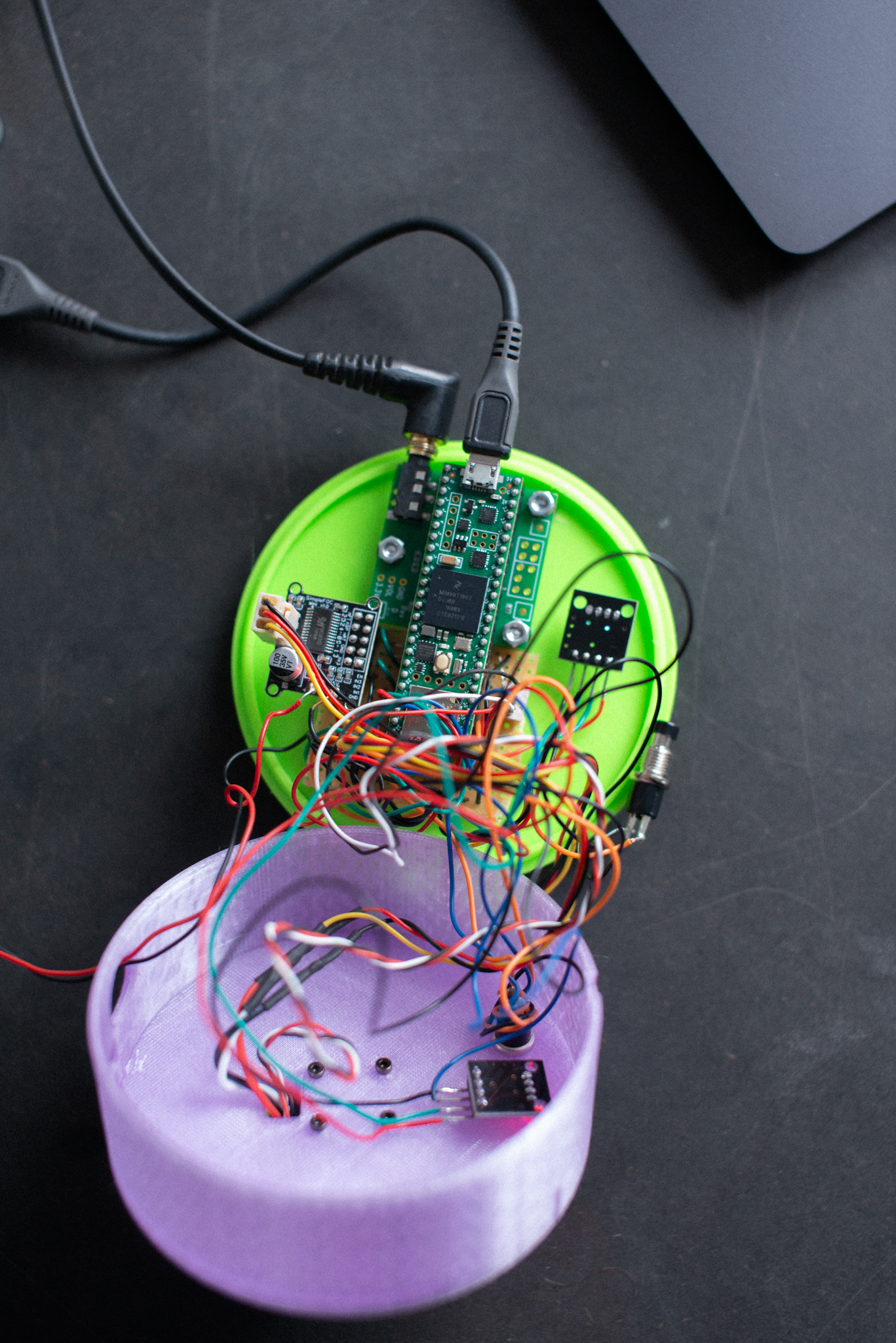
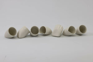
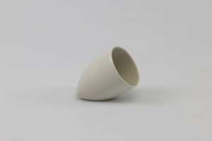
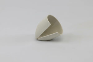
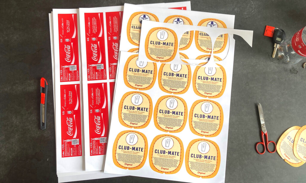
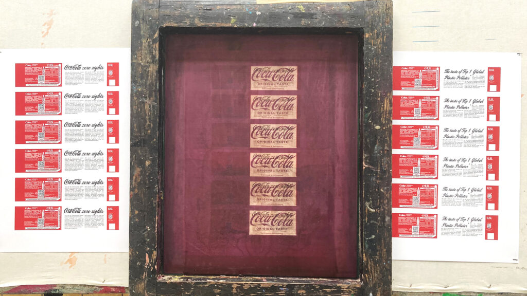
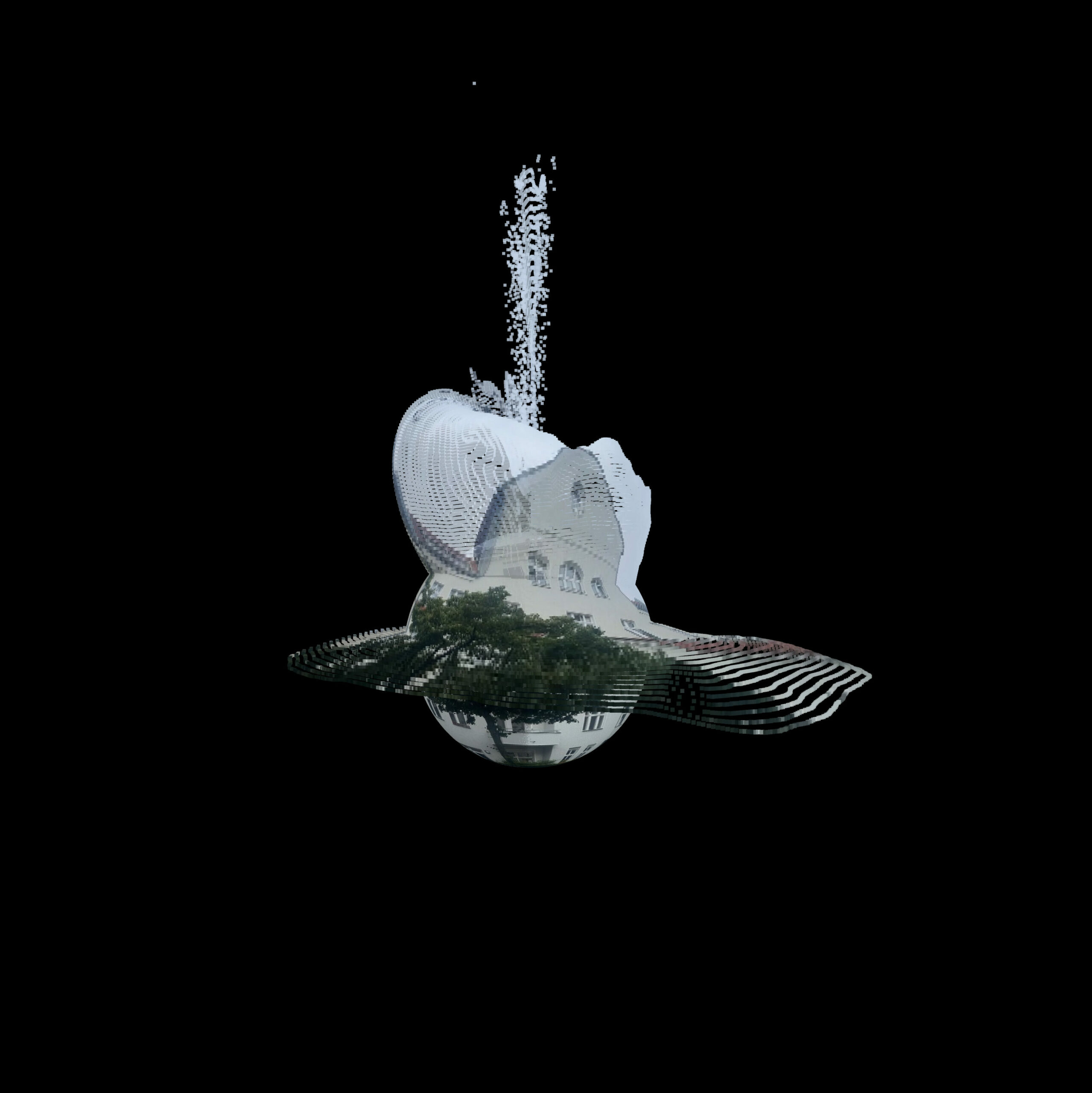
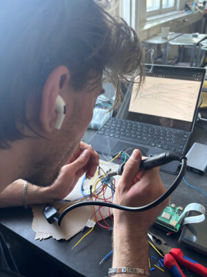
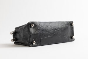
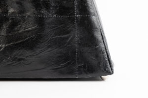
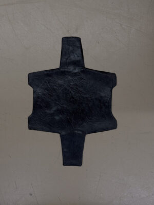
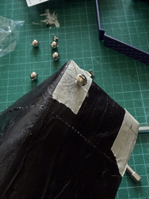
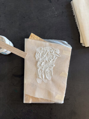
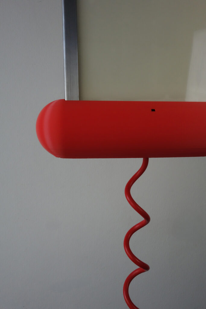
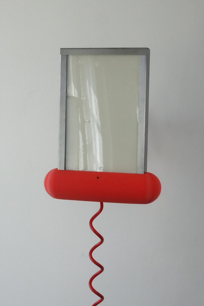
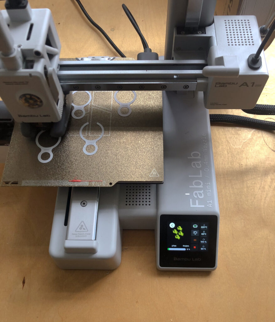
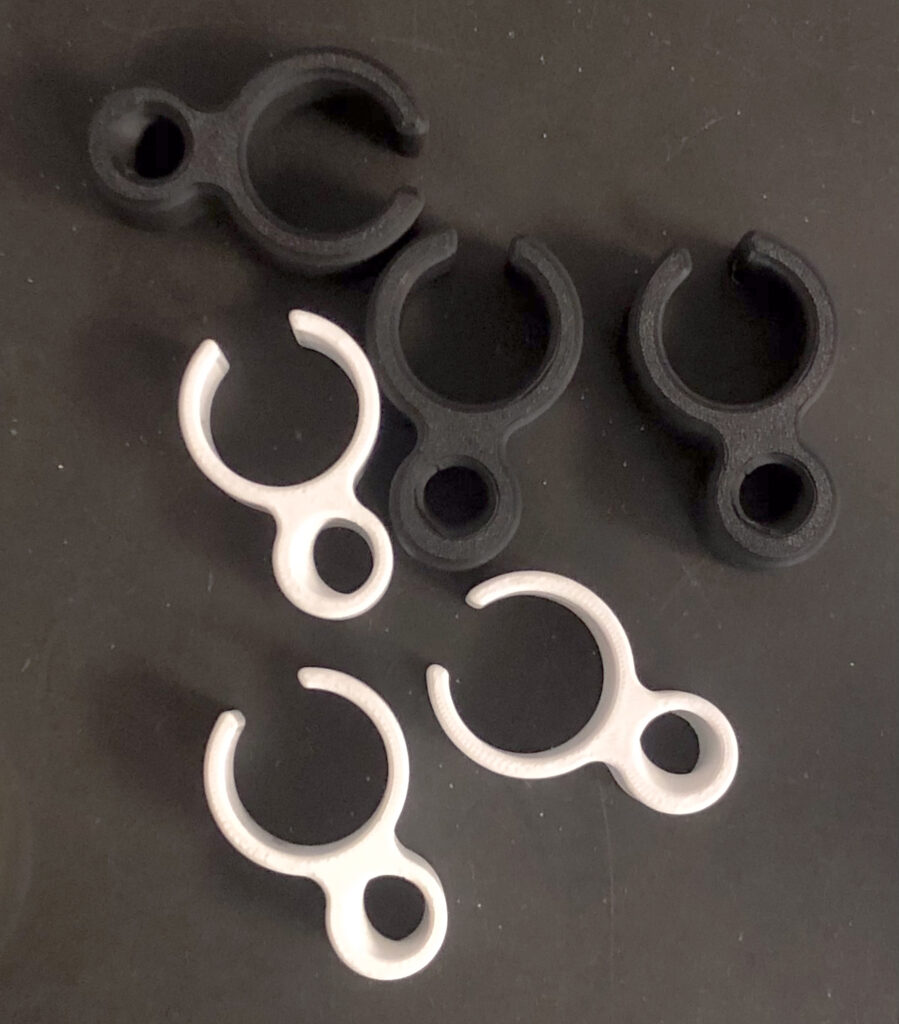
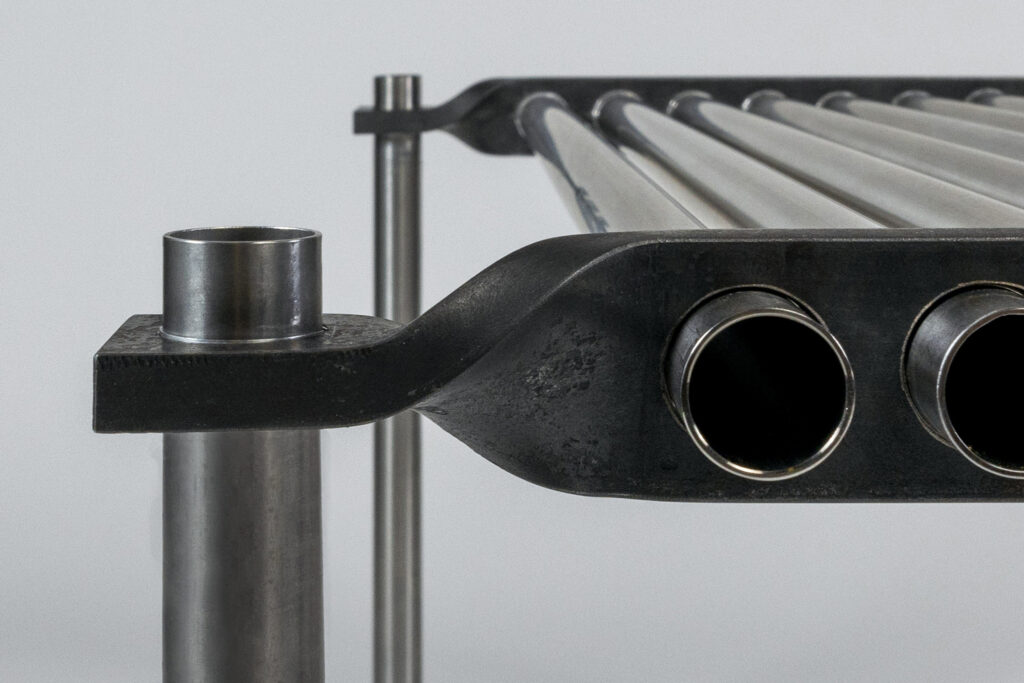
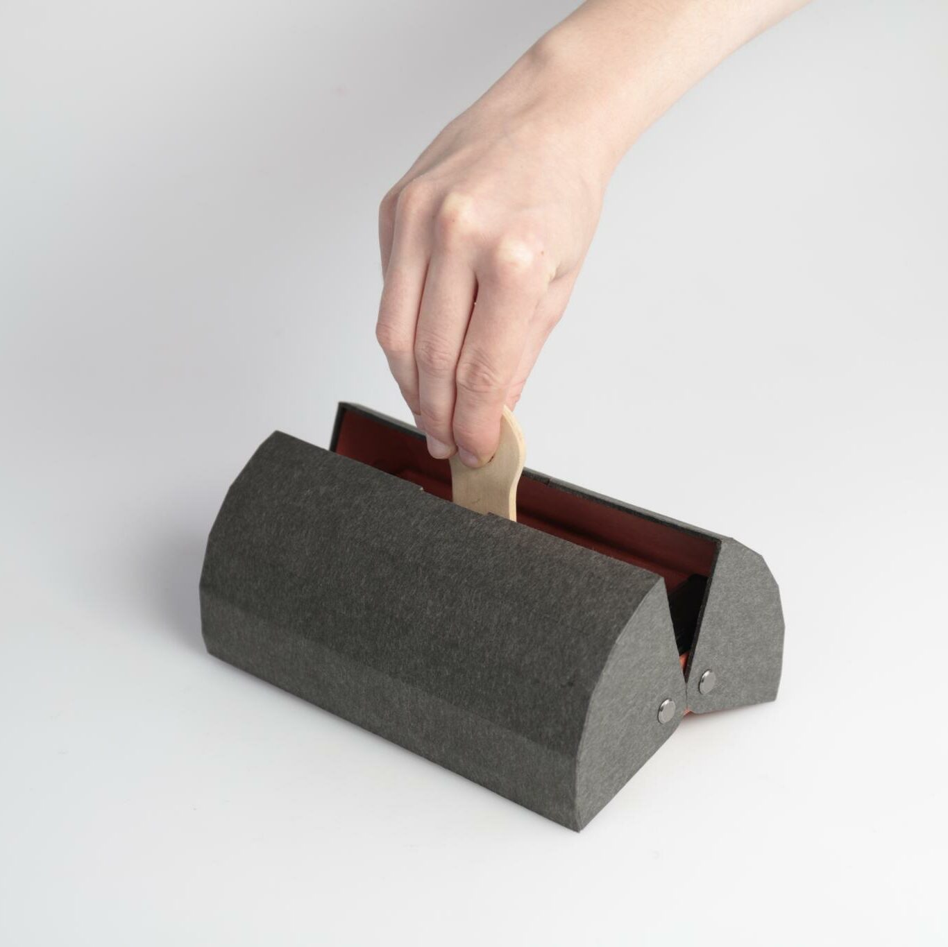
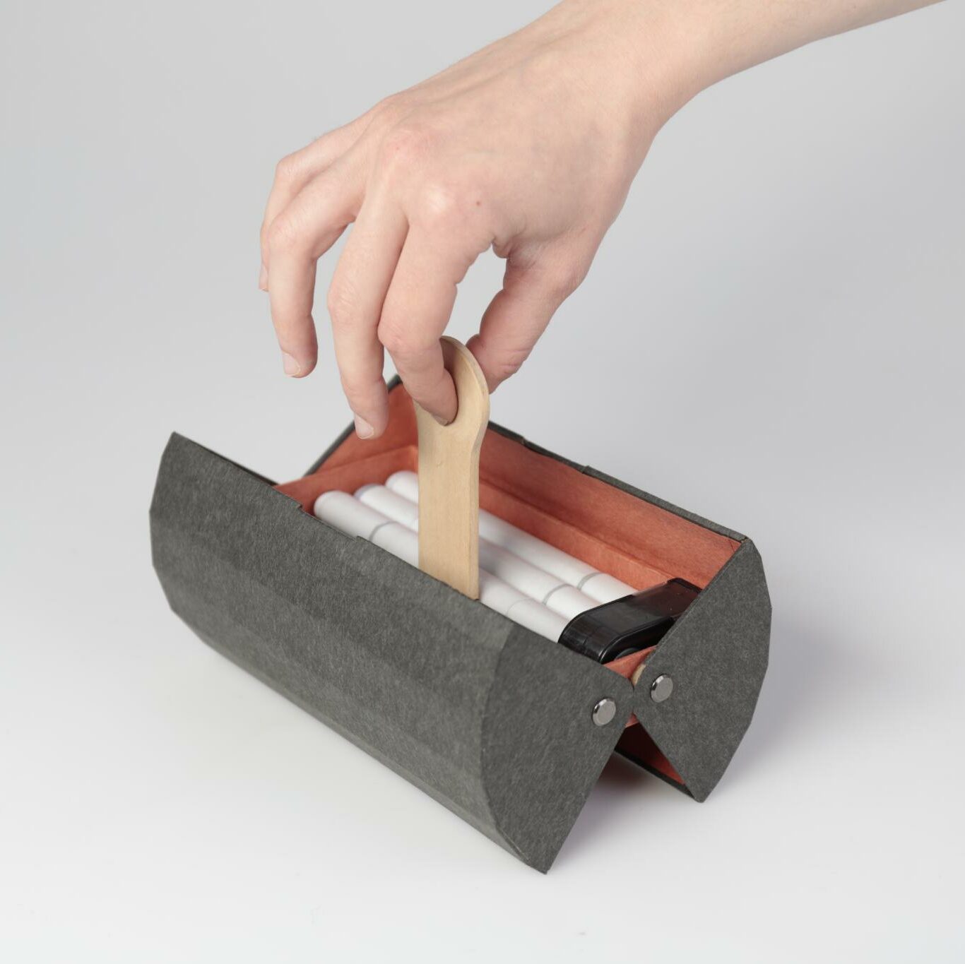
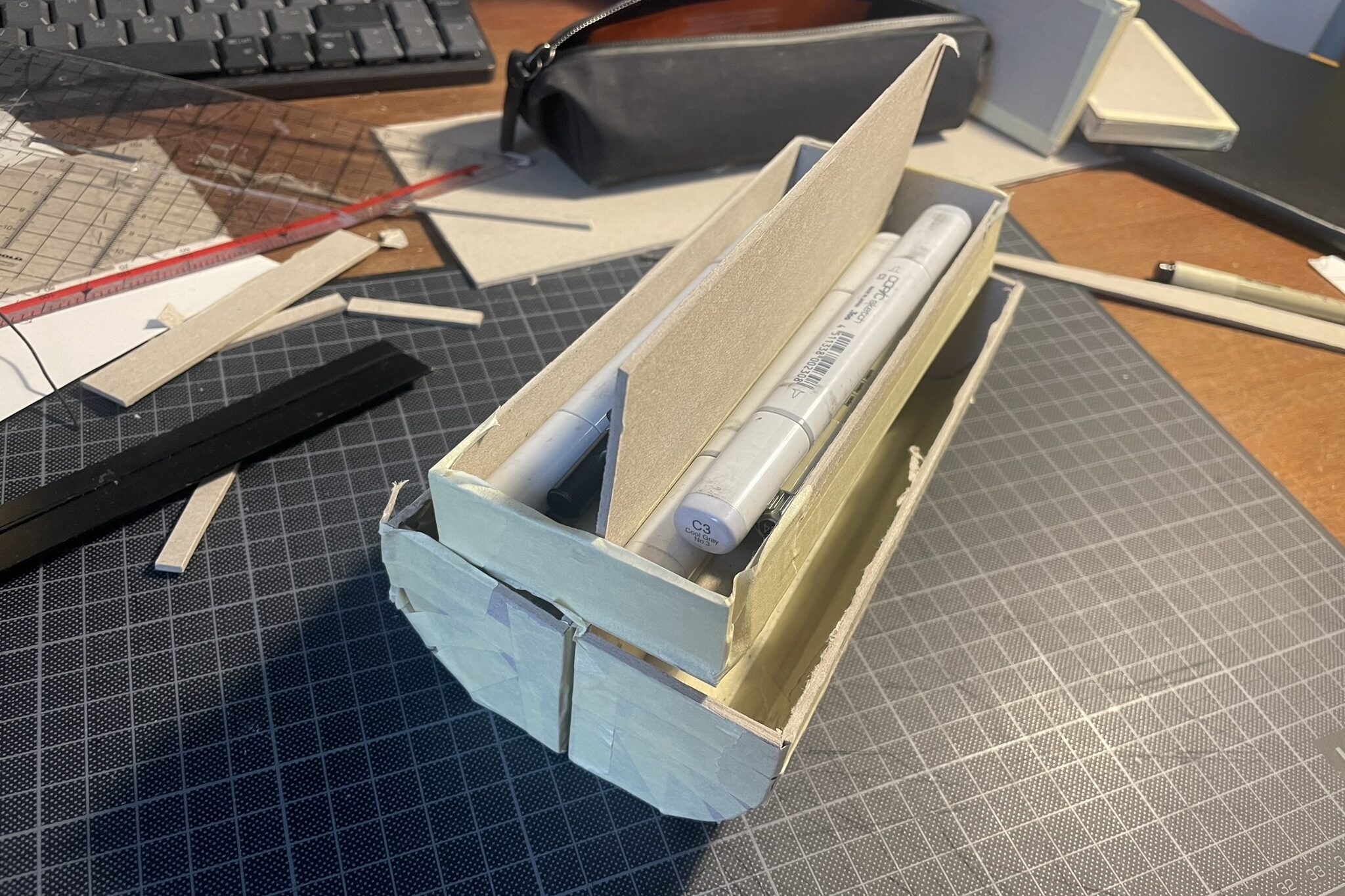
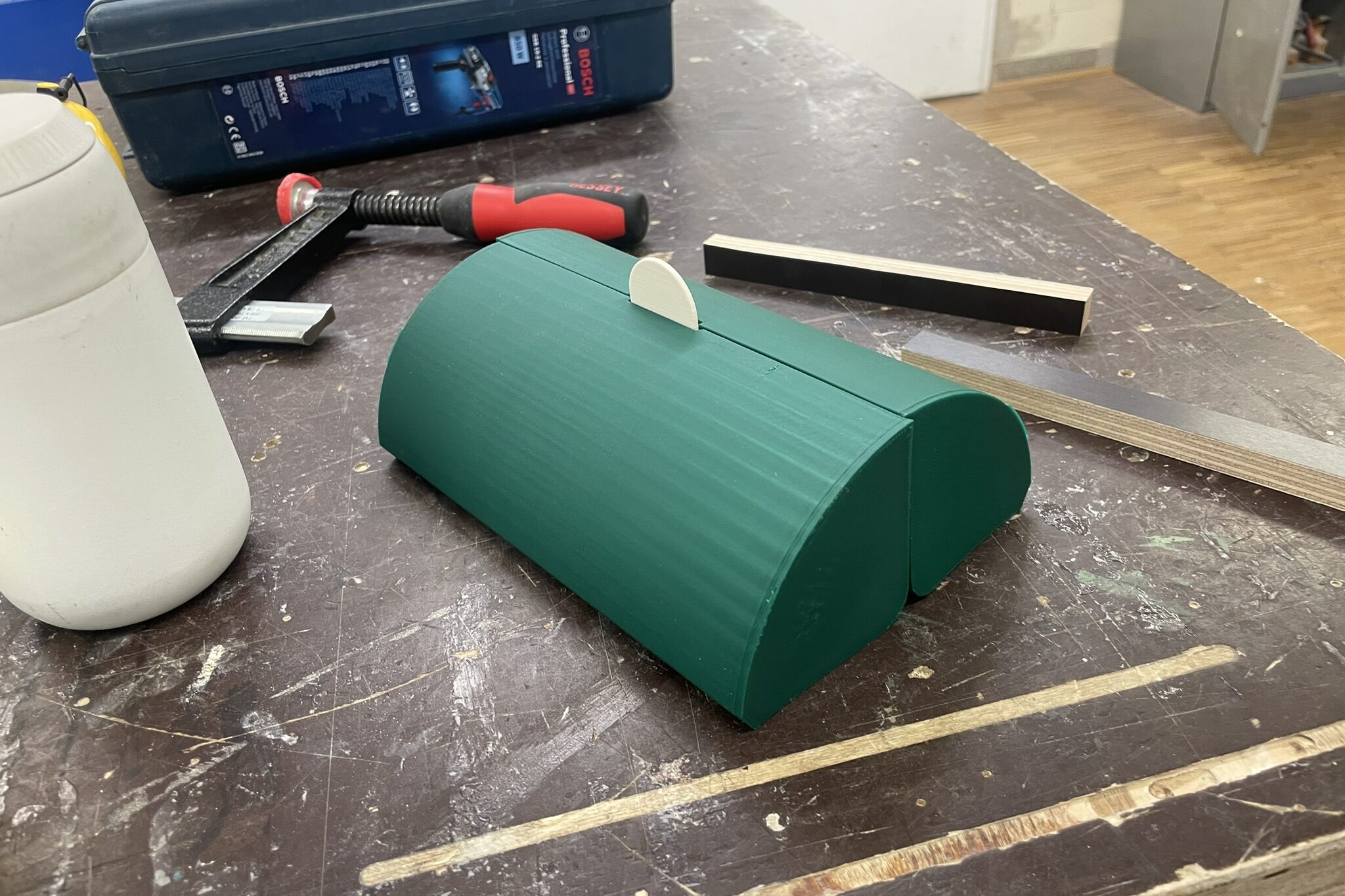
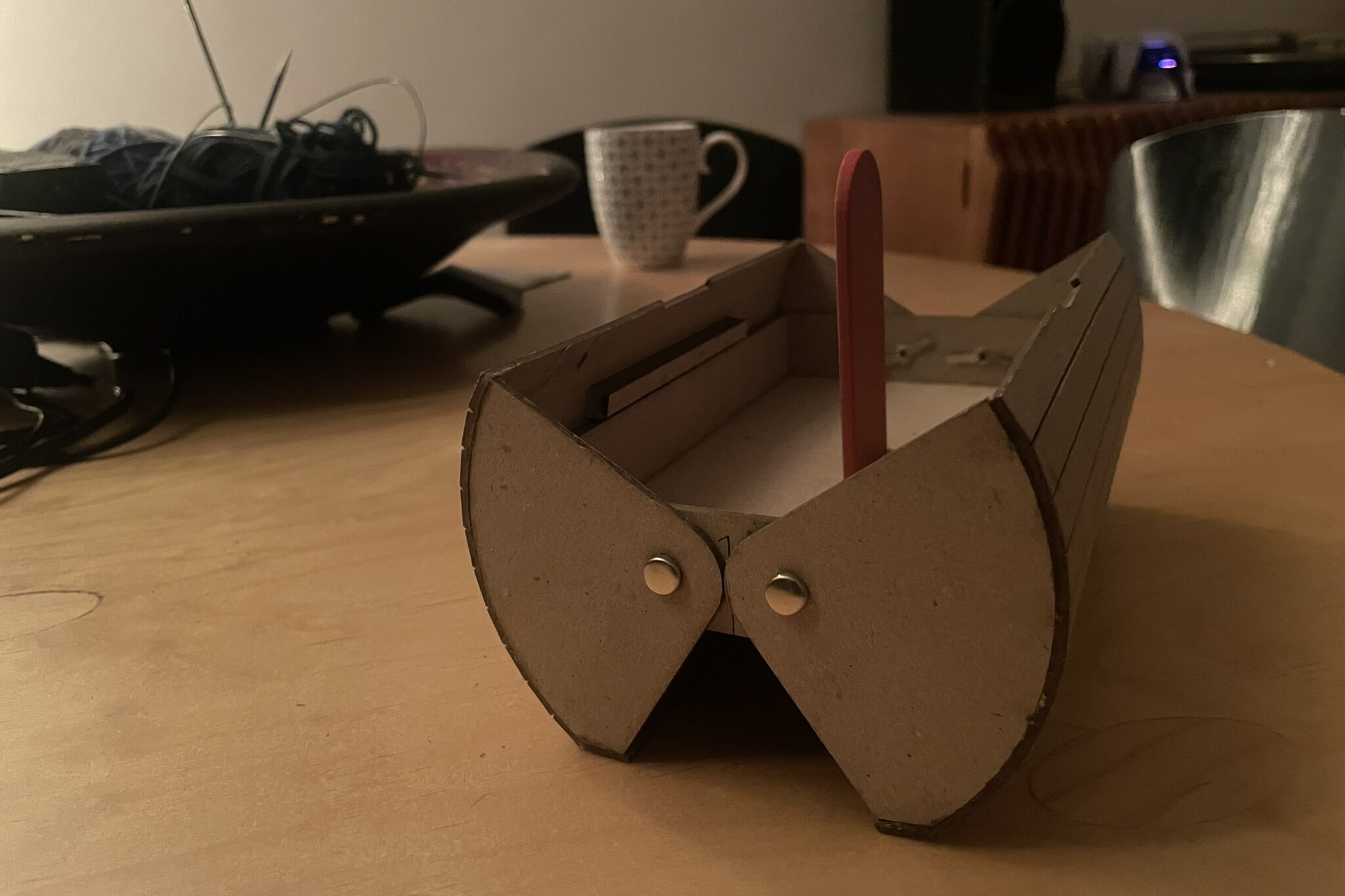
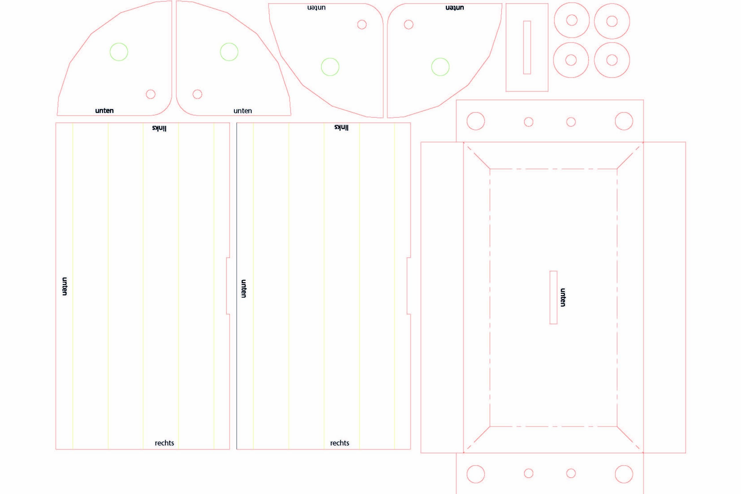
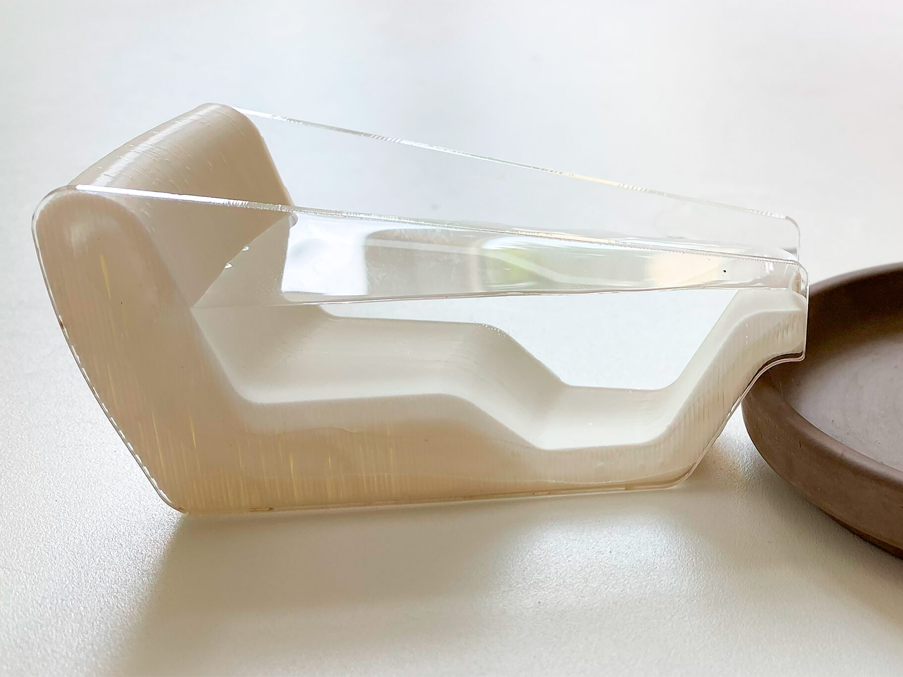
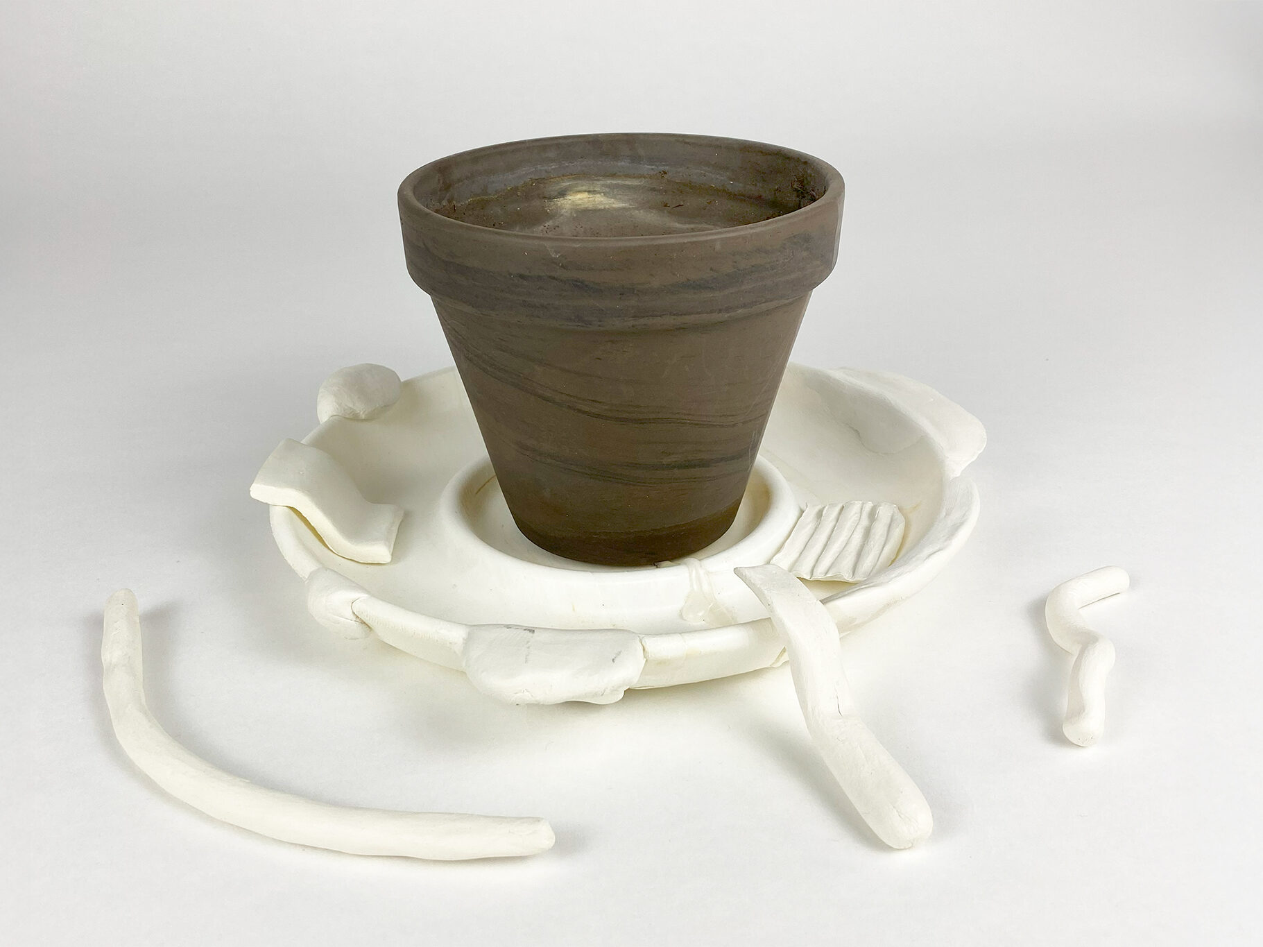
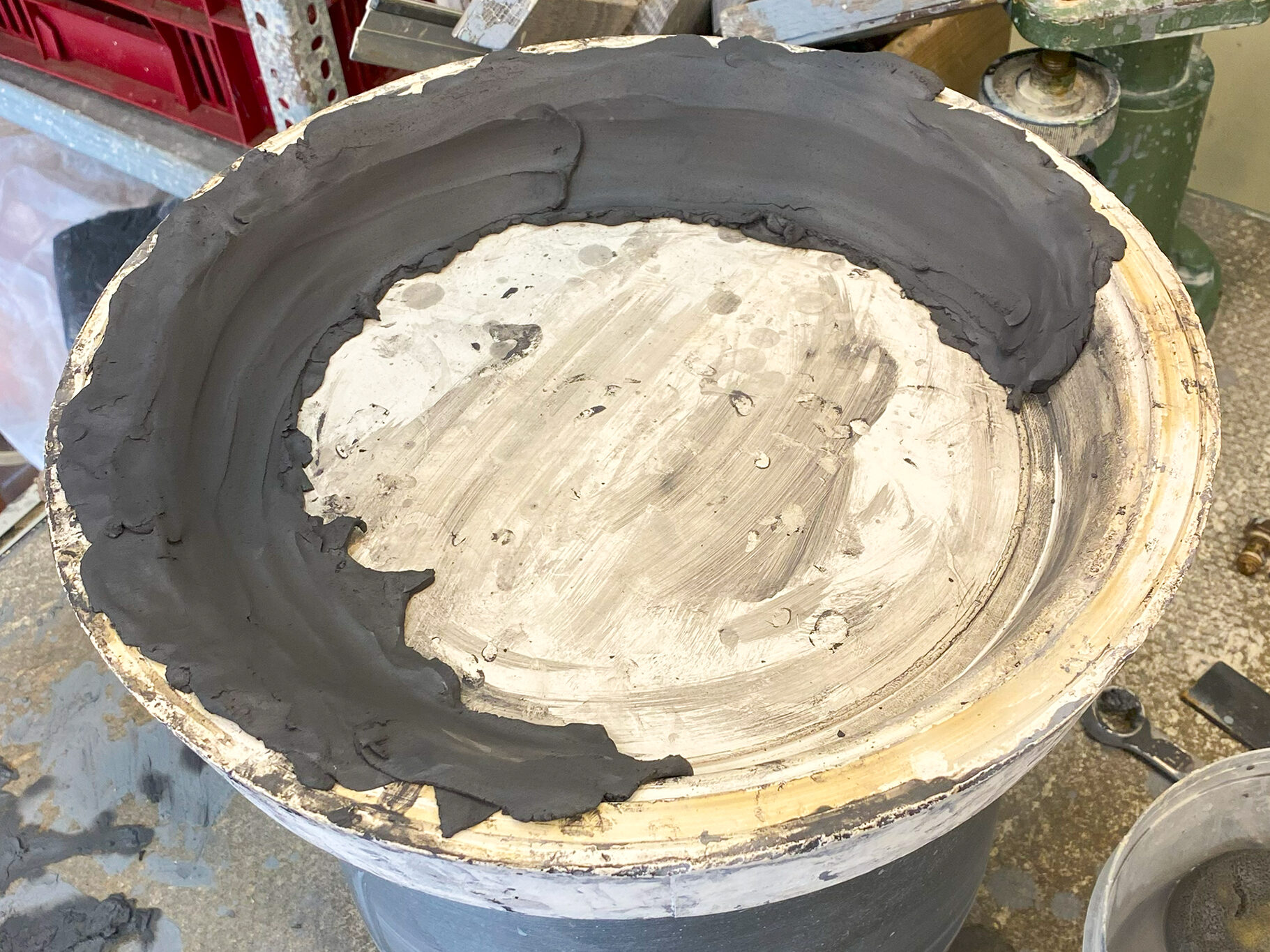
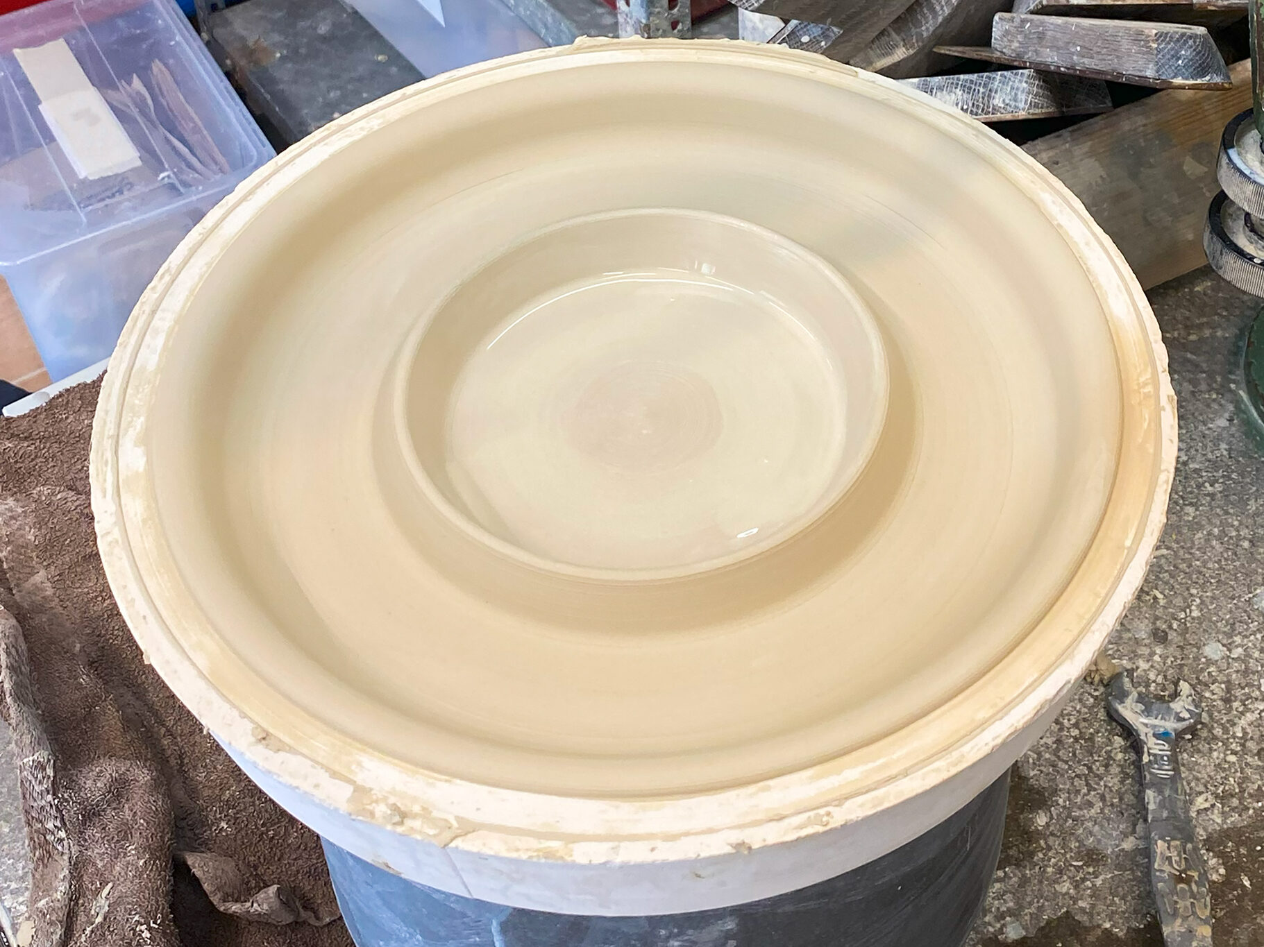
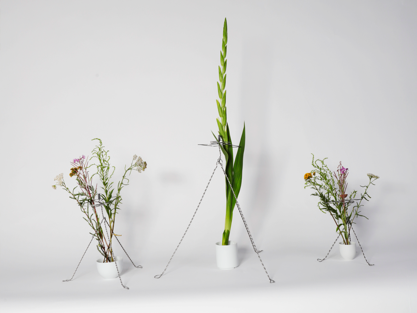
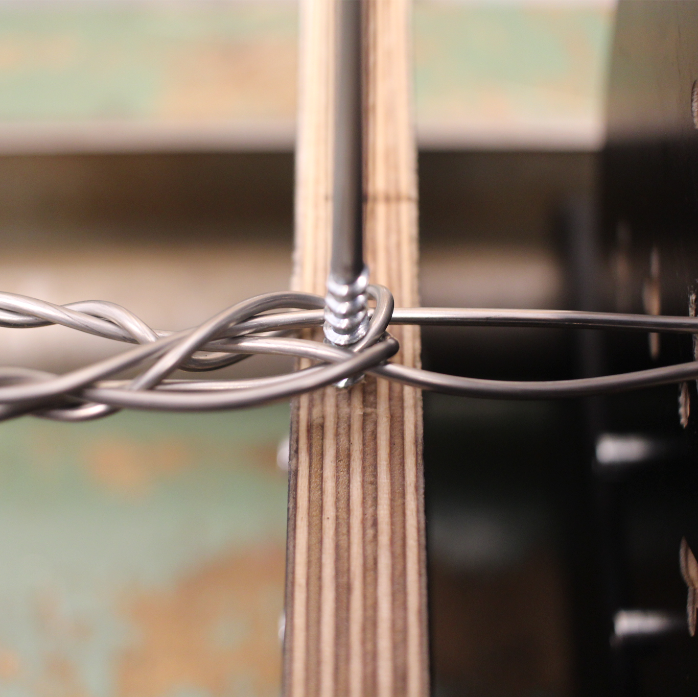
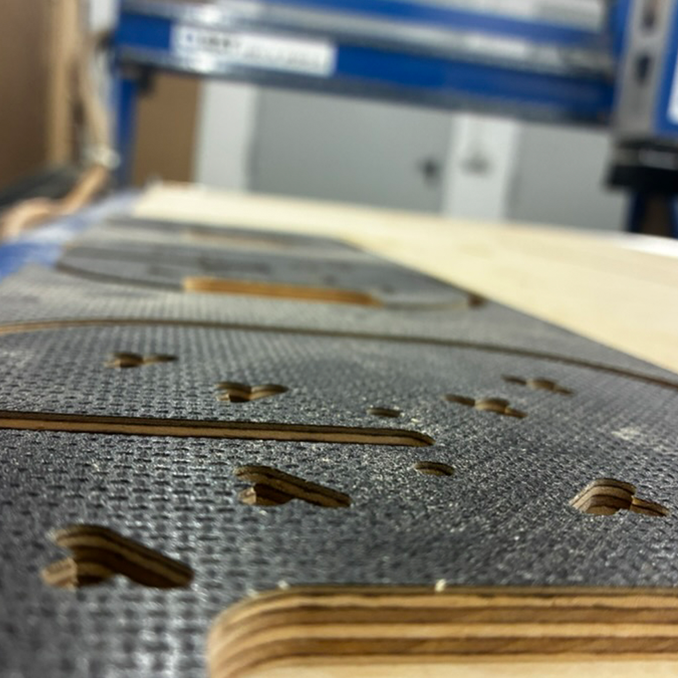
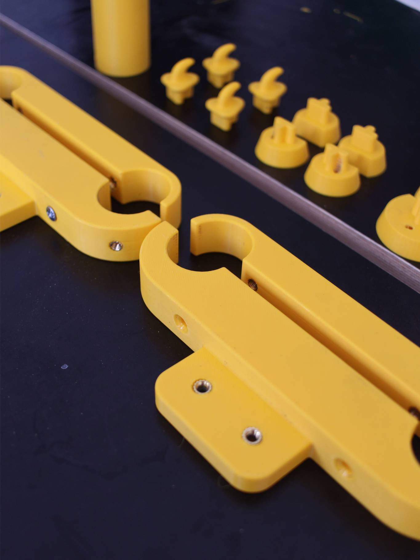
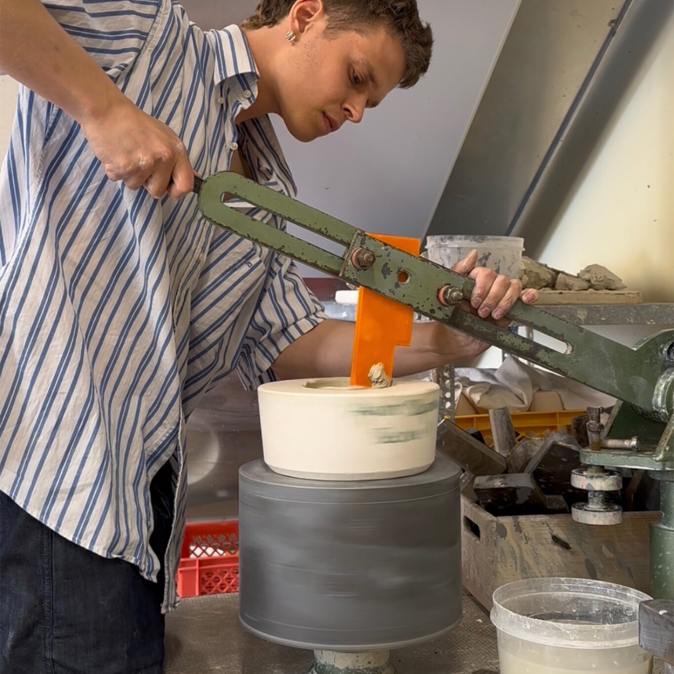
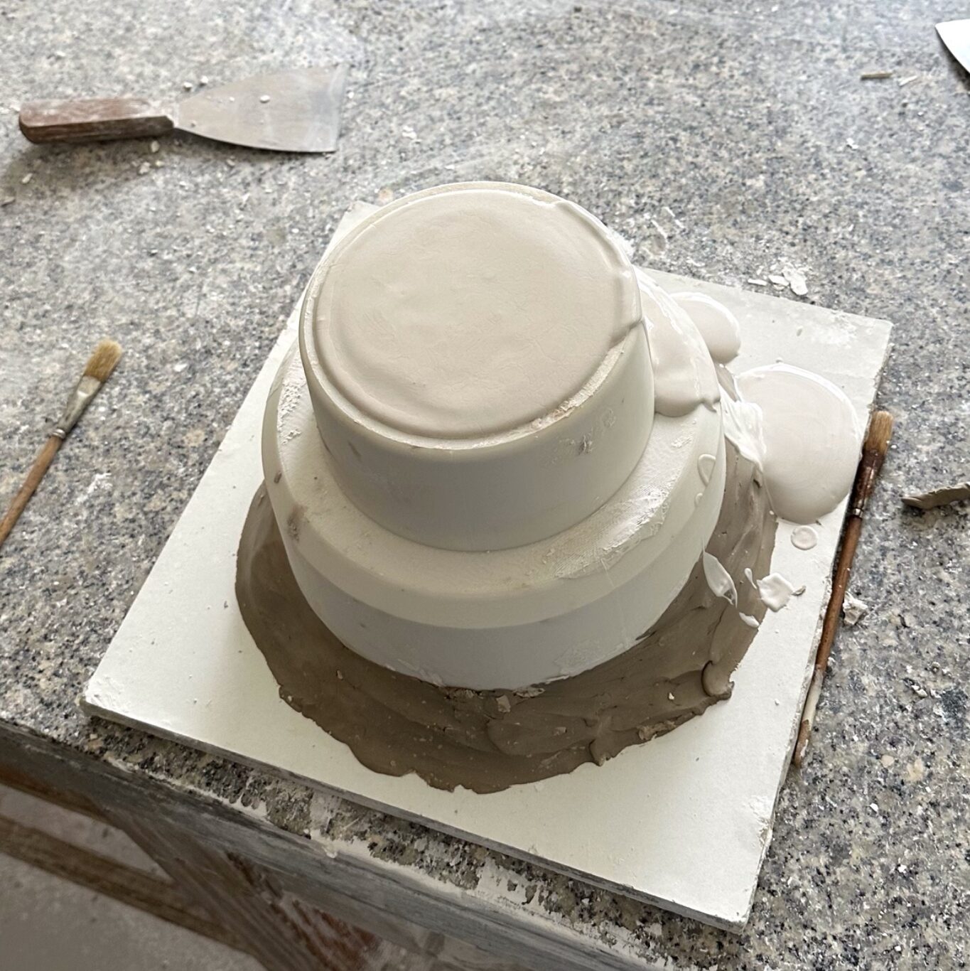
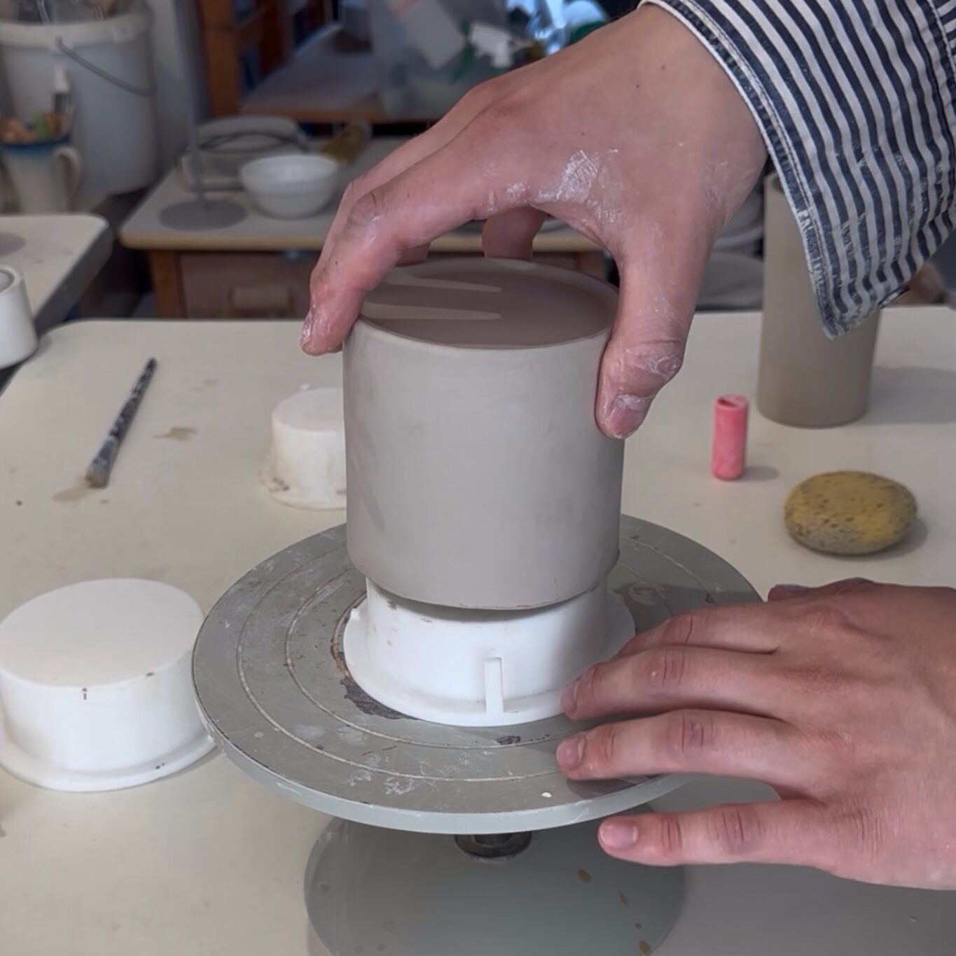
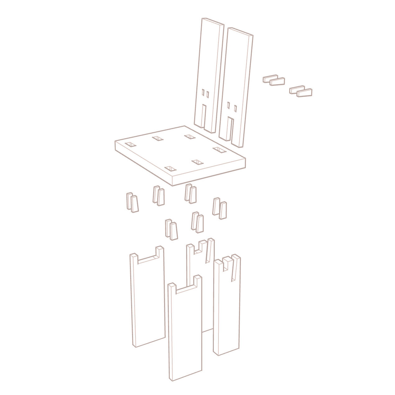
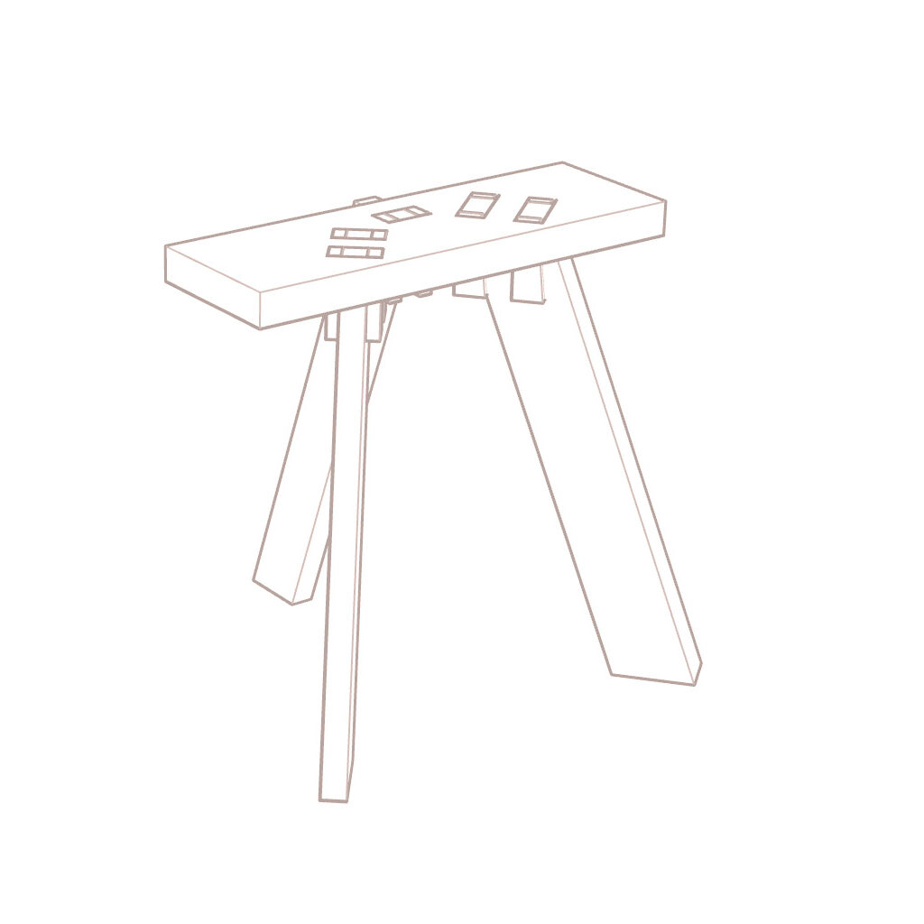
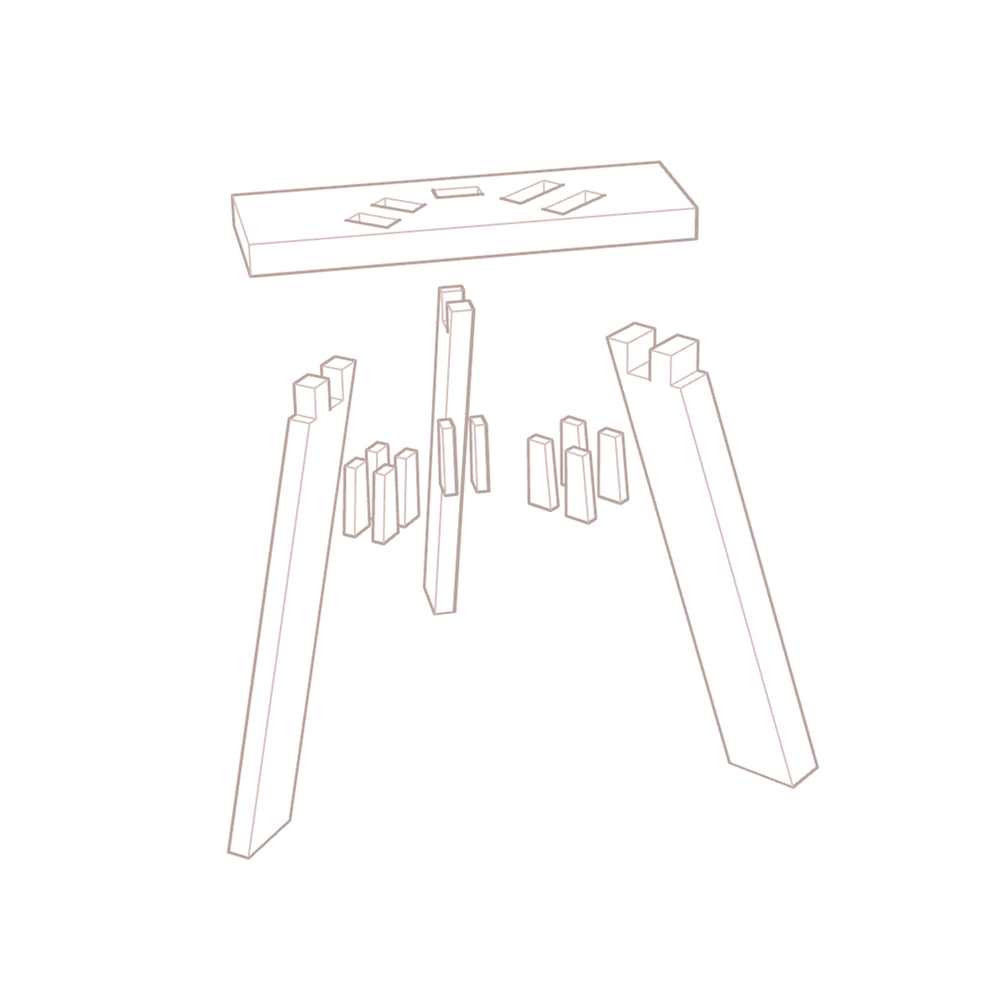
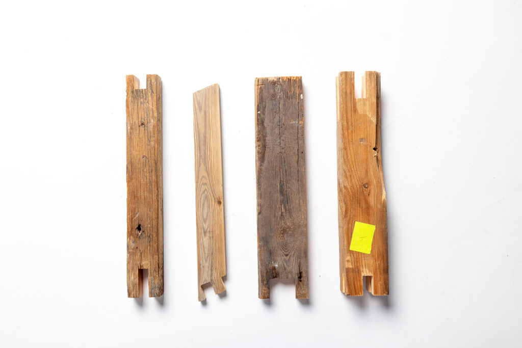
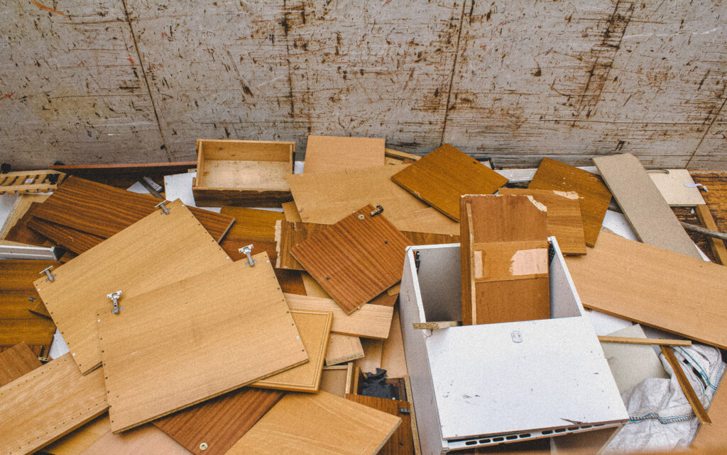
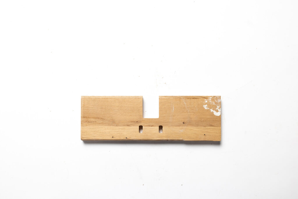
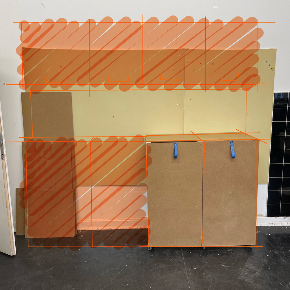
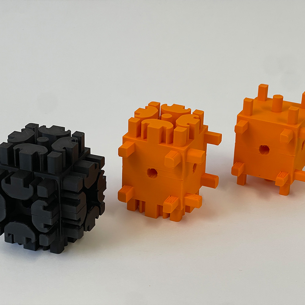
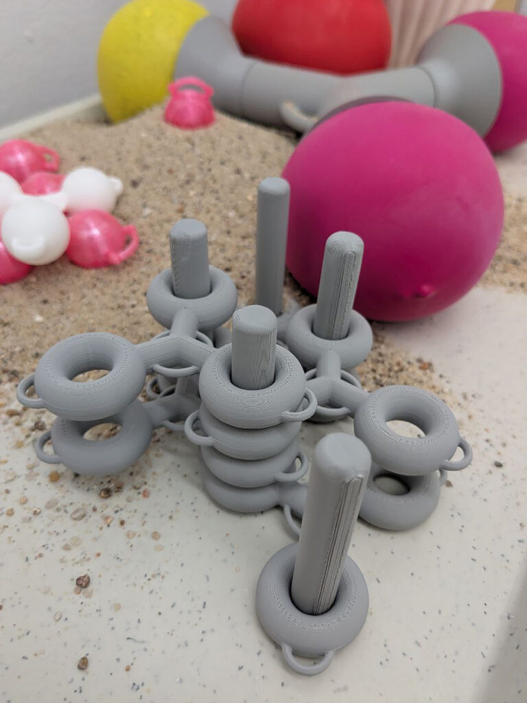
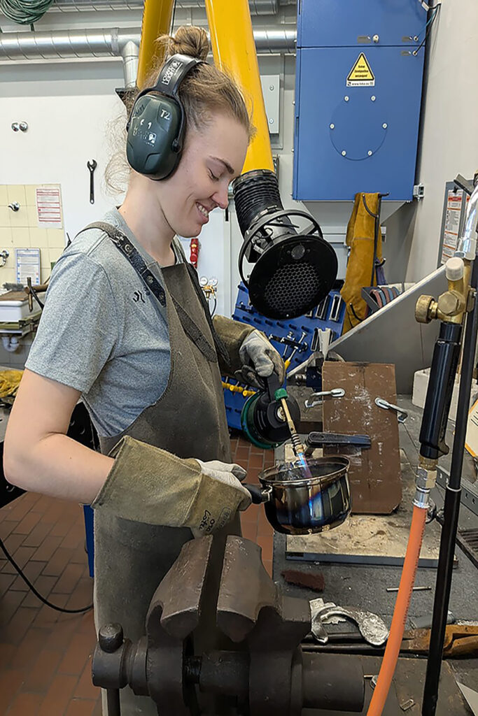
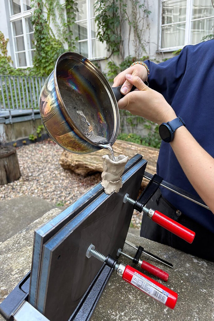
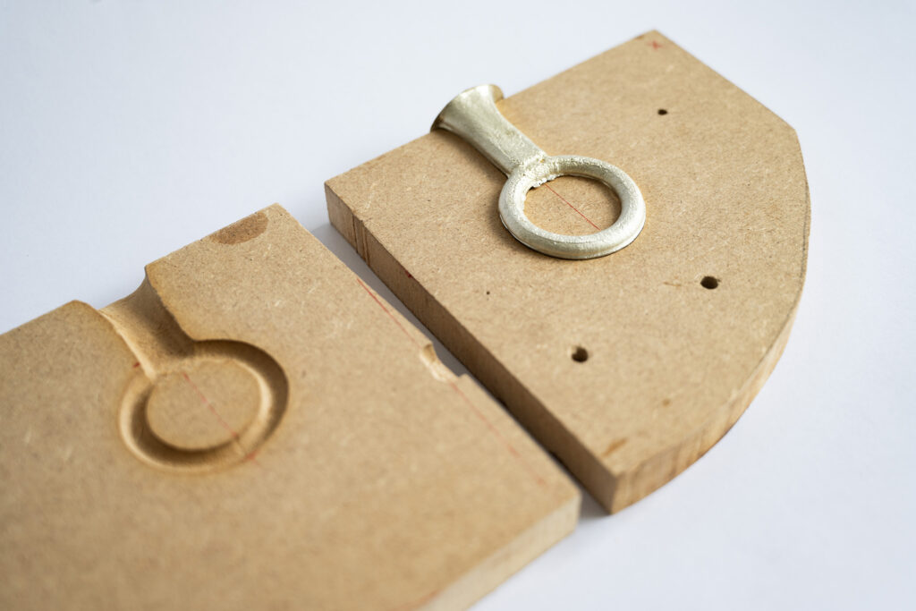
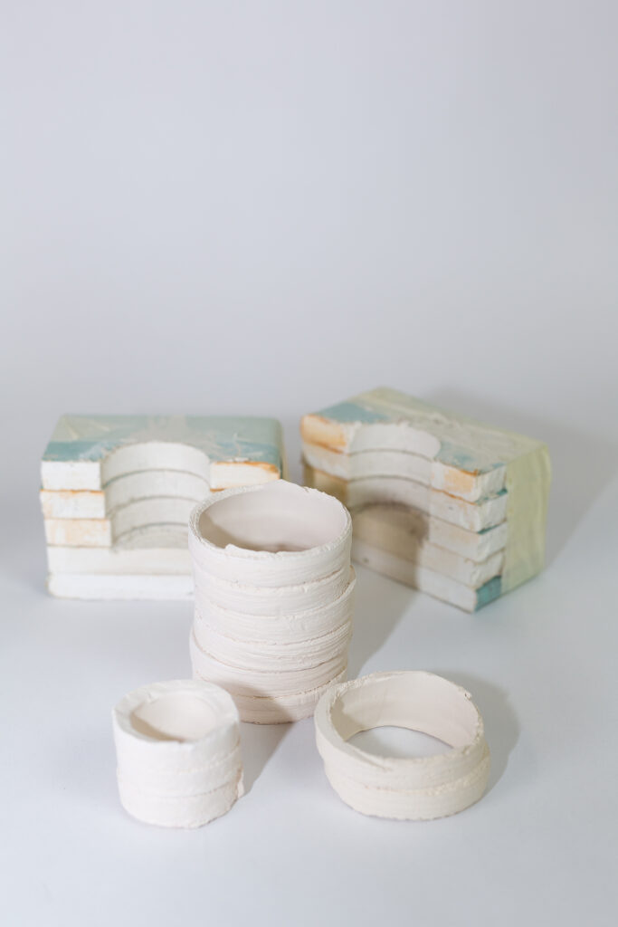
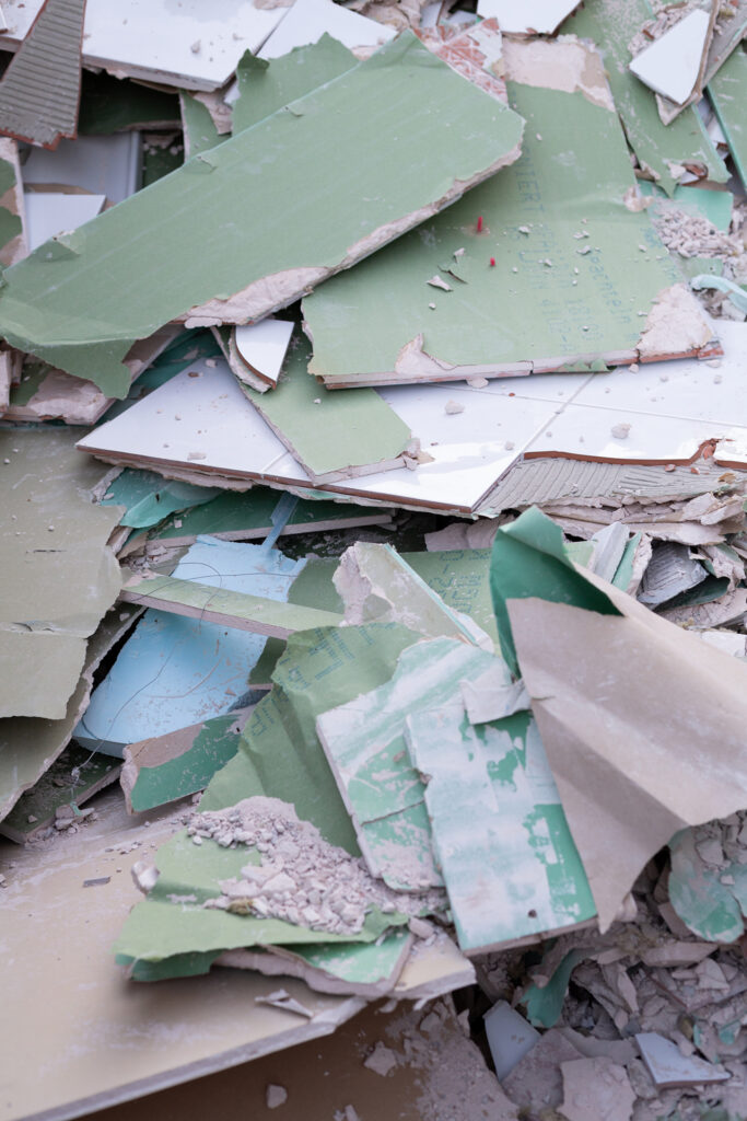
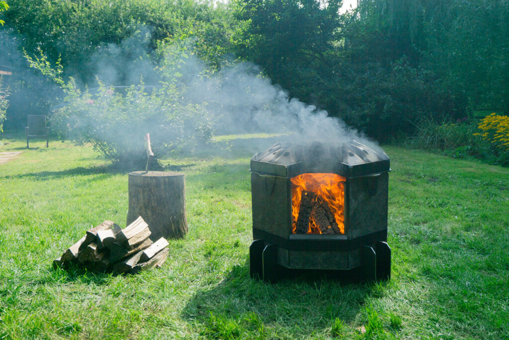
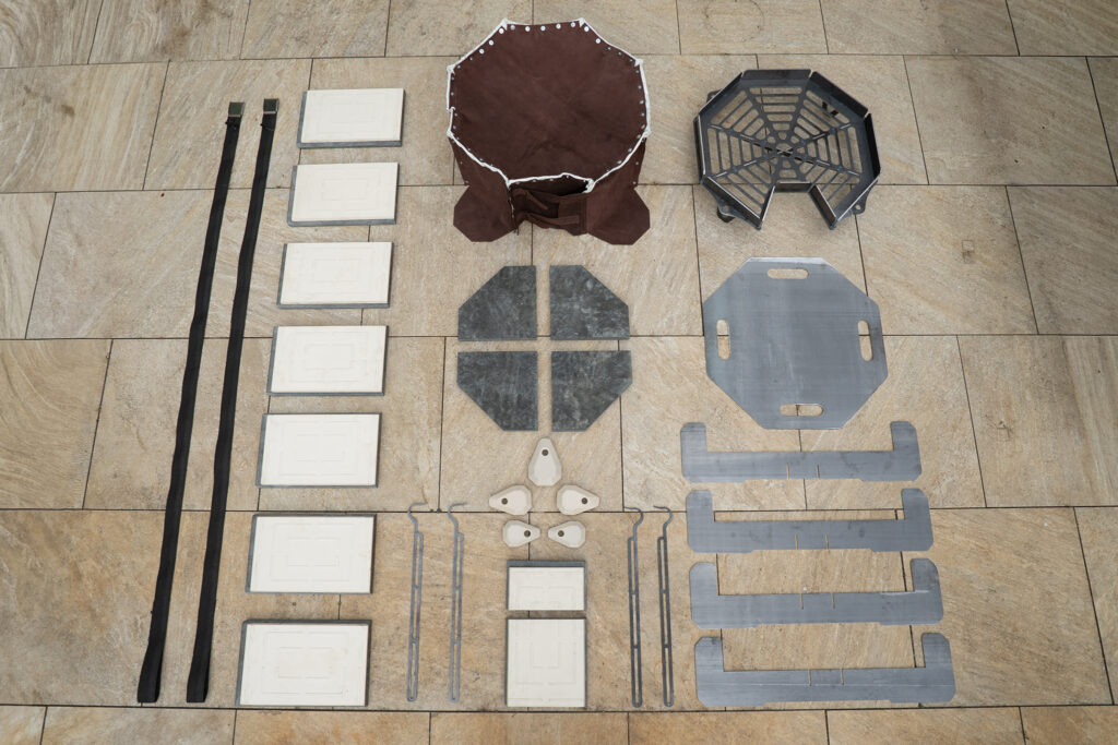
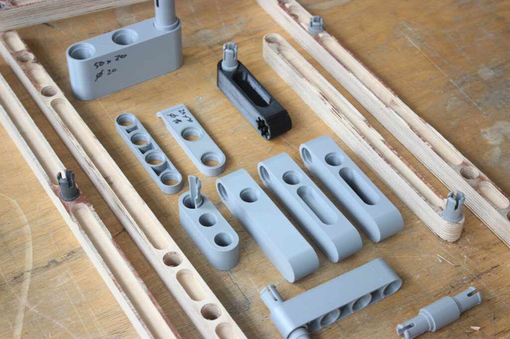
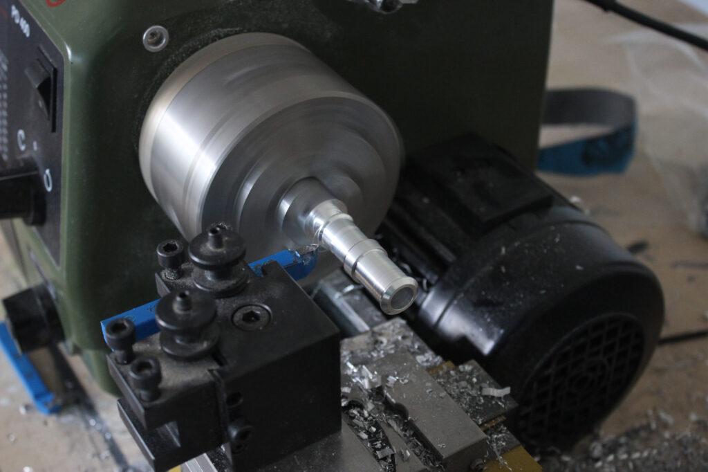
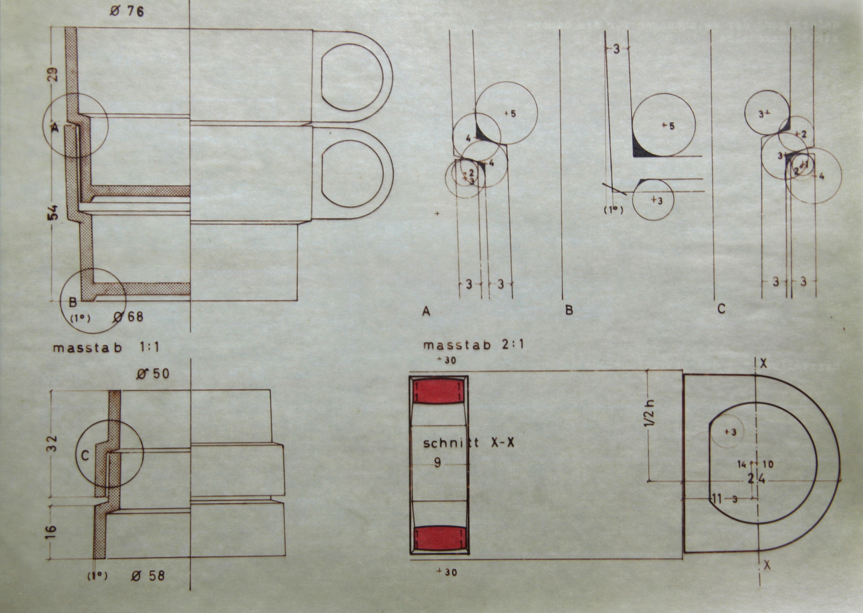
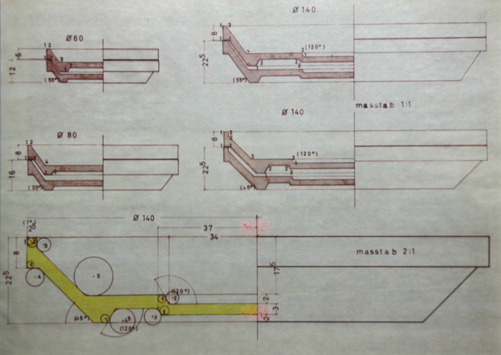
Prozess
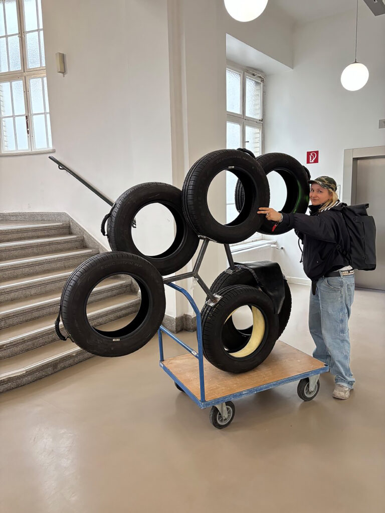
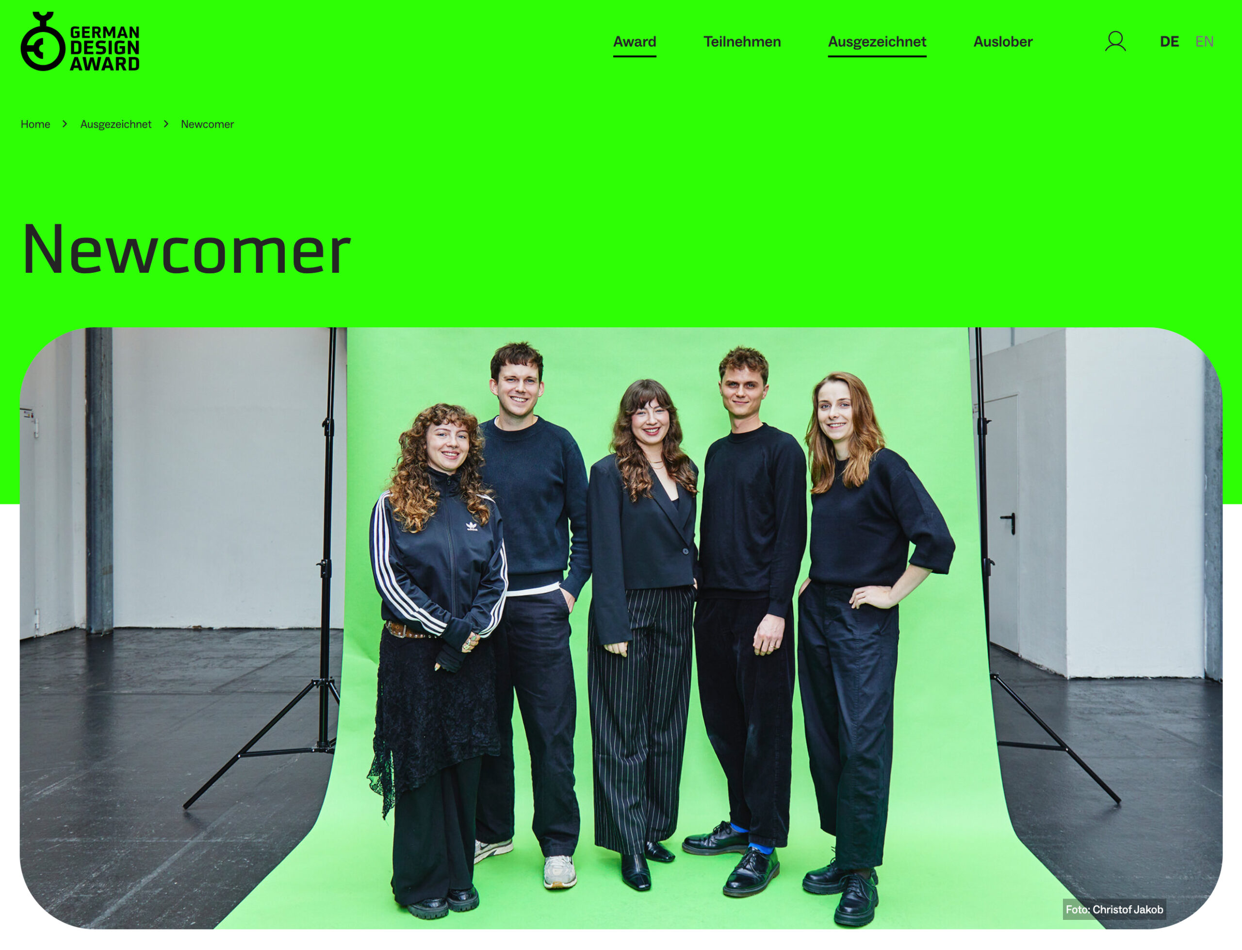
Prüfer: A.Stankowski, A. Engelmann, M. Beck
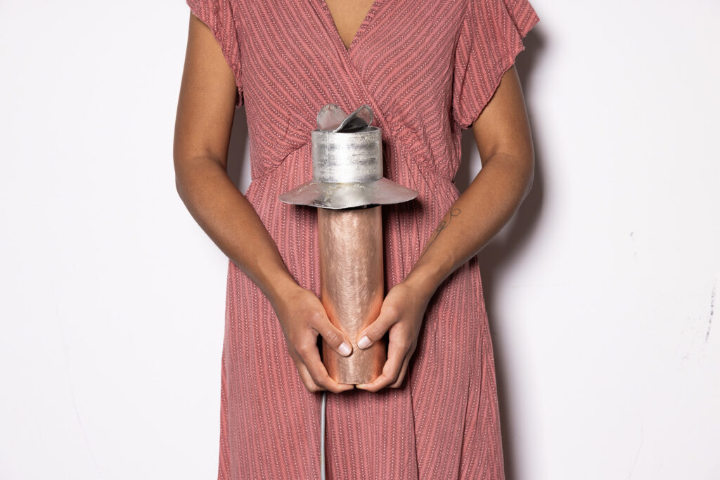
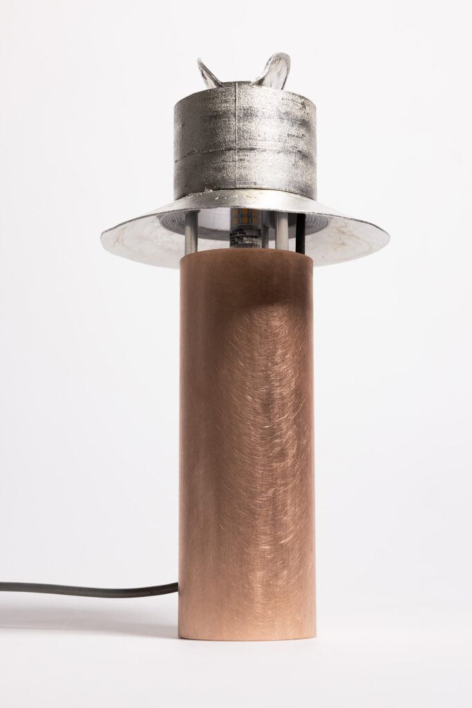
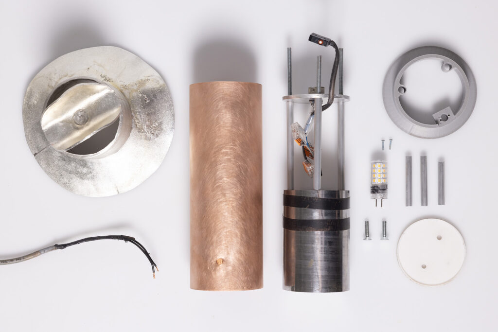
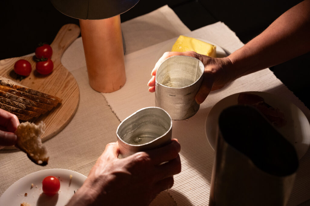

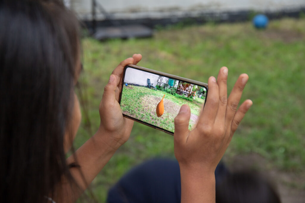
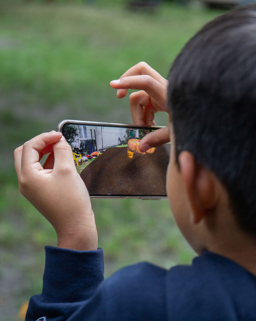
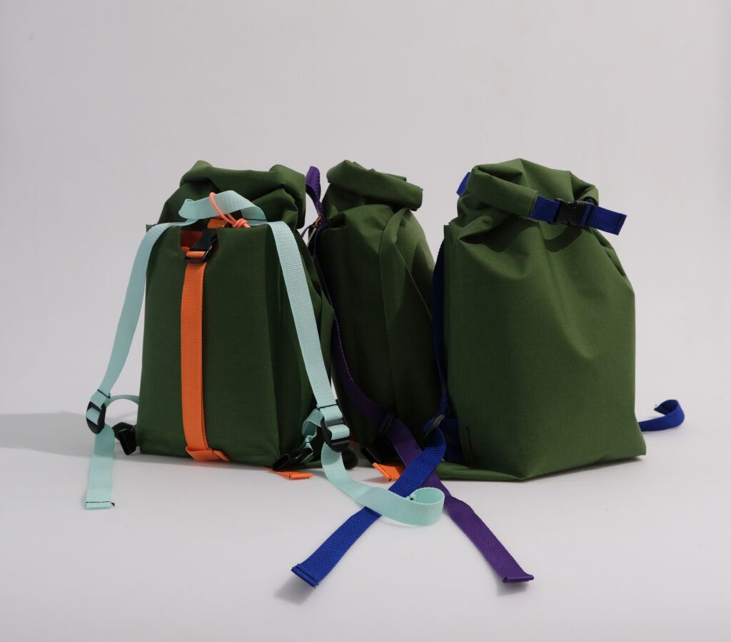
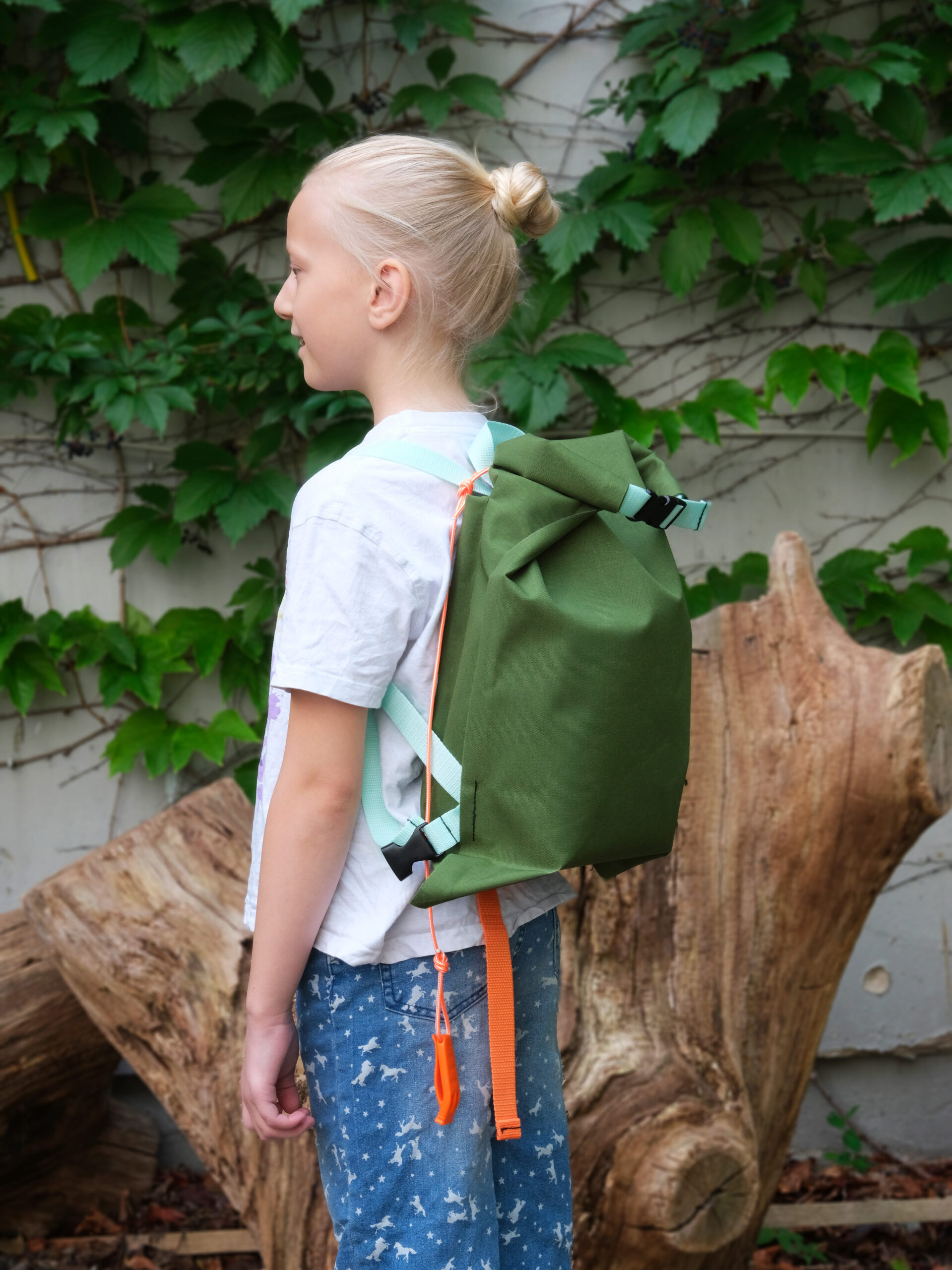
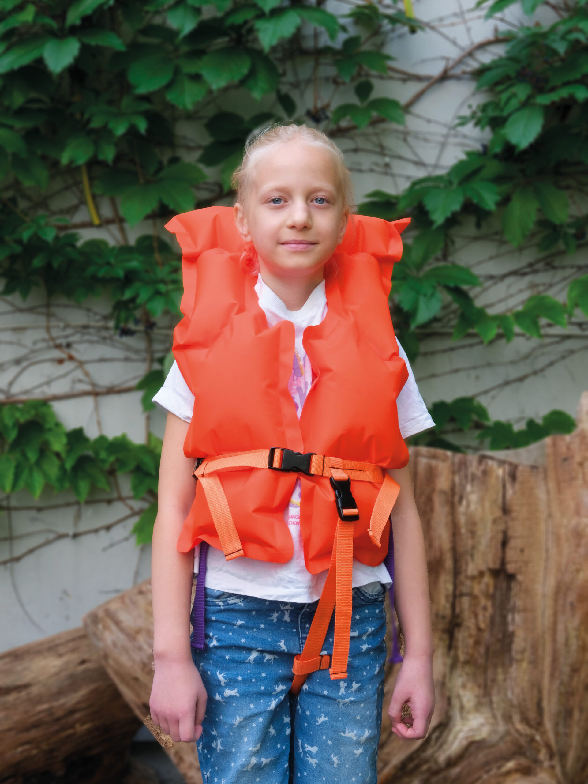
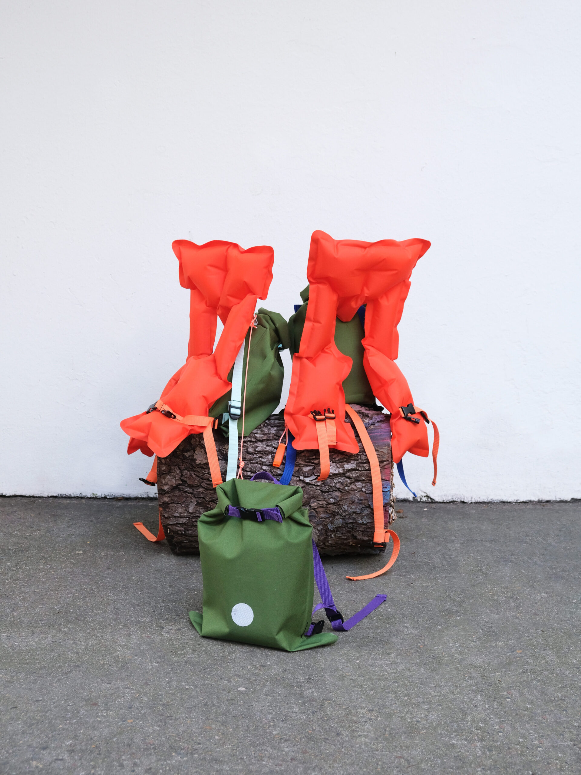
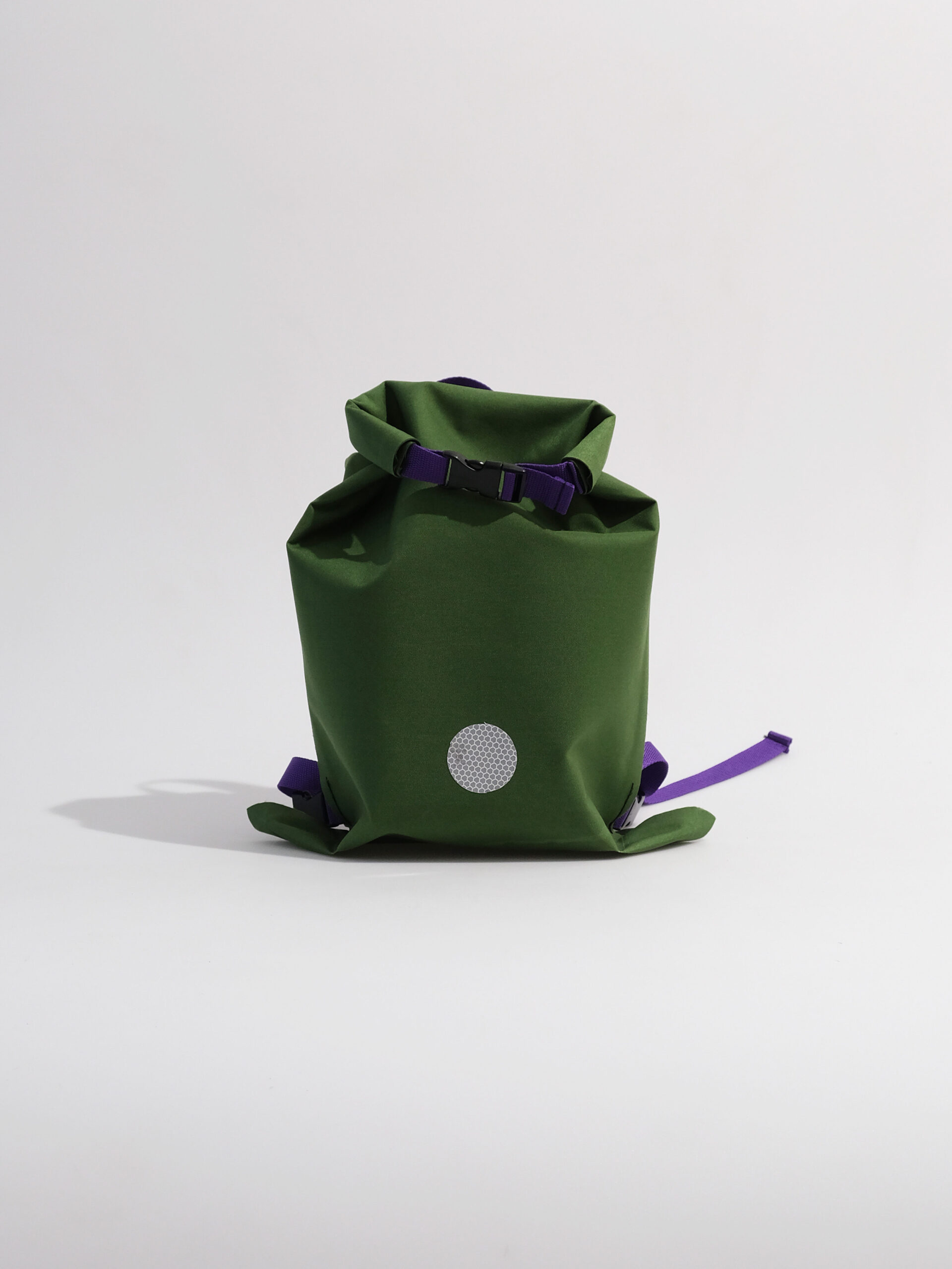
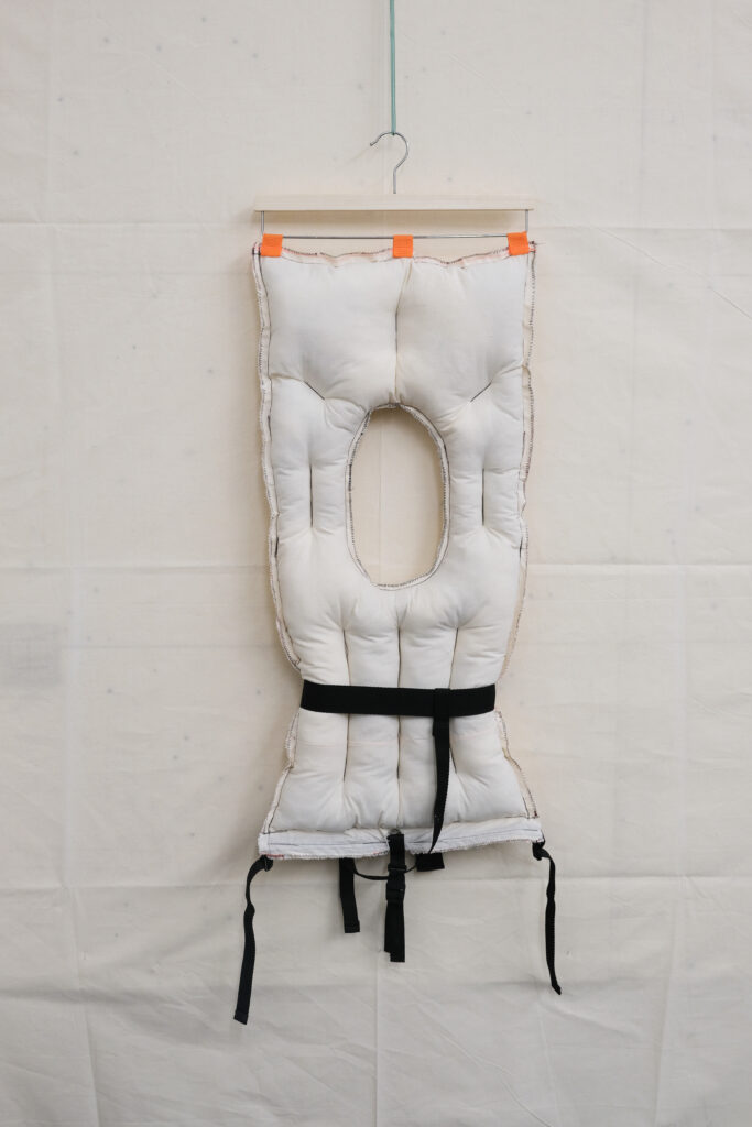
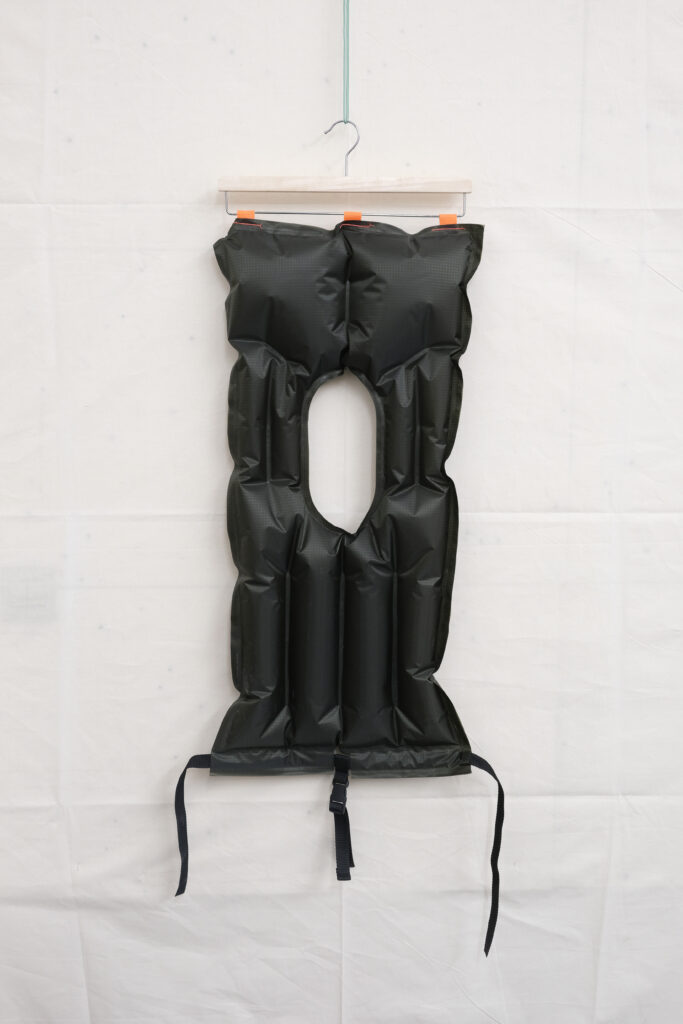
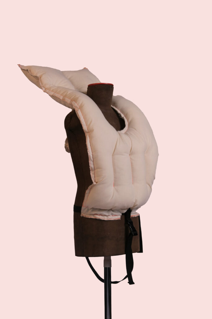
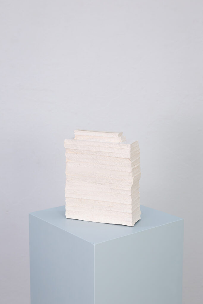
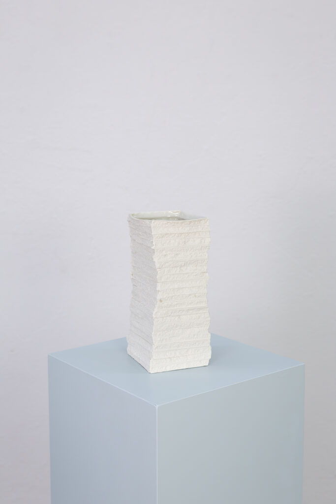
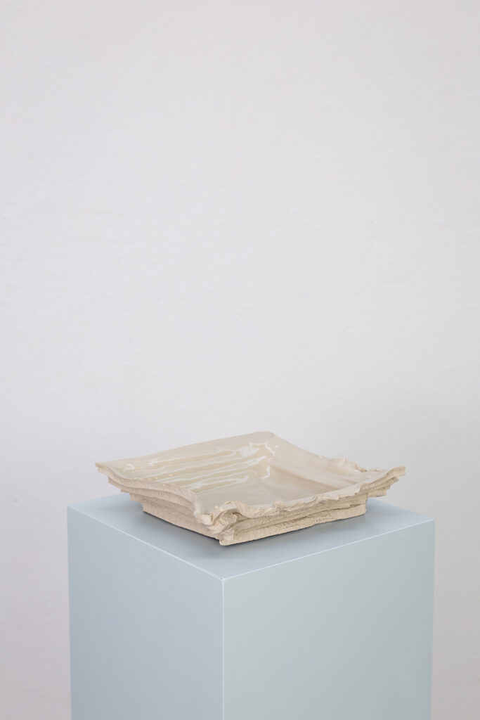
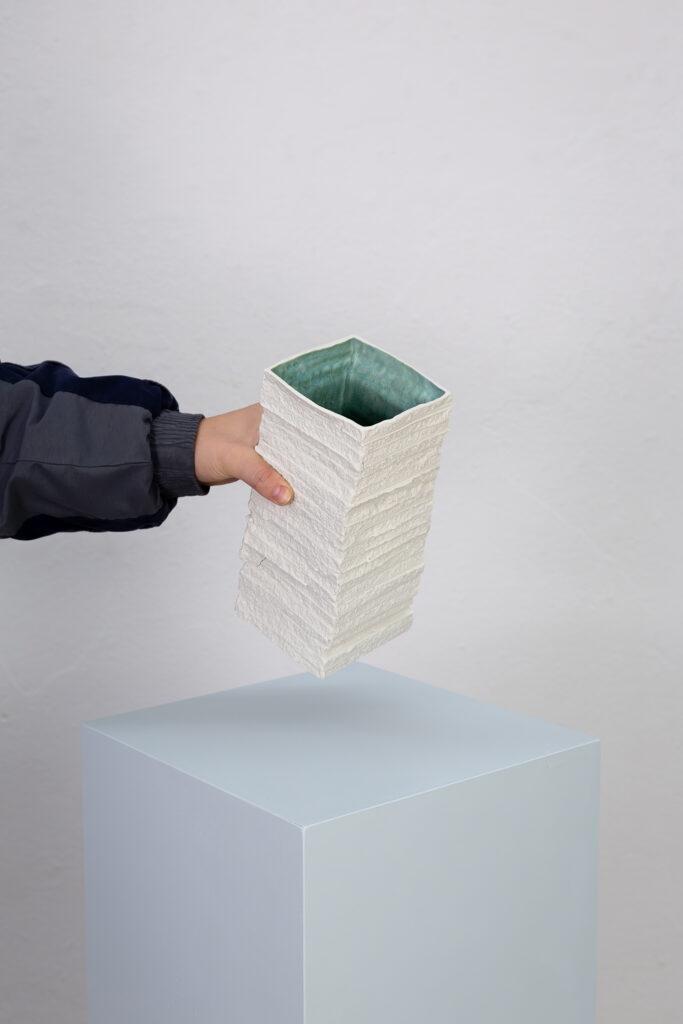
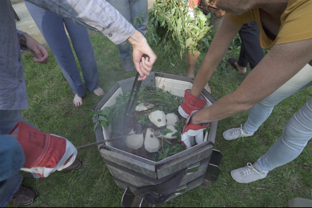
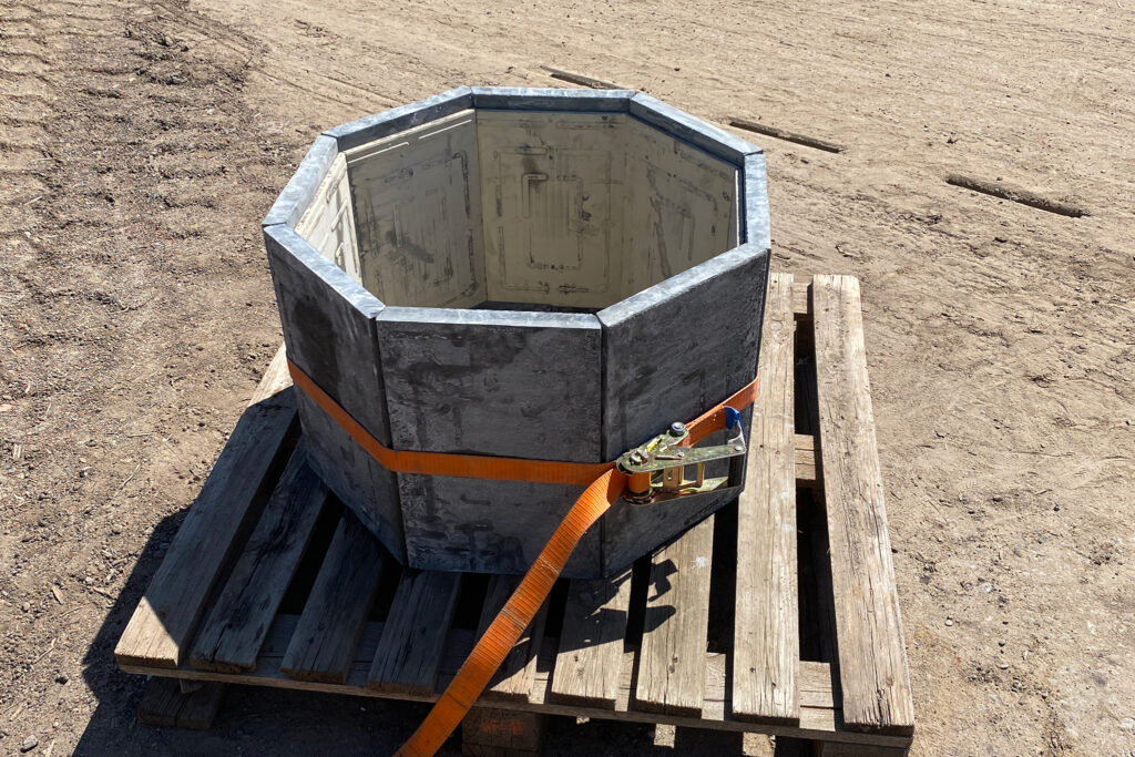
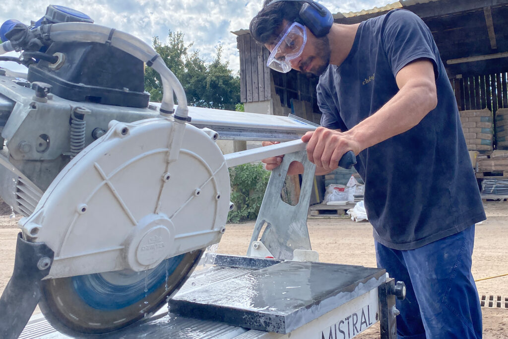
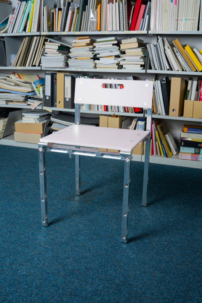
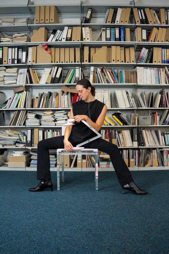
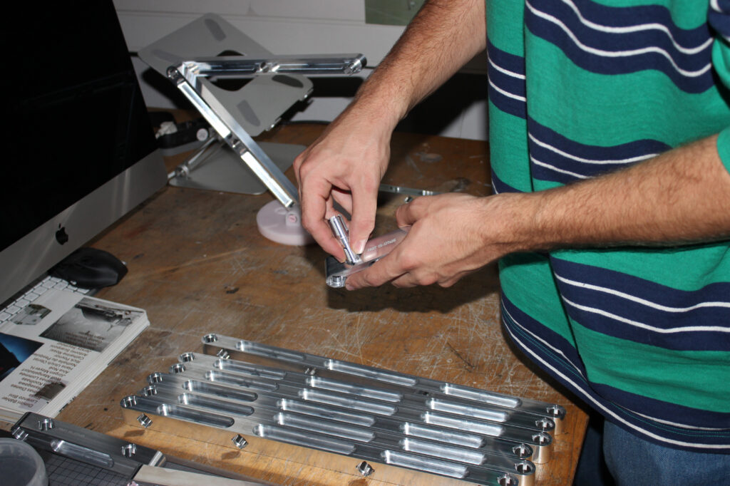

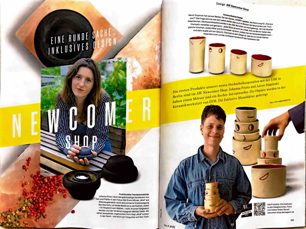
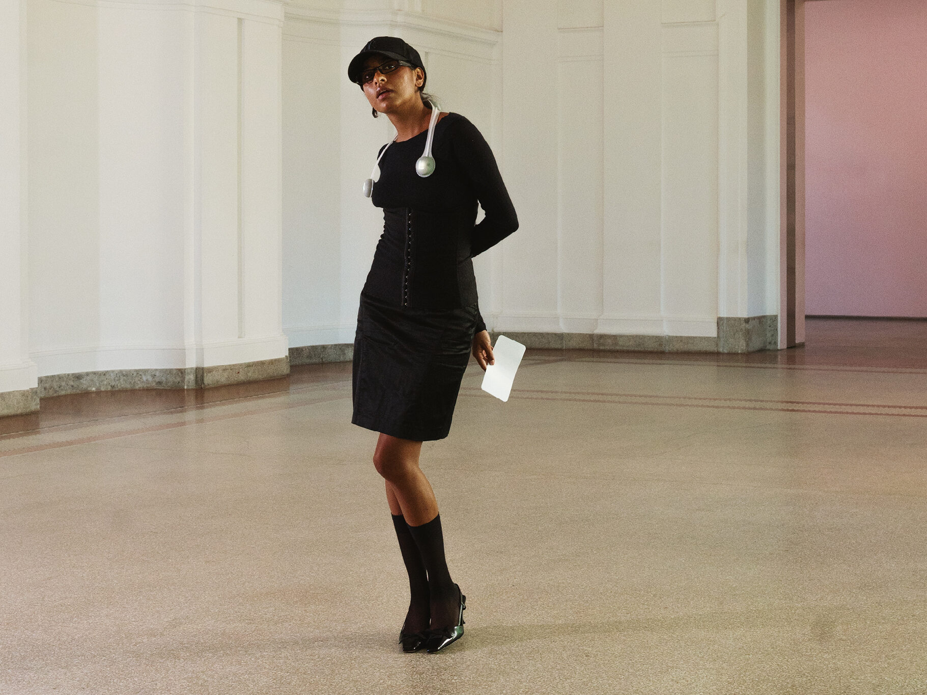
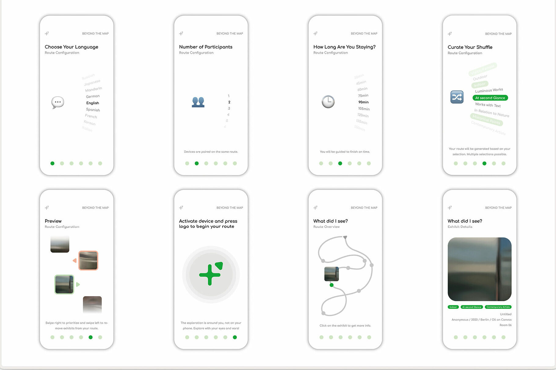
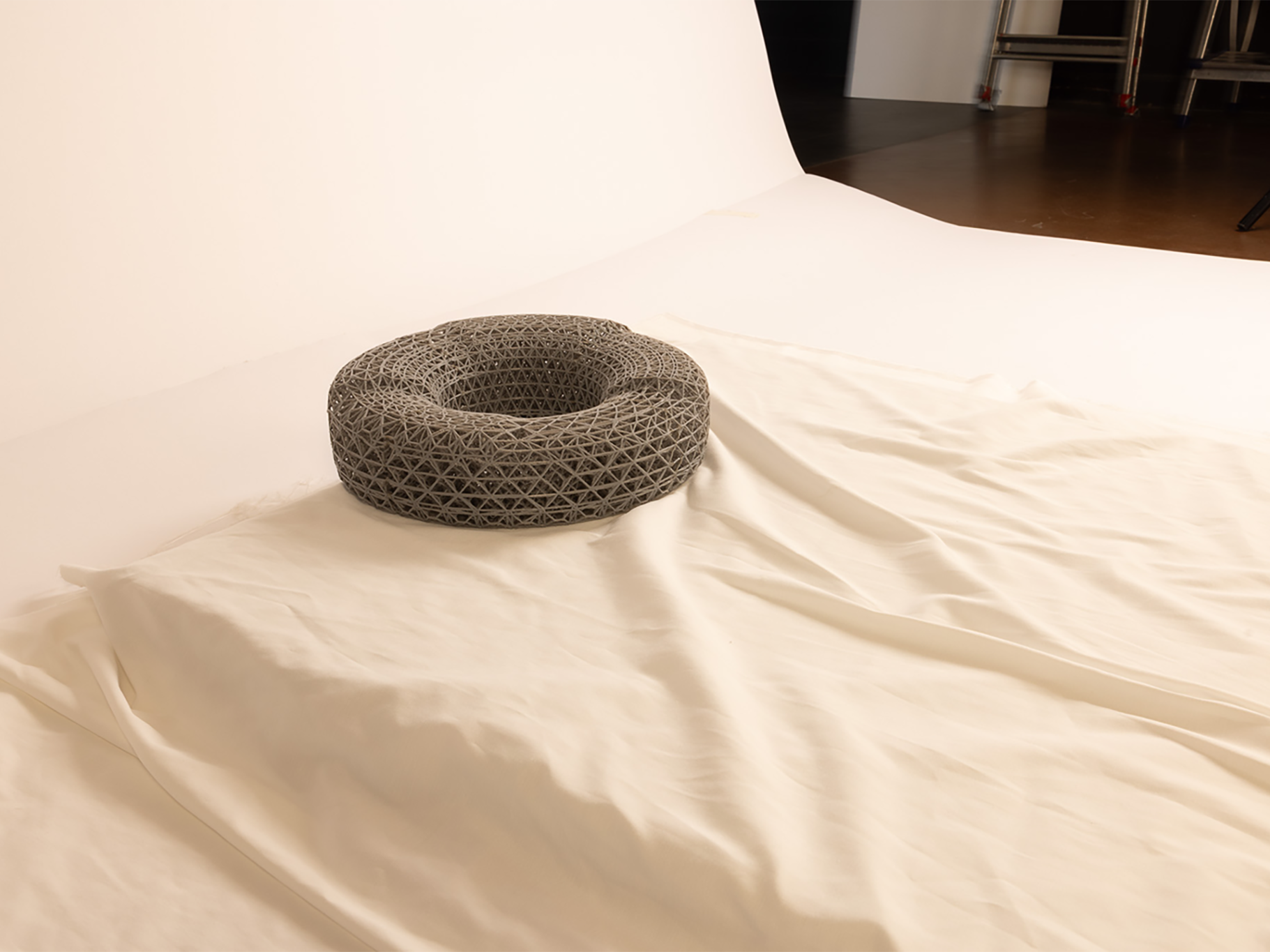
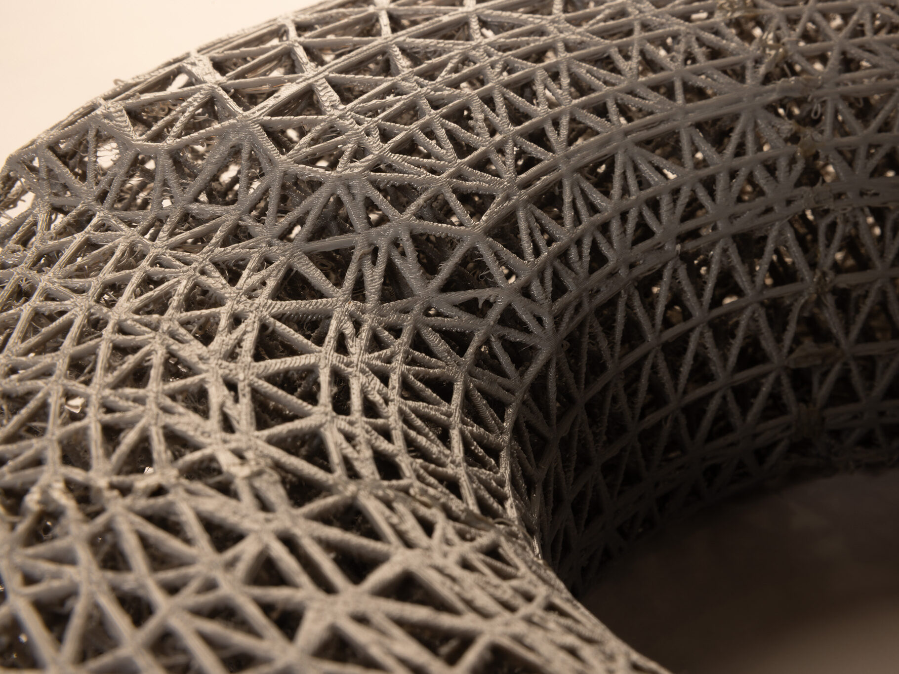
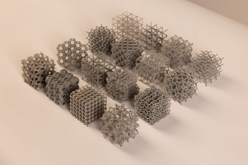
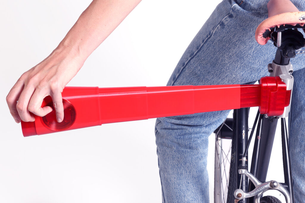
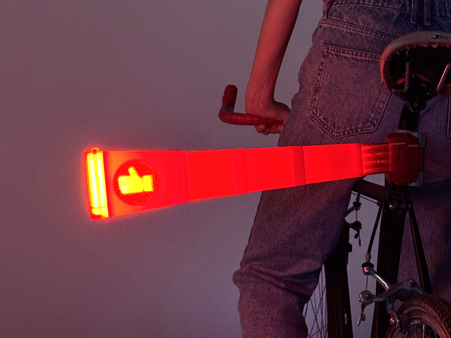
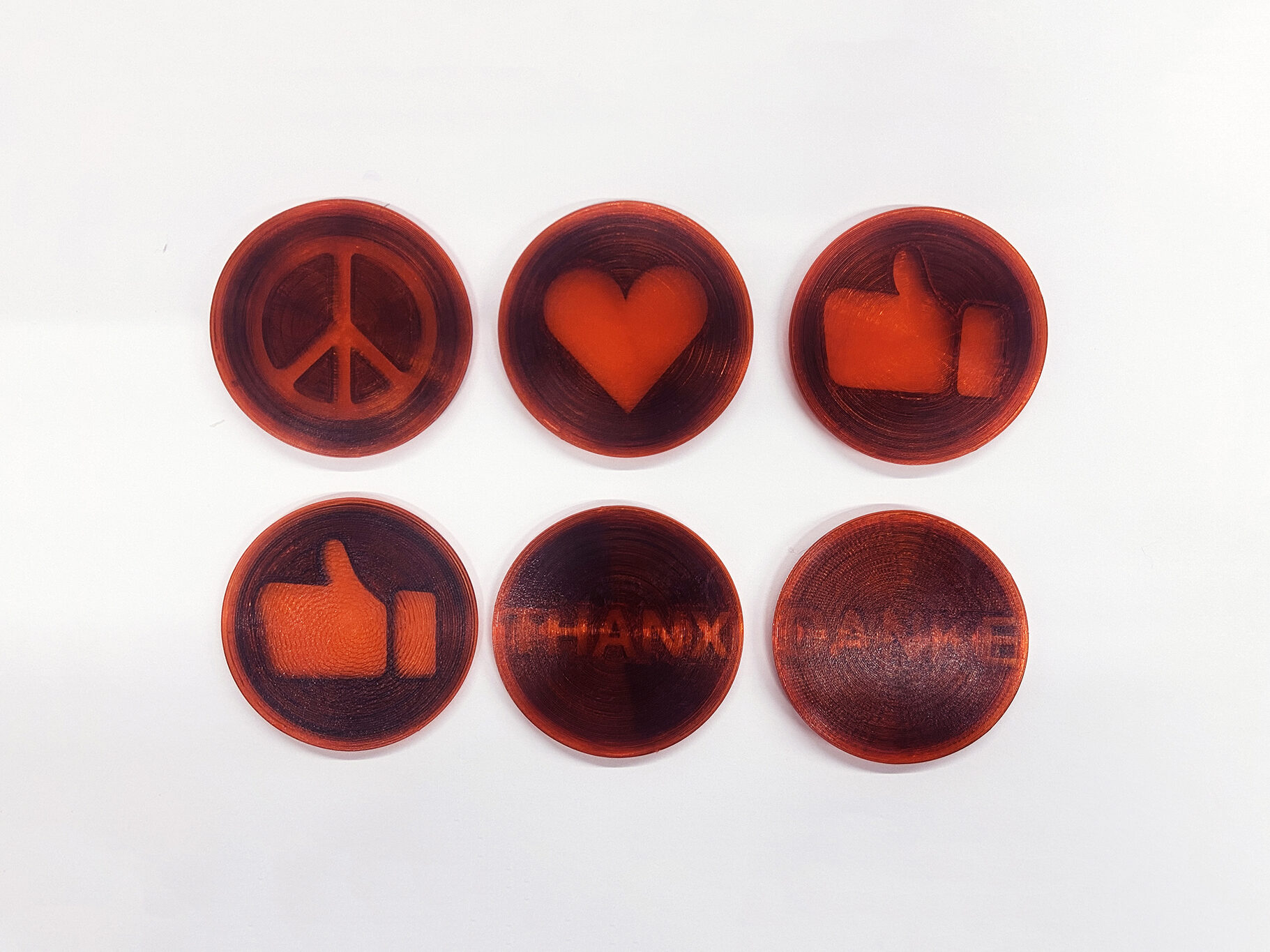
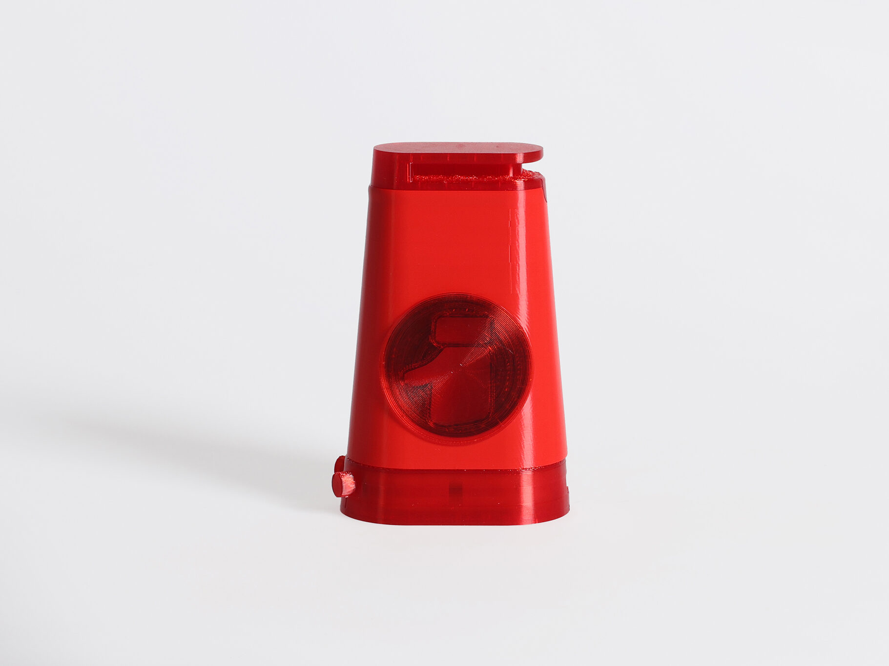
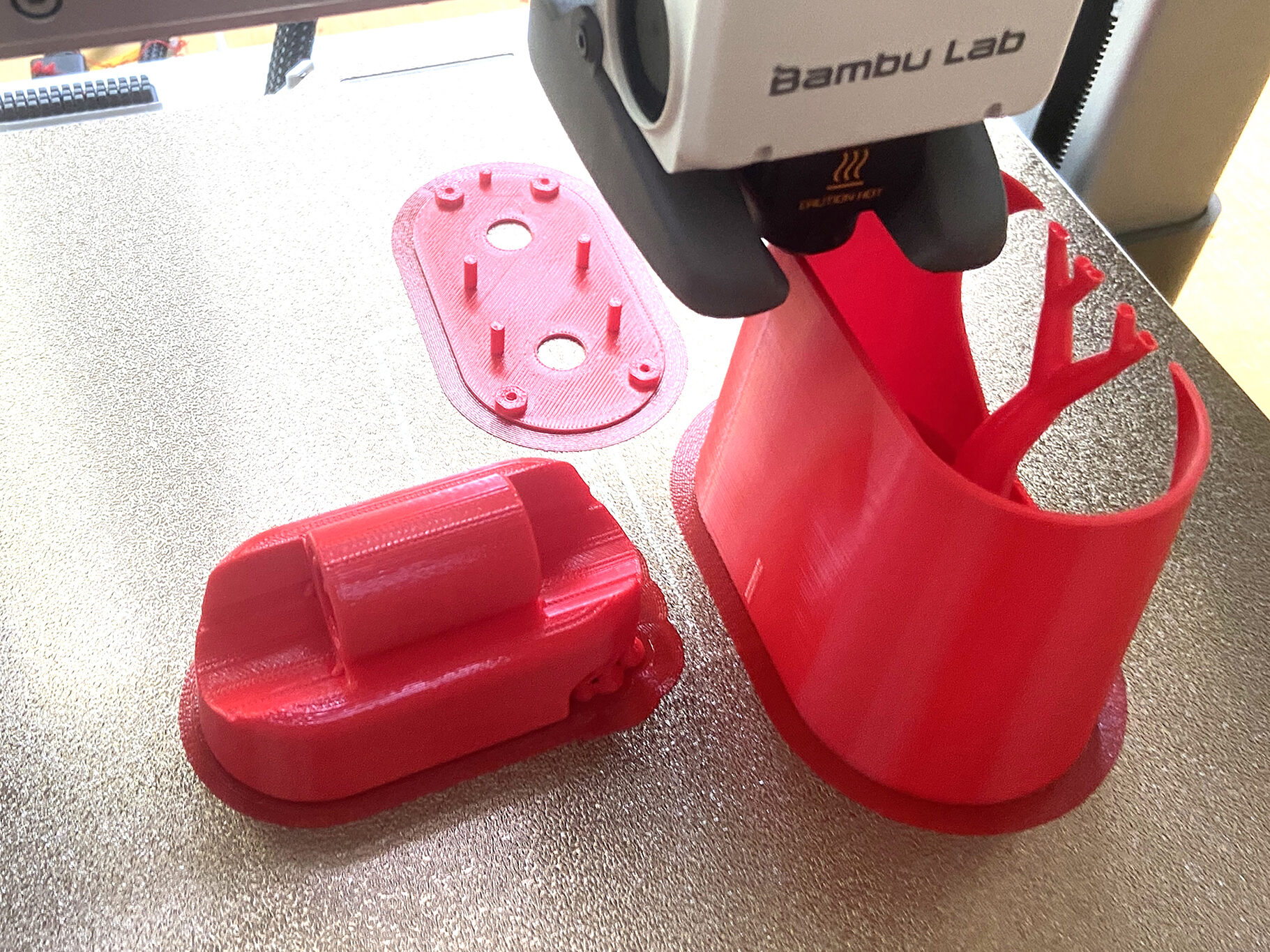
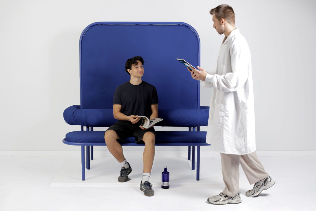
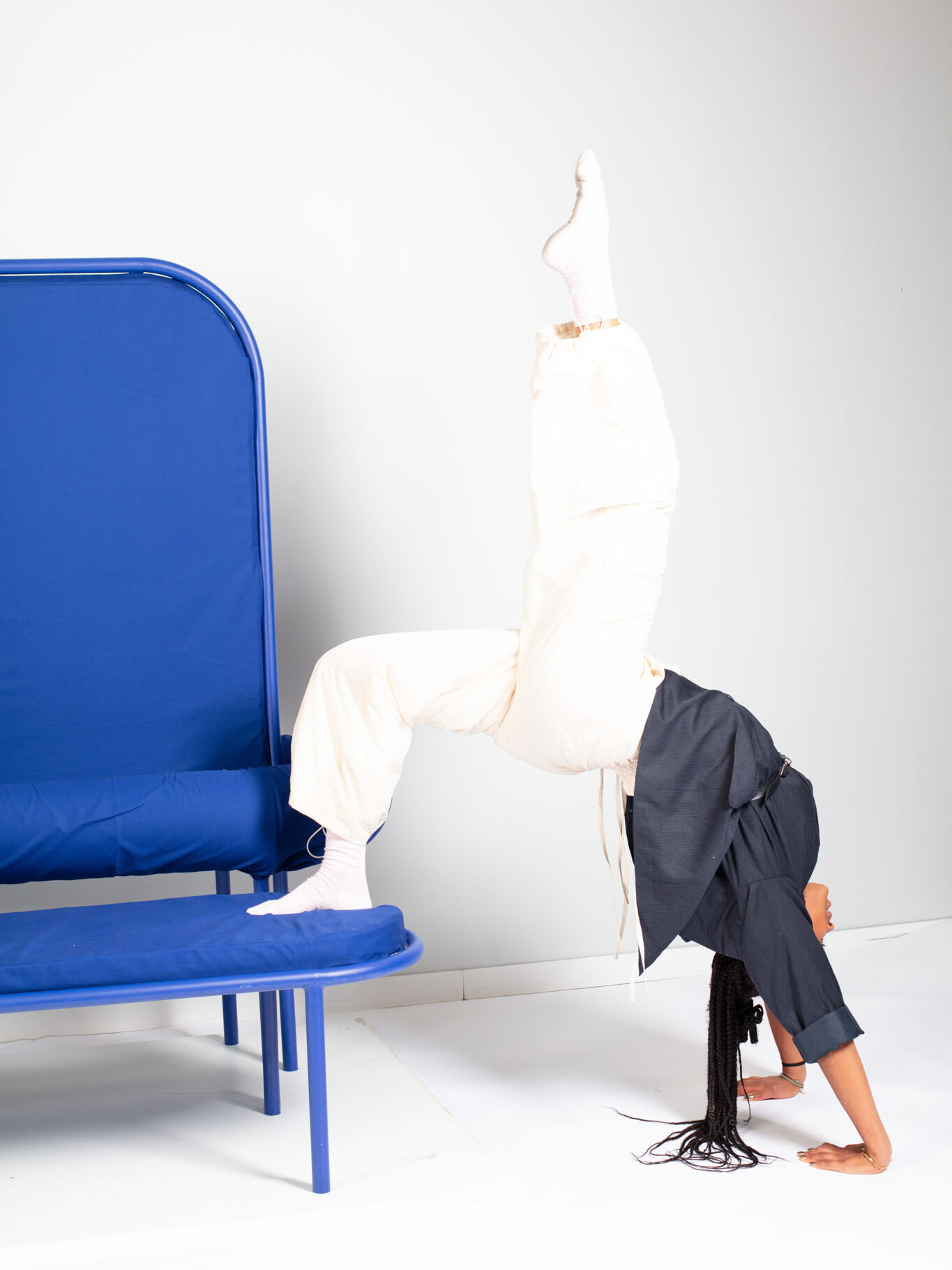
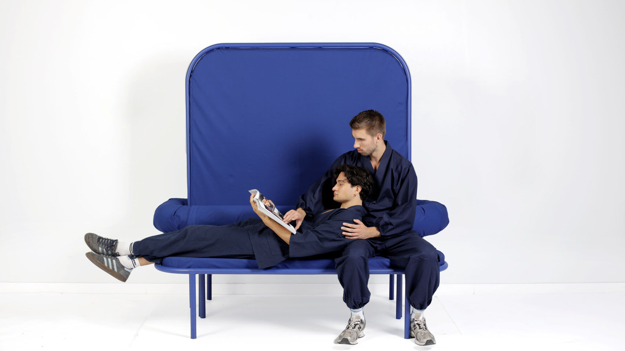
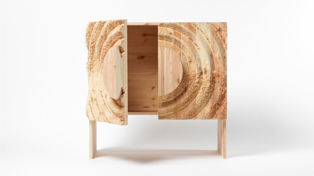
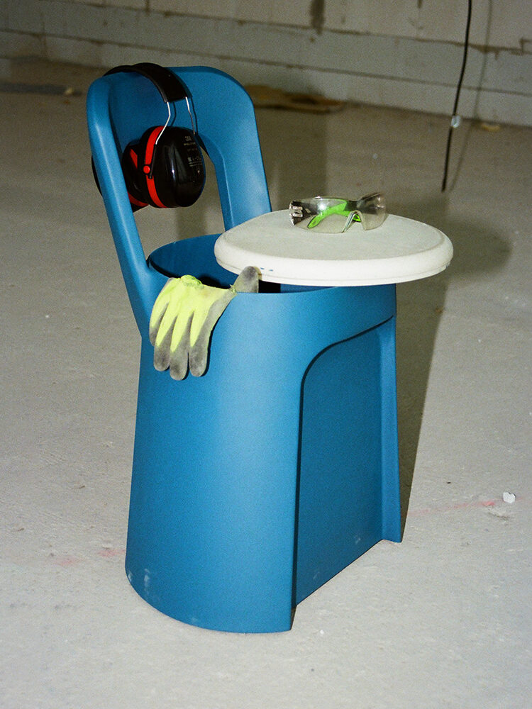
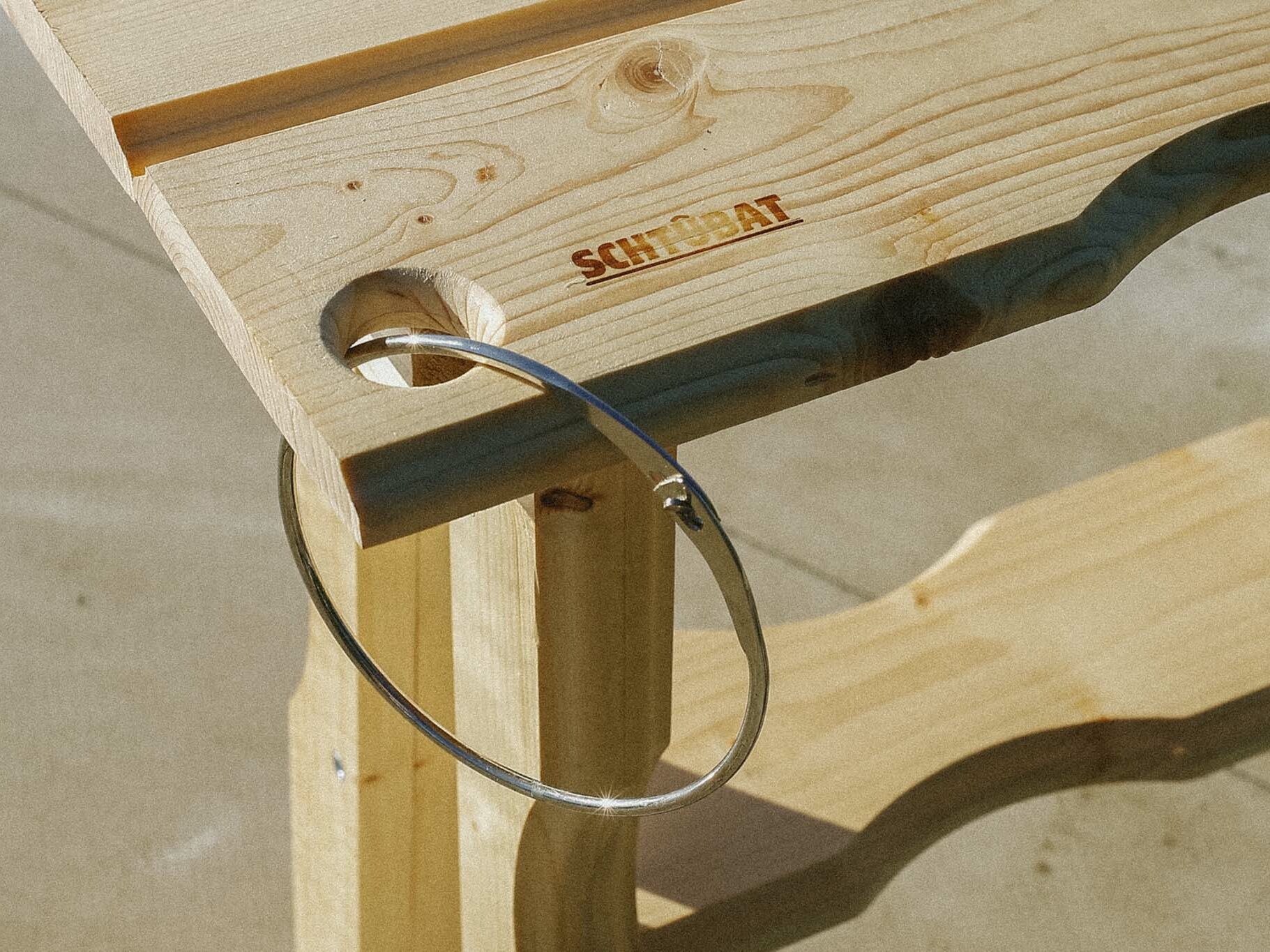
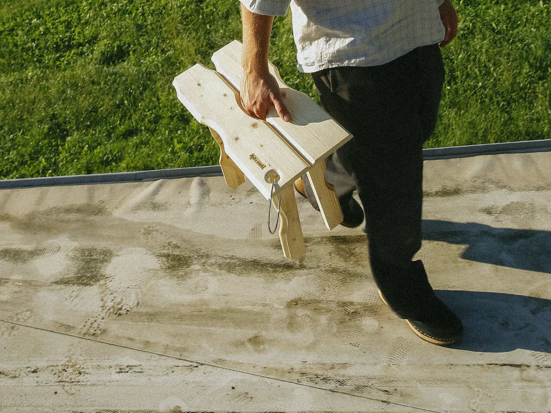
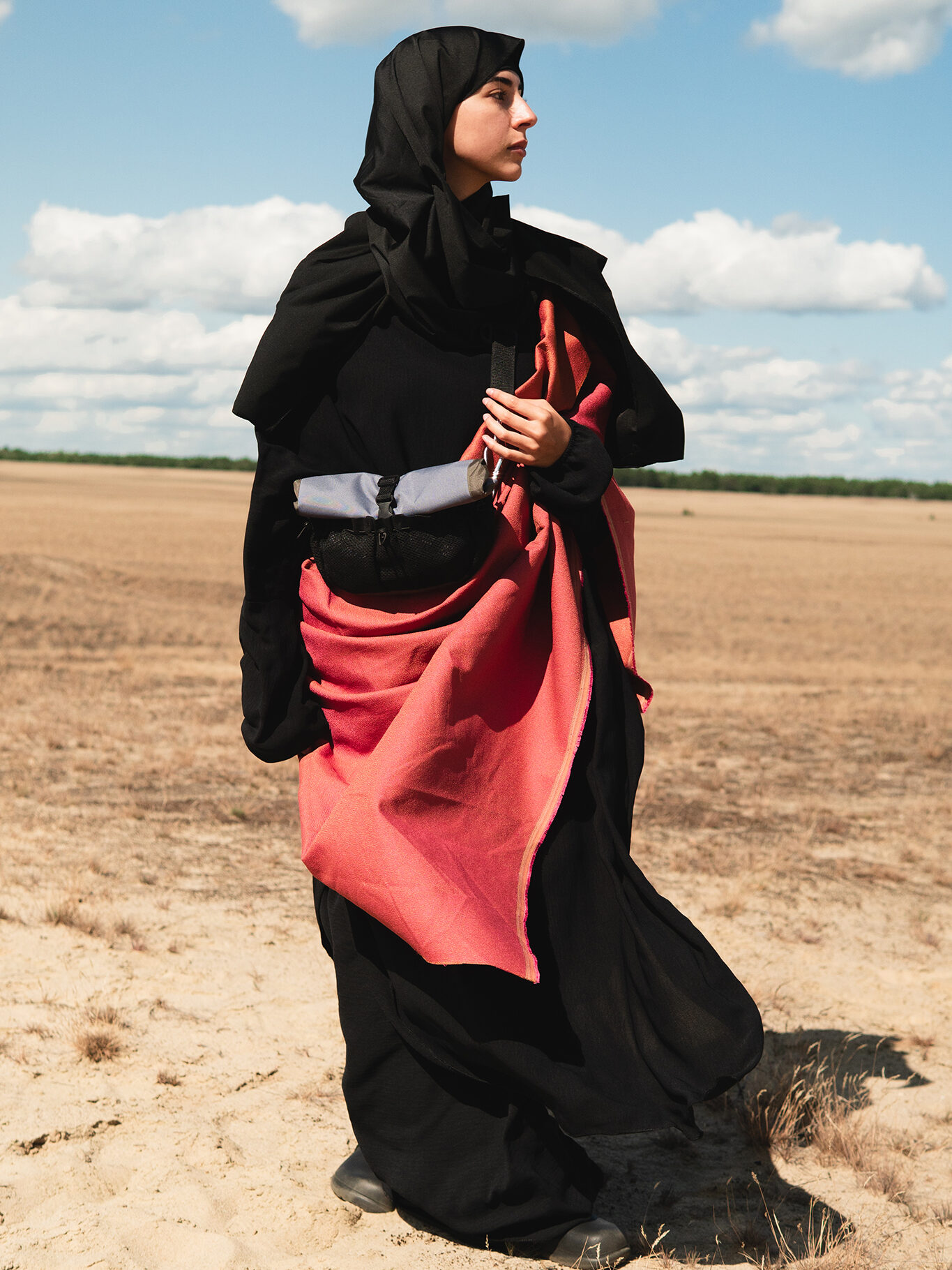
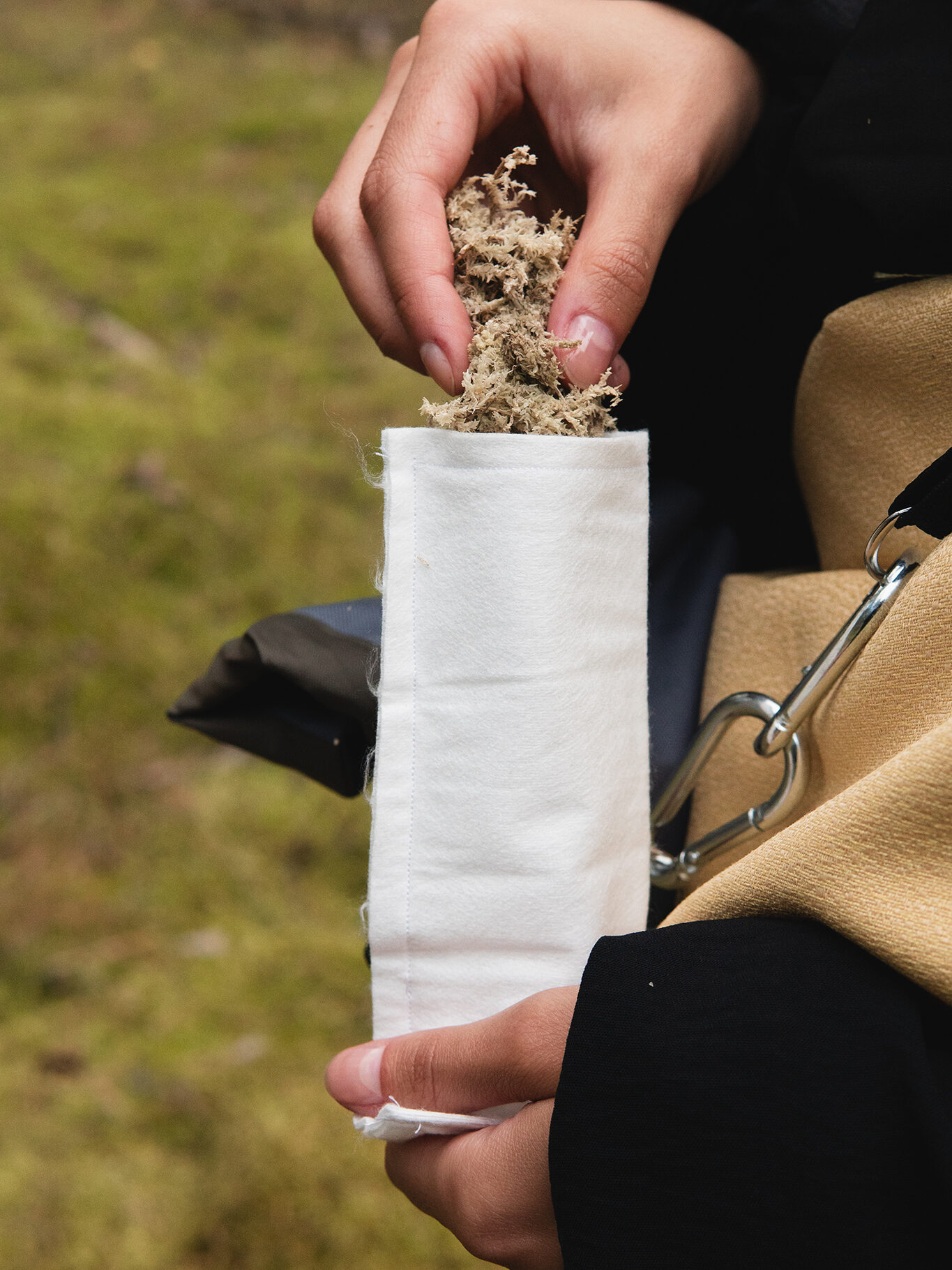
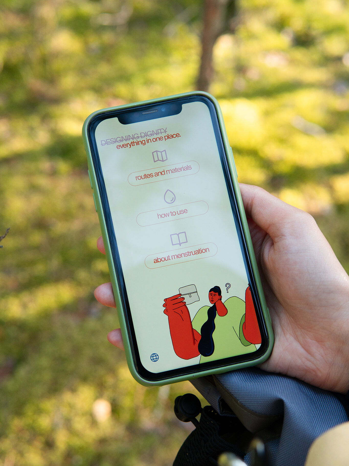
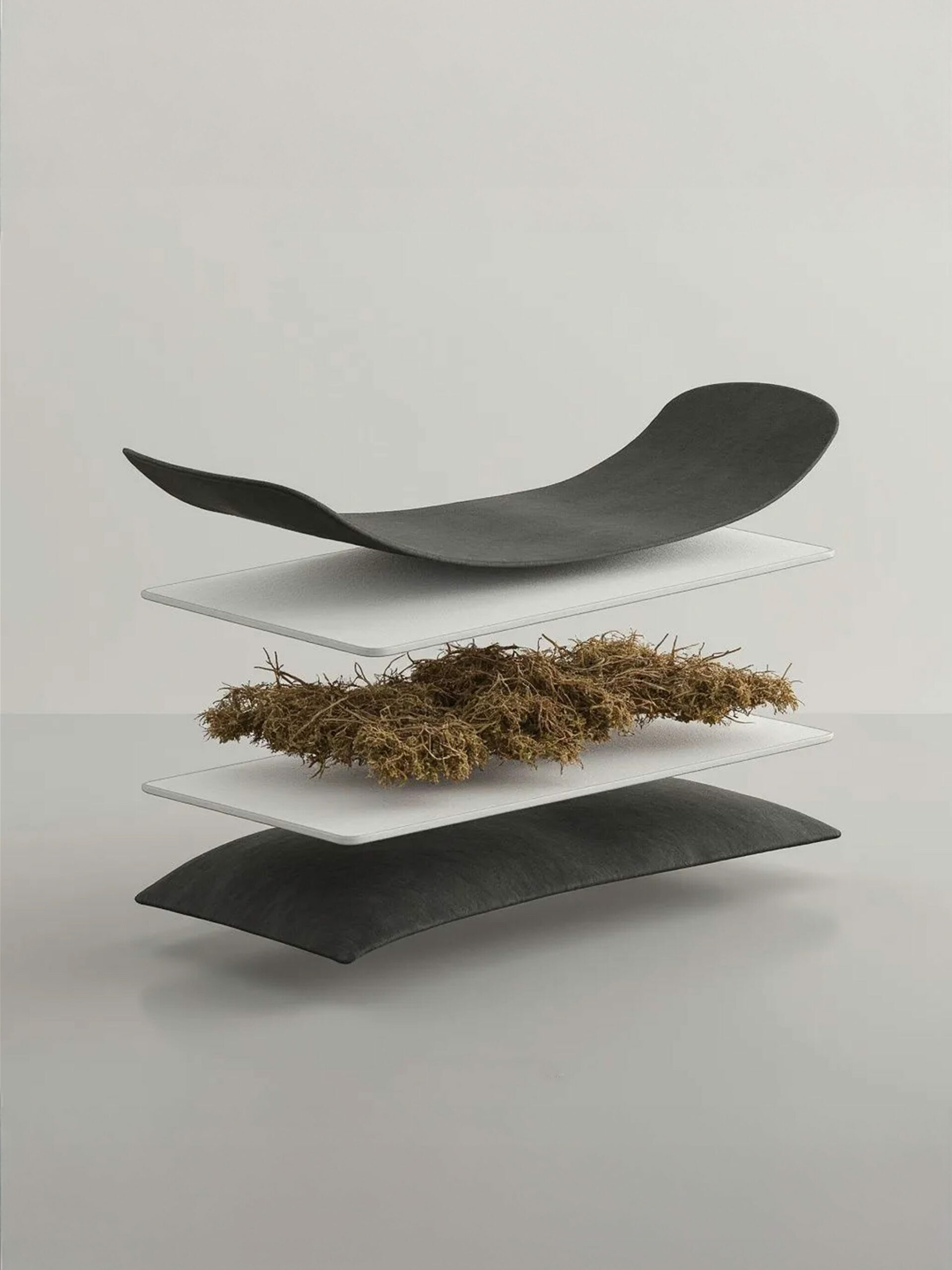
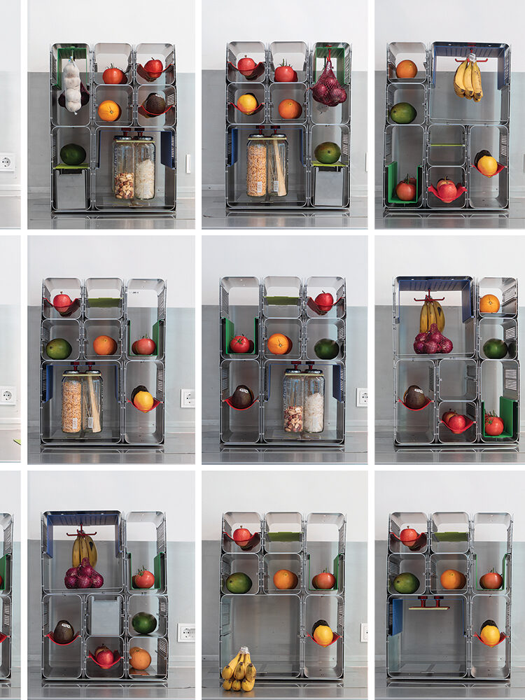
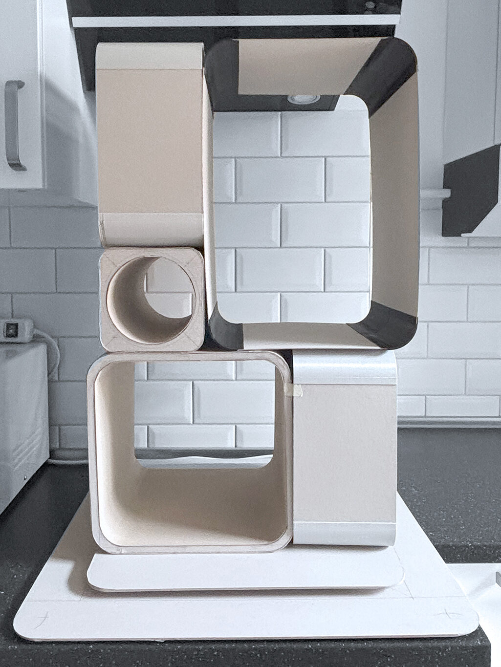
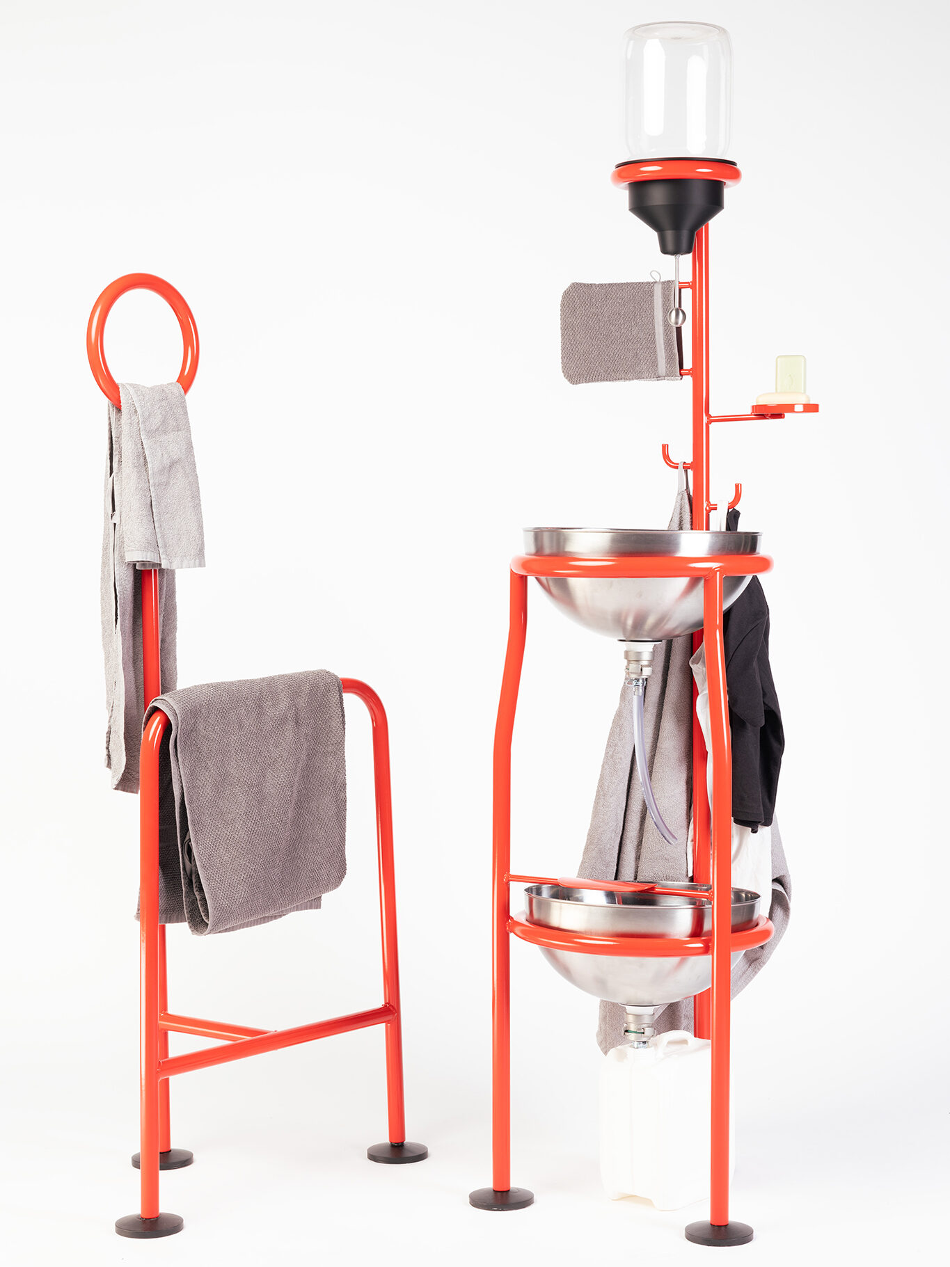
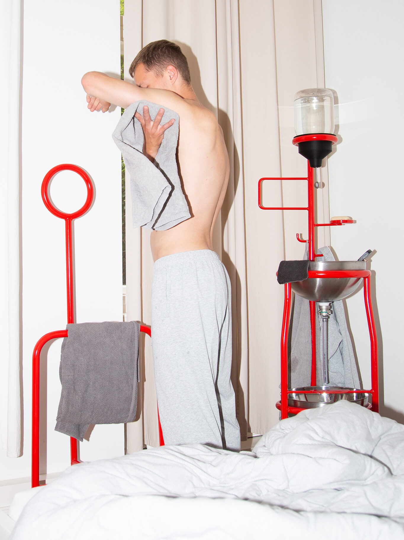
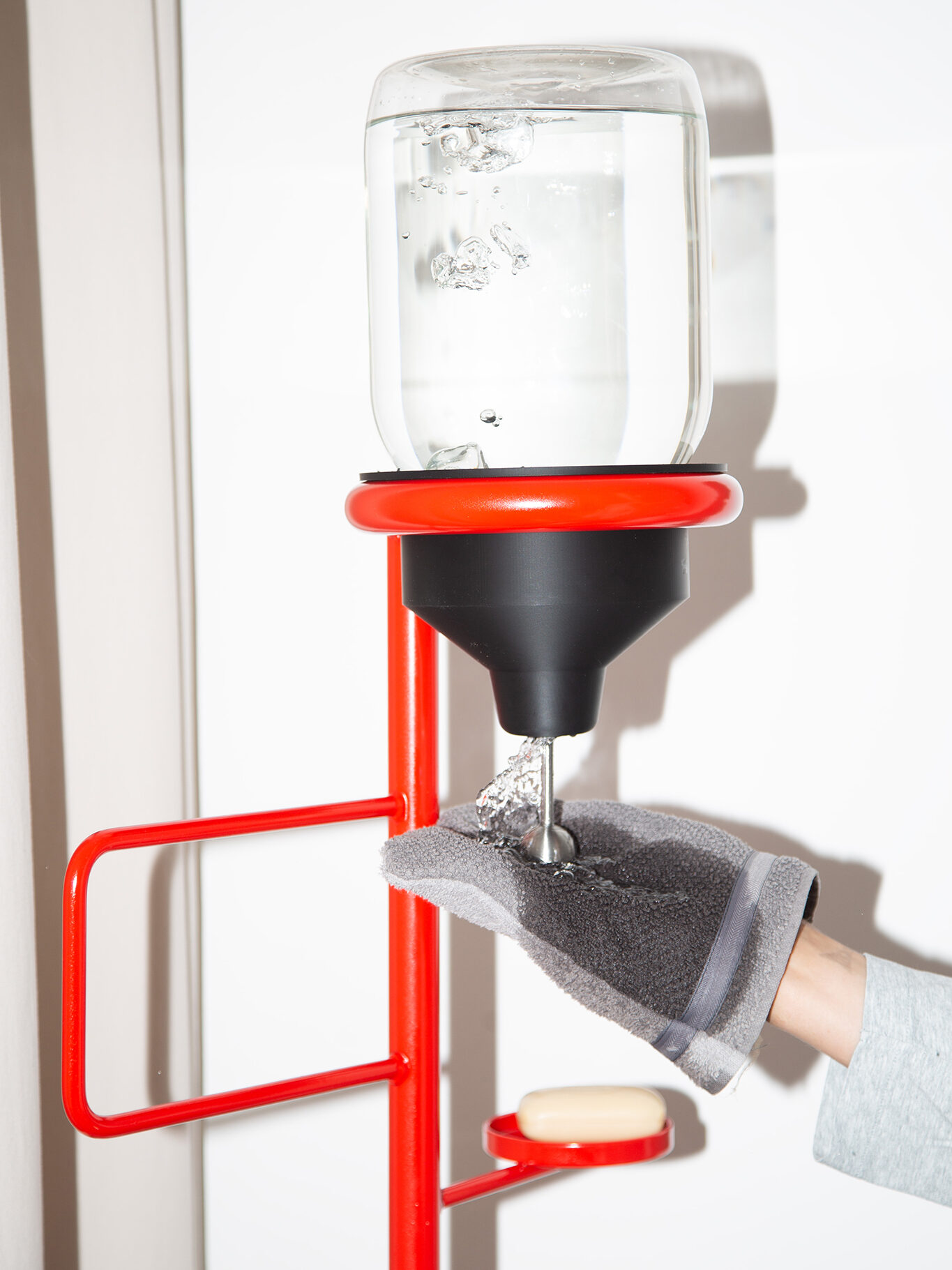
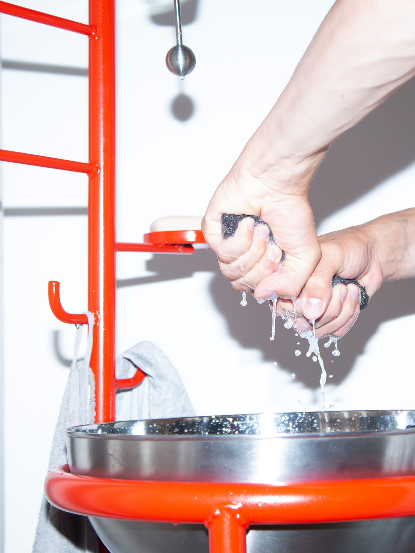
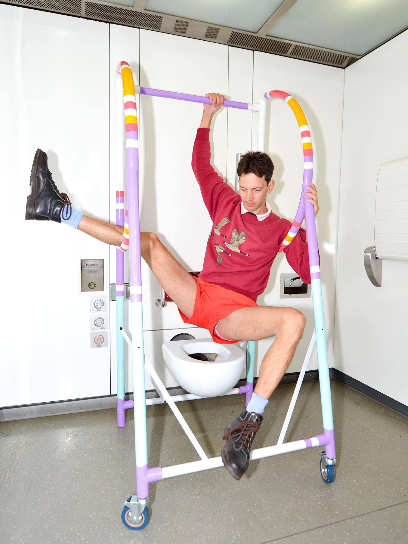
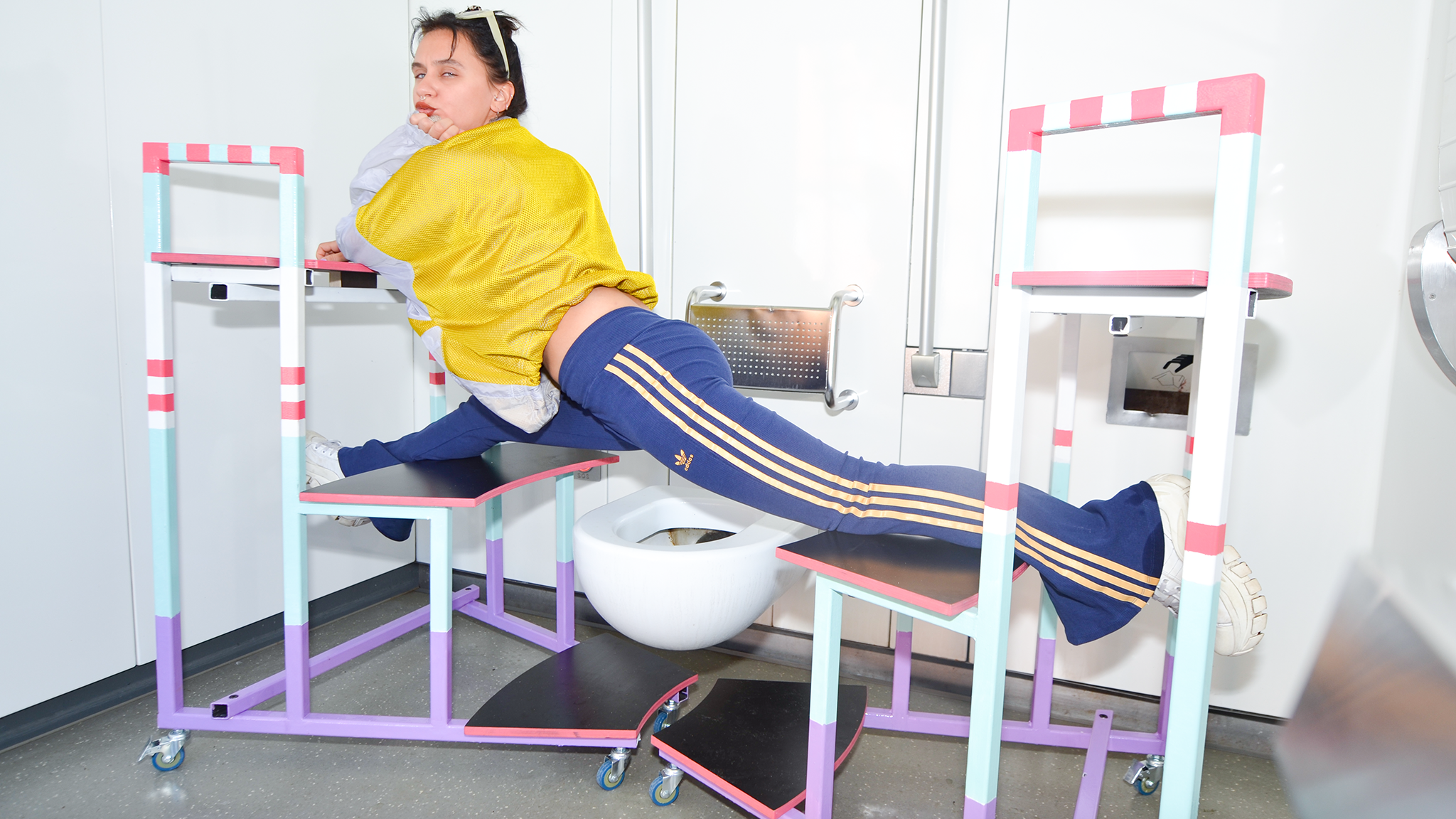
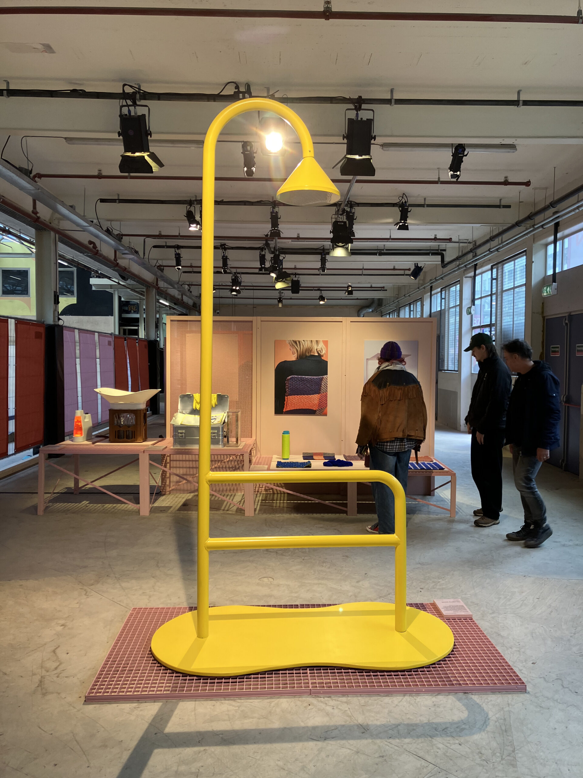
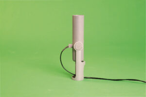
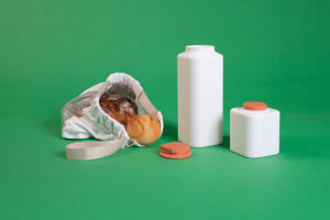
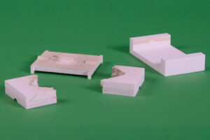
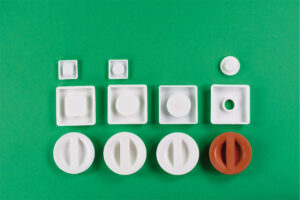
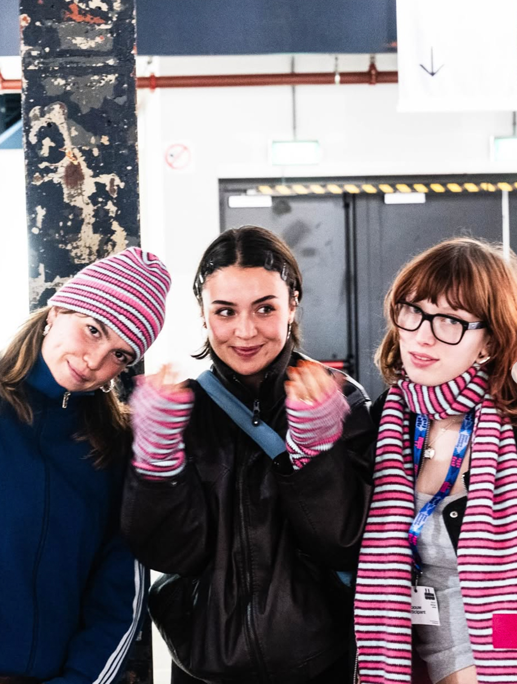
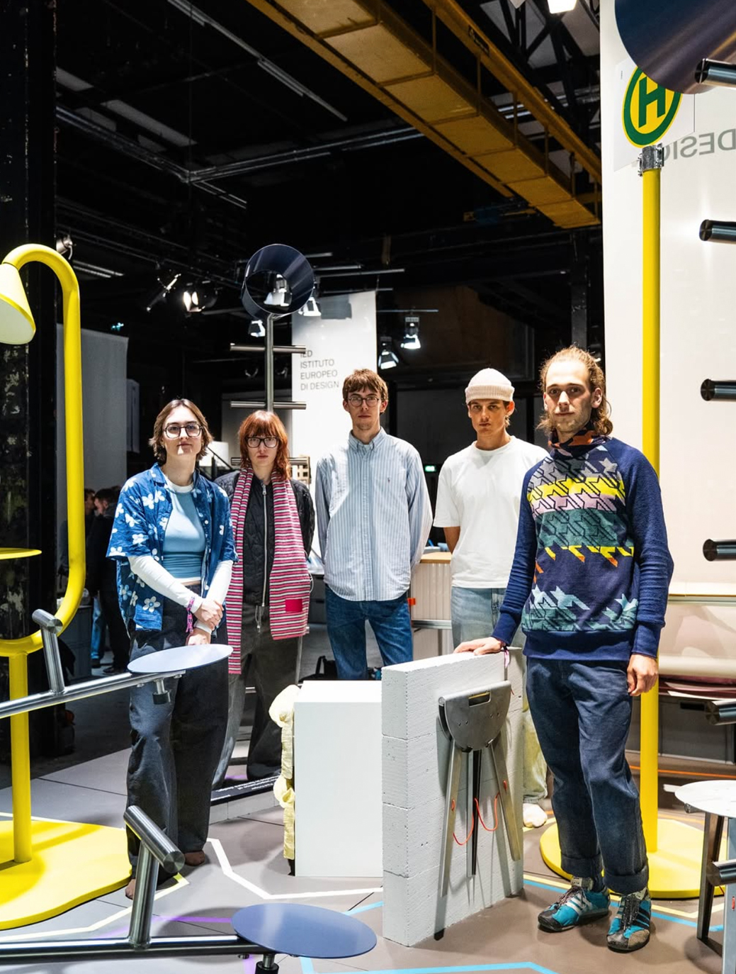
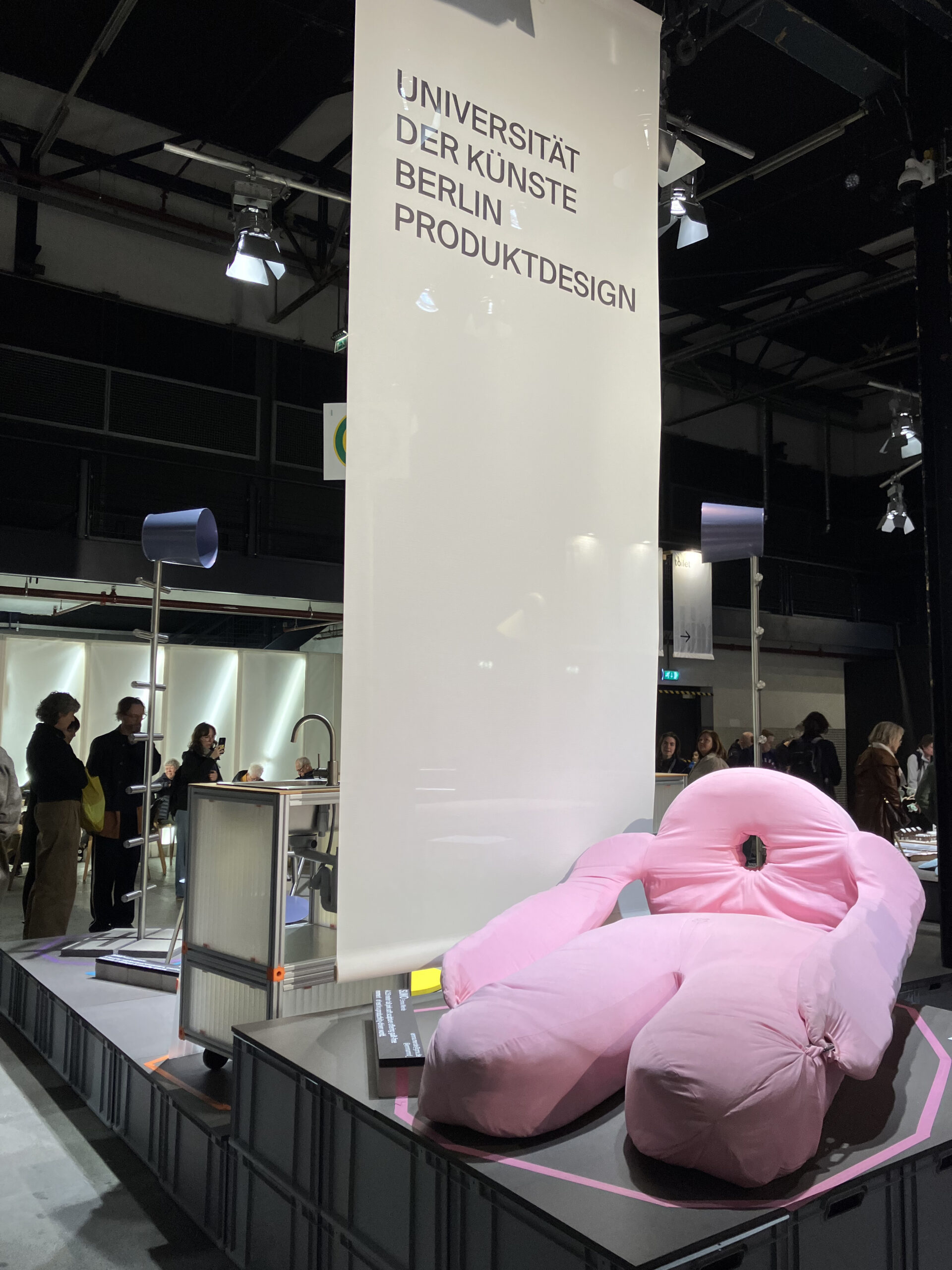
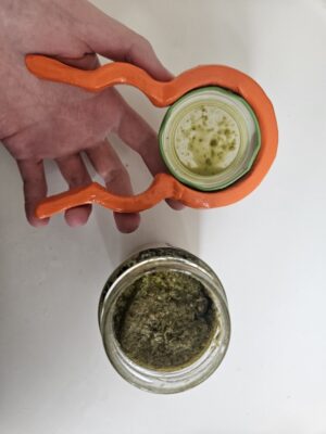
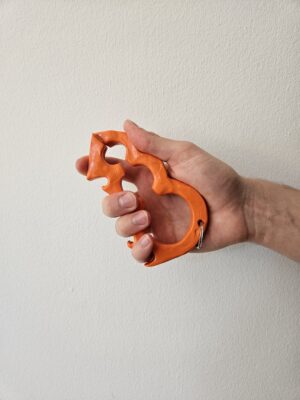
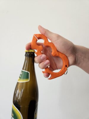
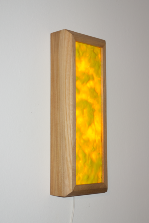
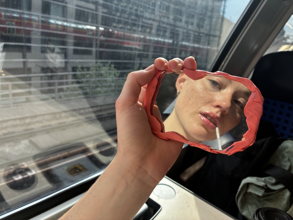
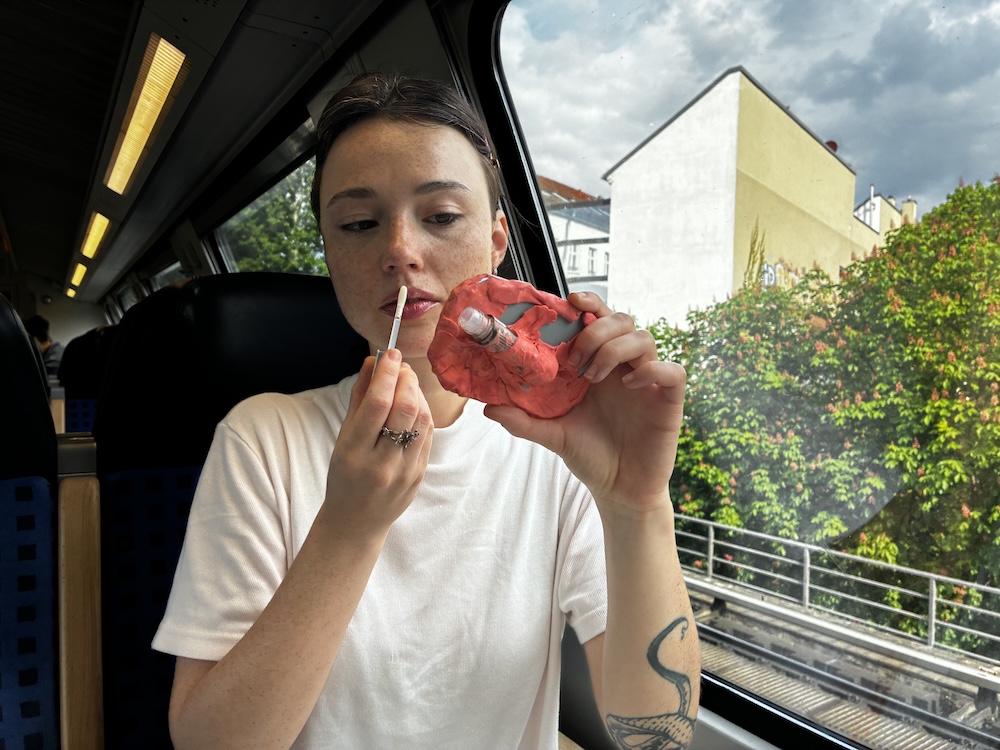
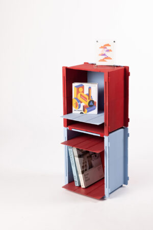
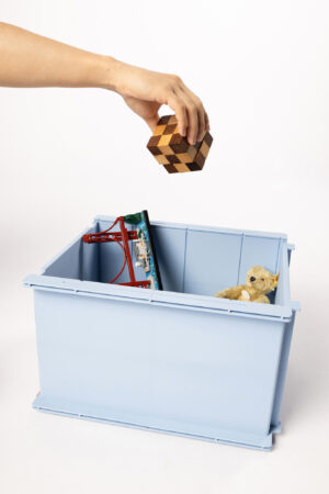
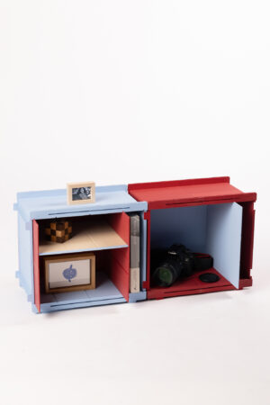
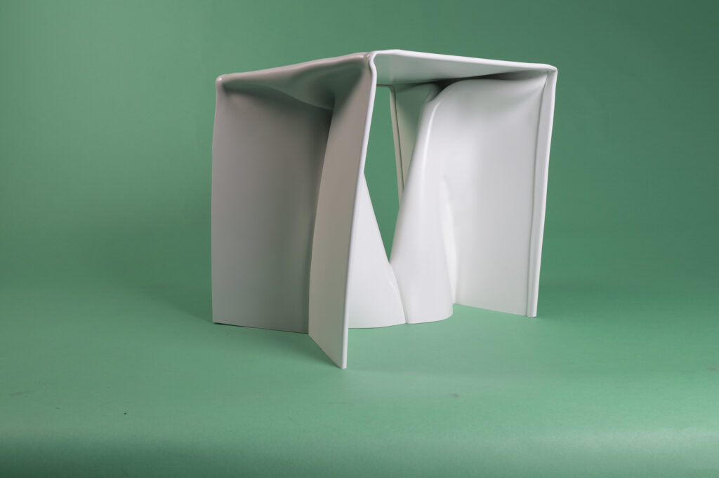
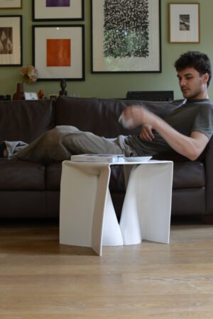
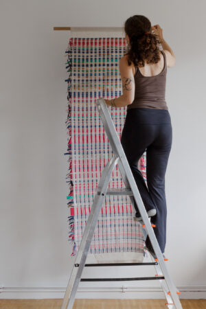
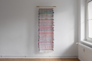
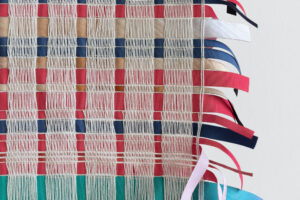
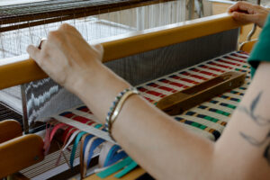
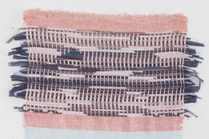
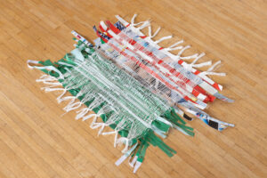
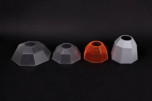
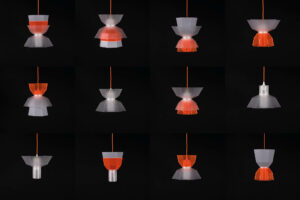
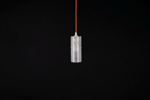
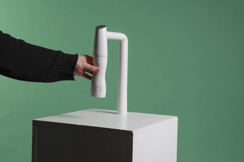
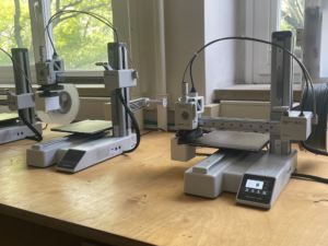
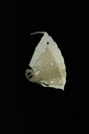
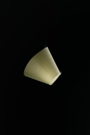
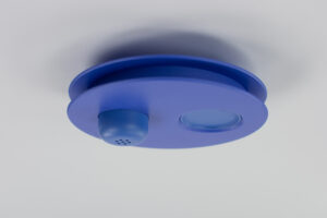
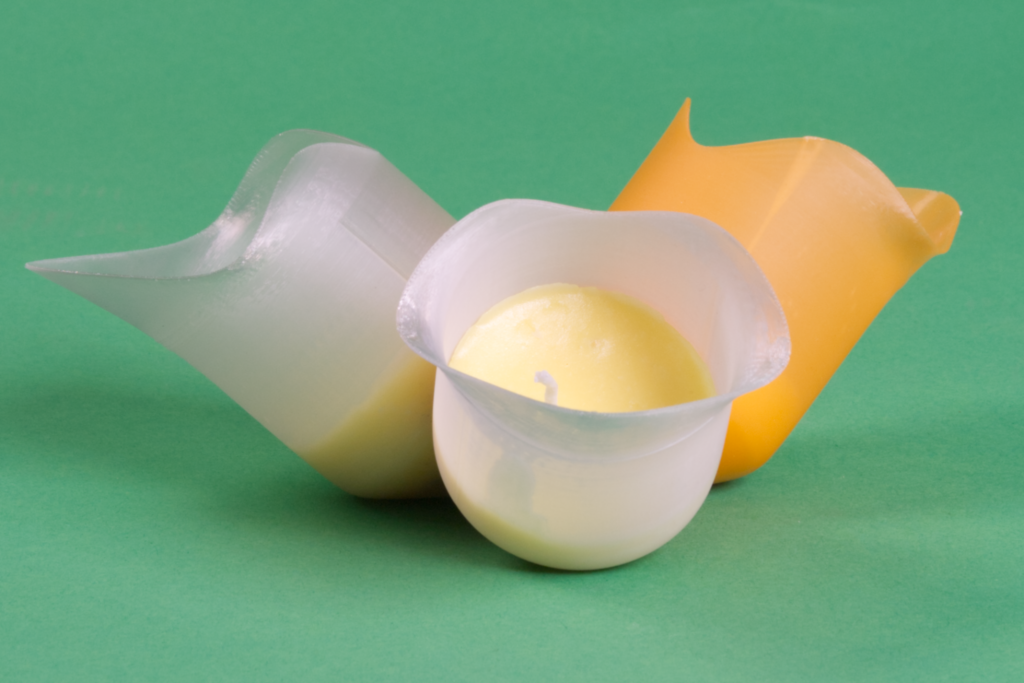
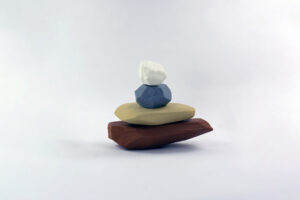
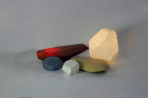
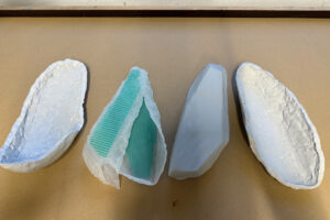
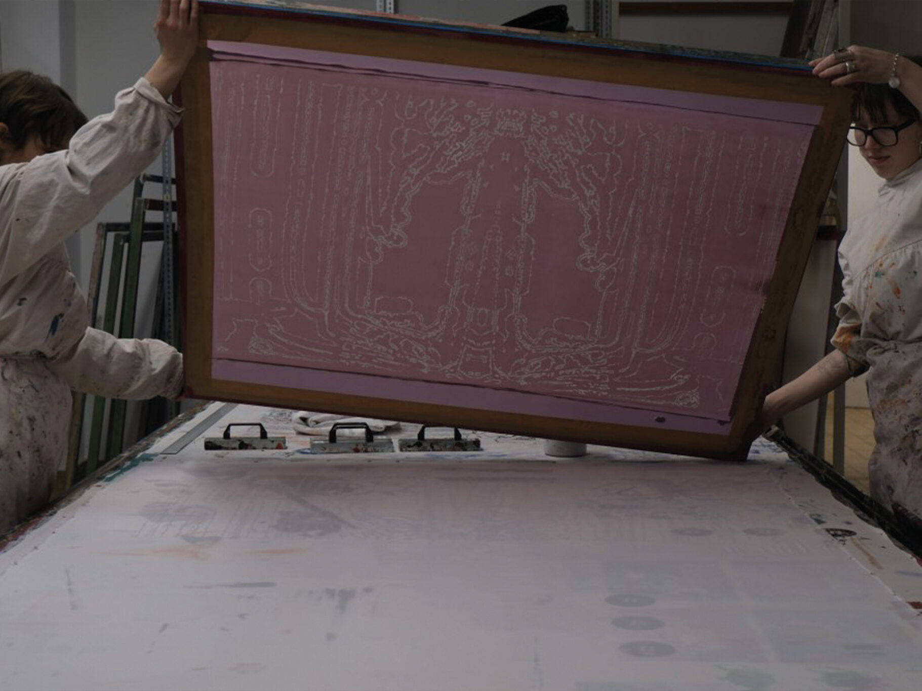
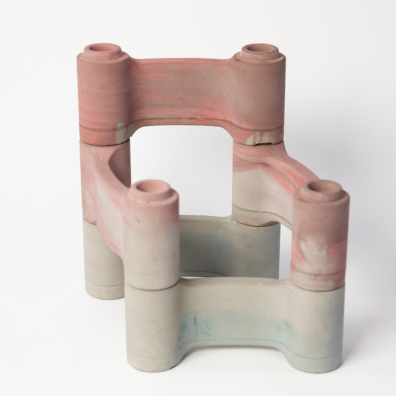
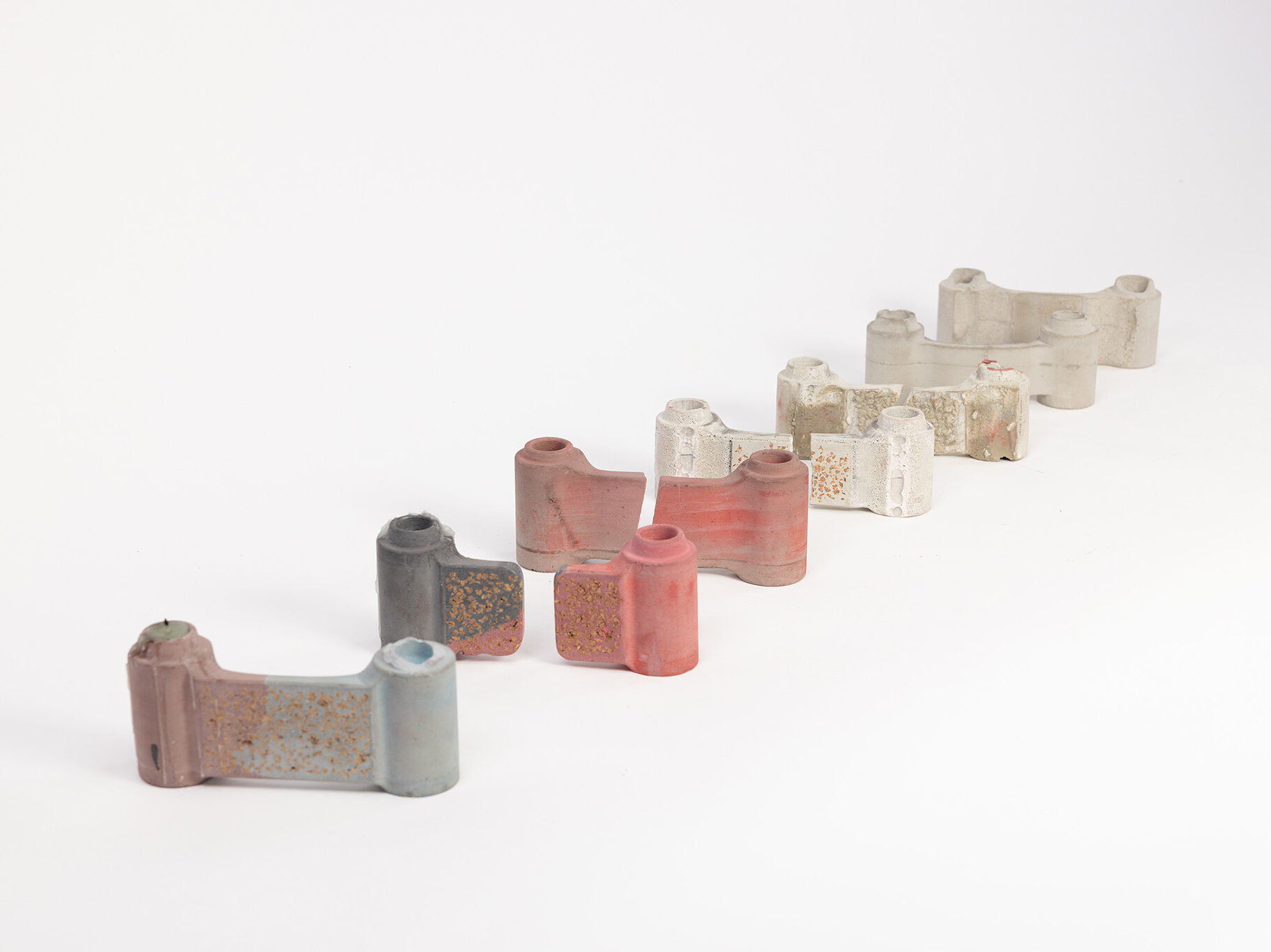
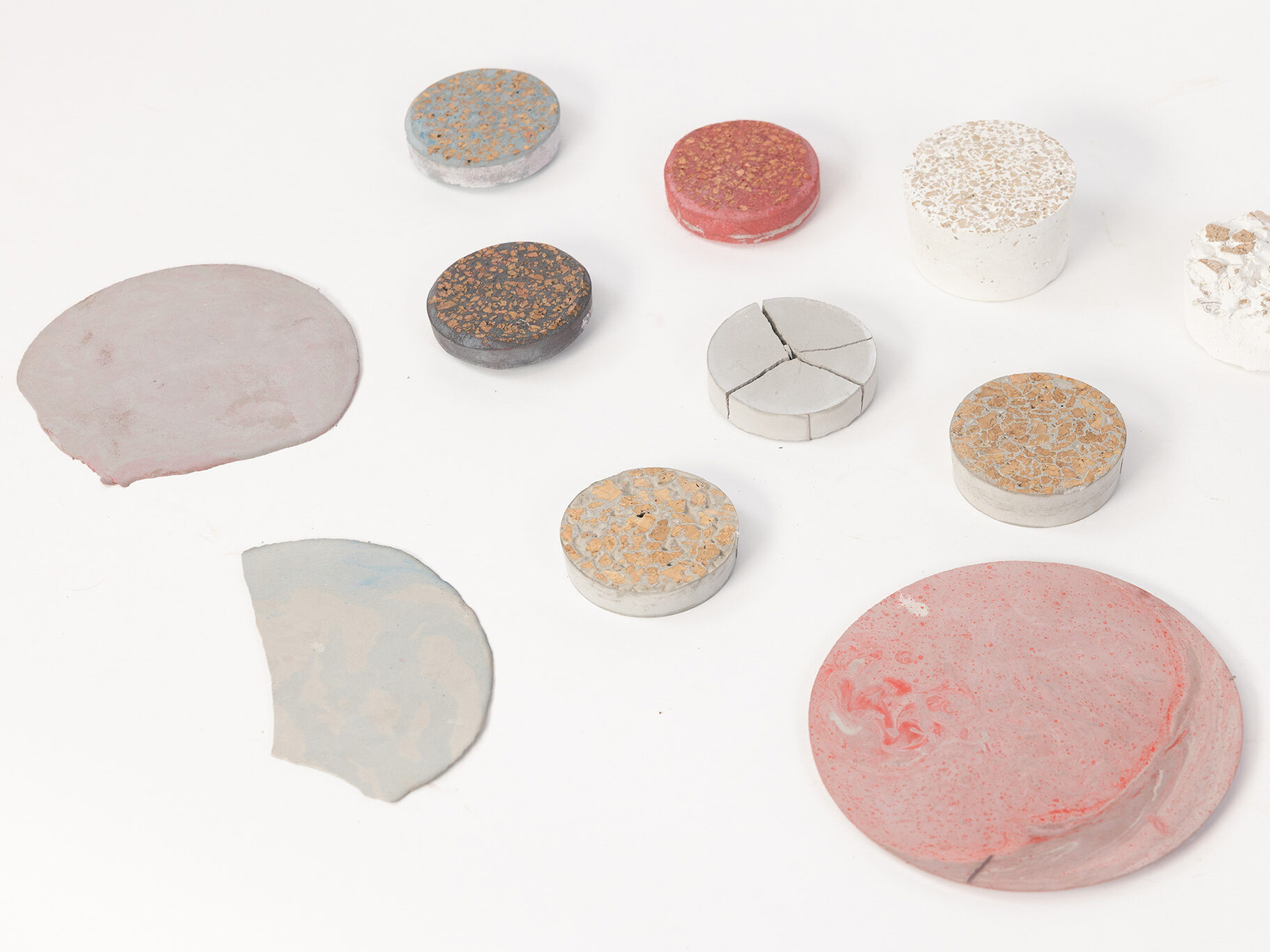
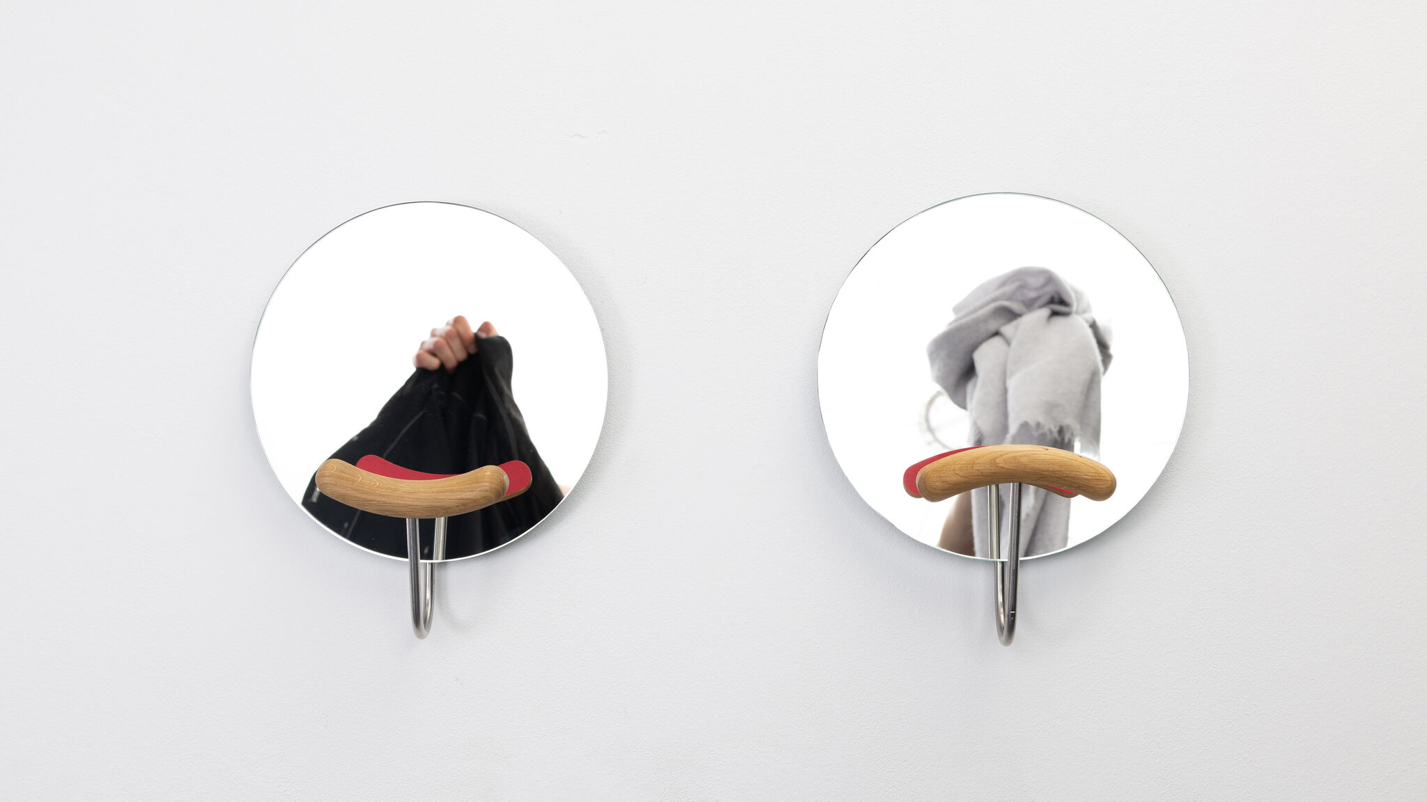
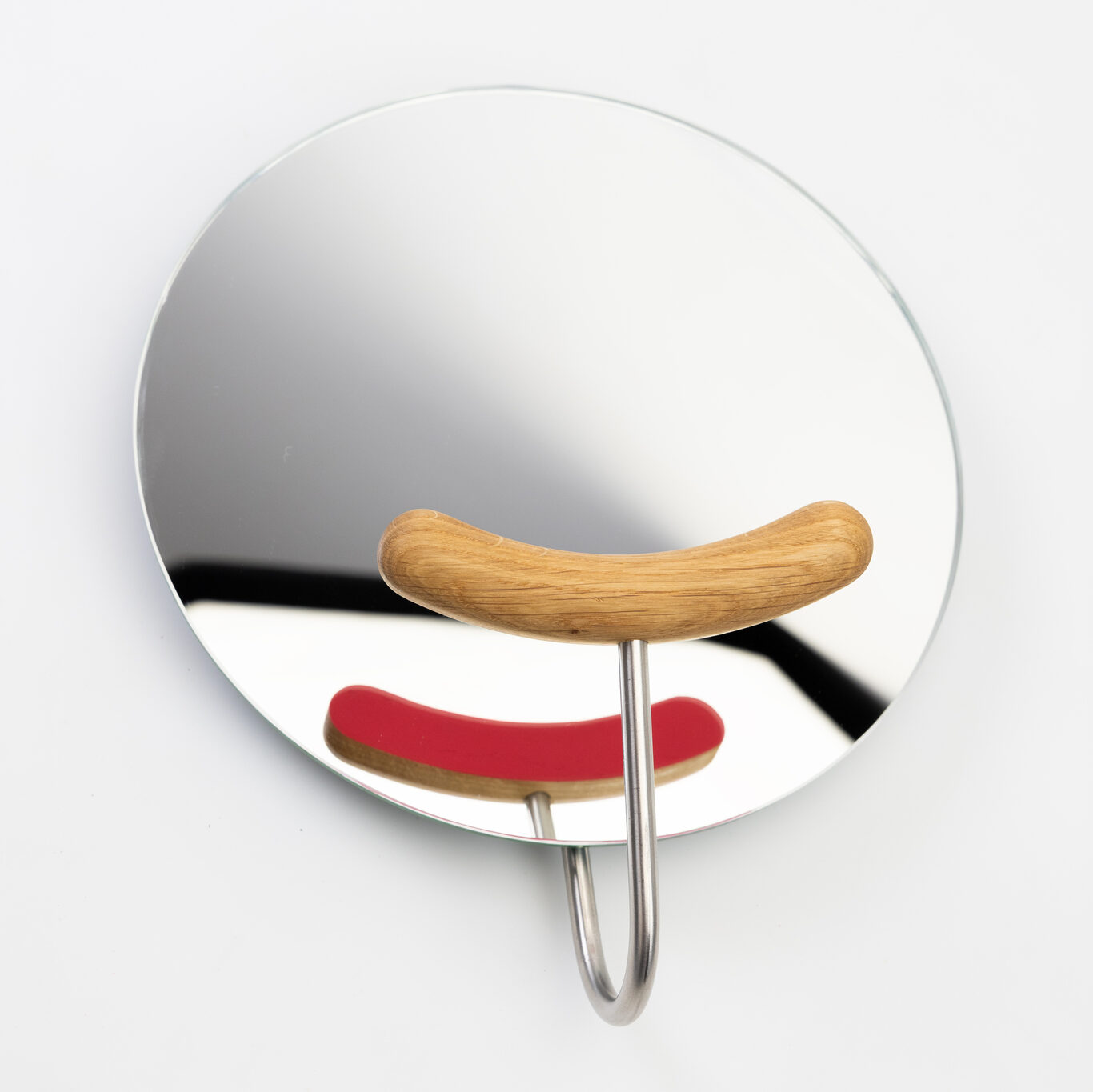
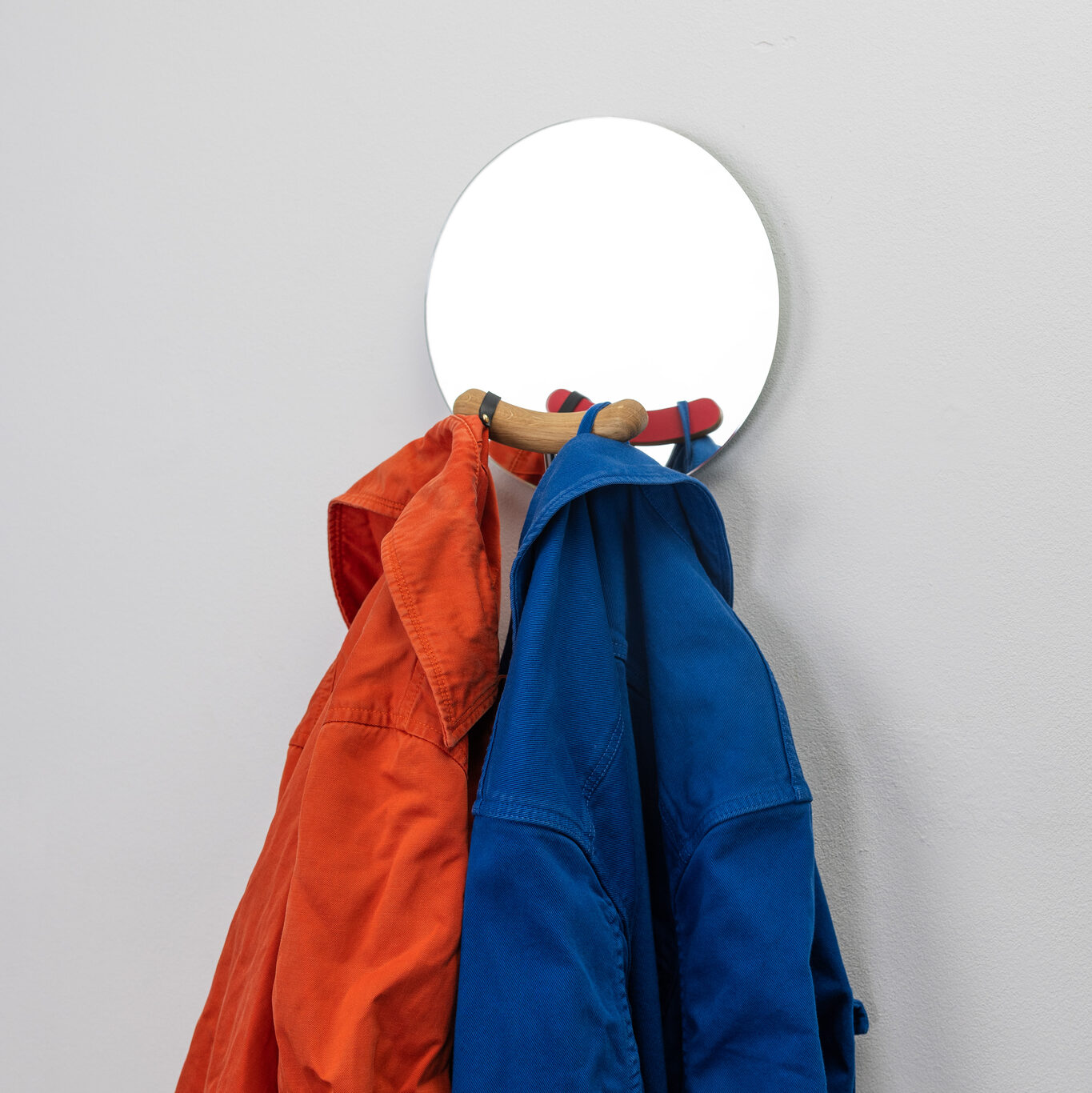
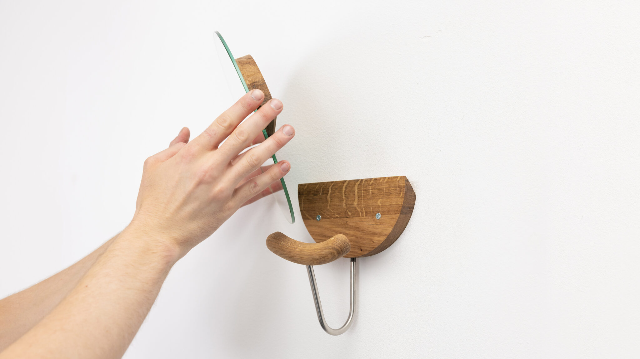
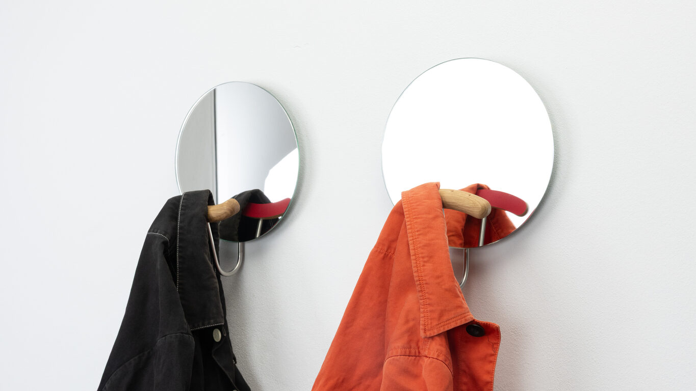
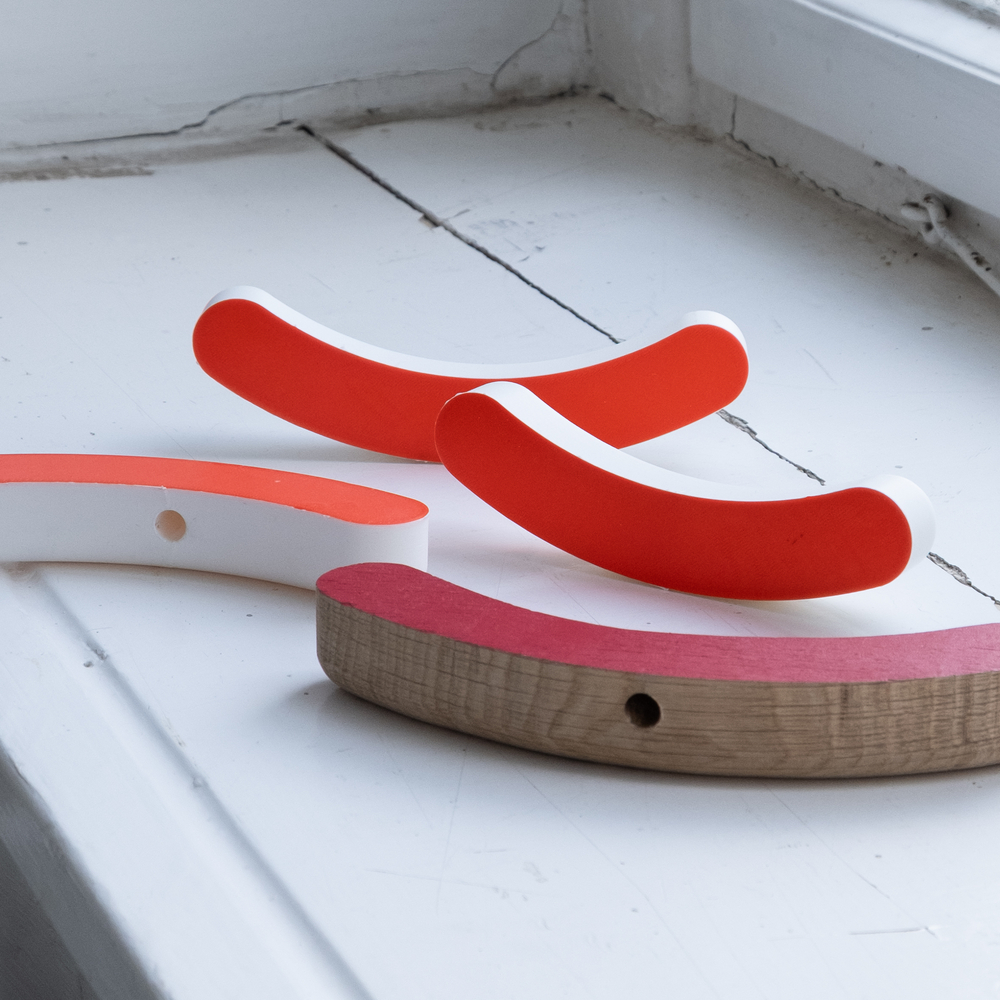
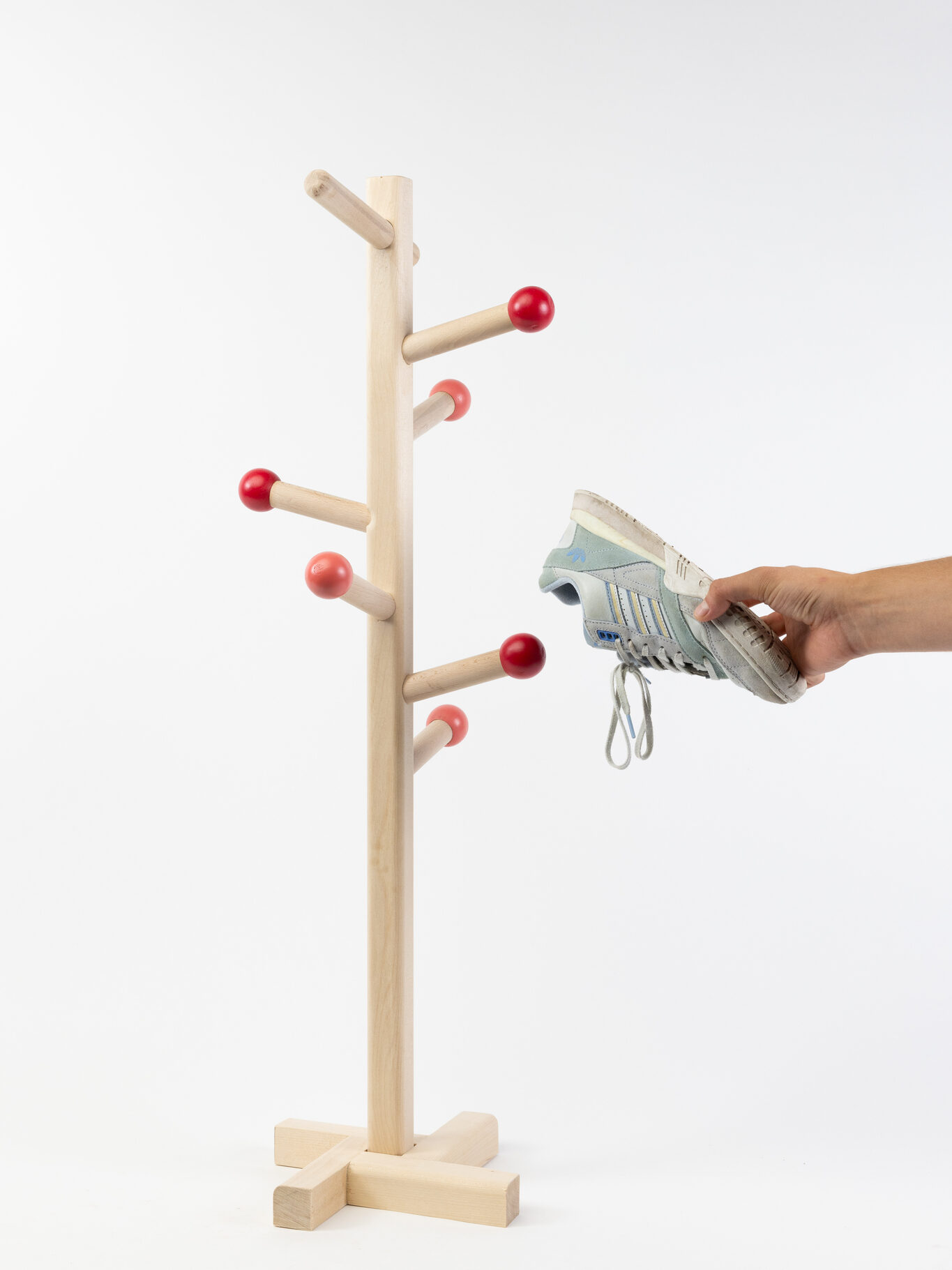
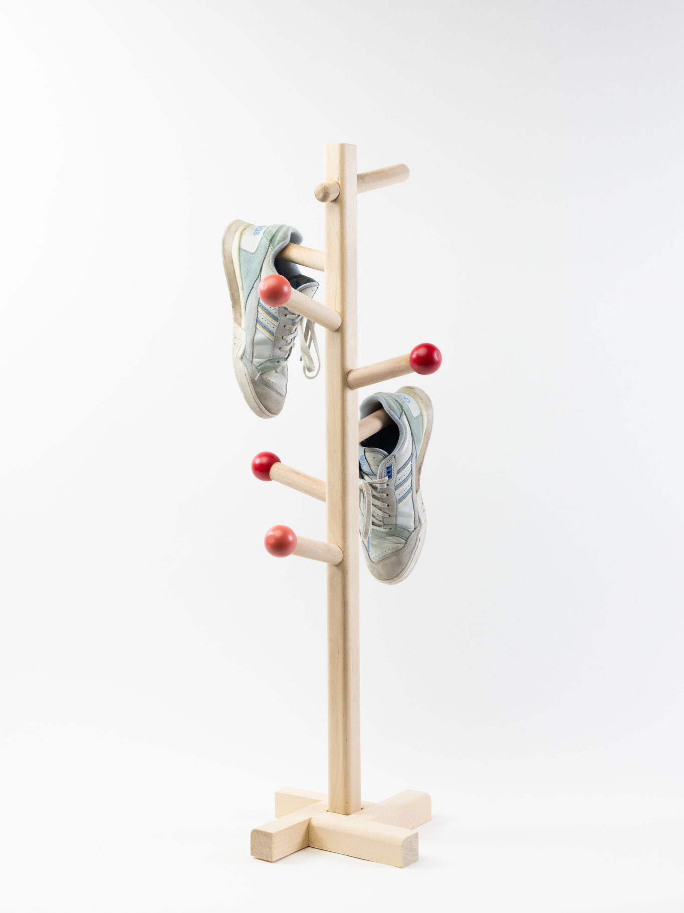
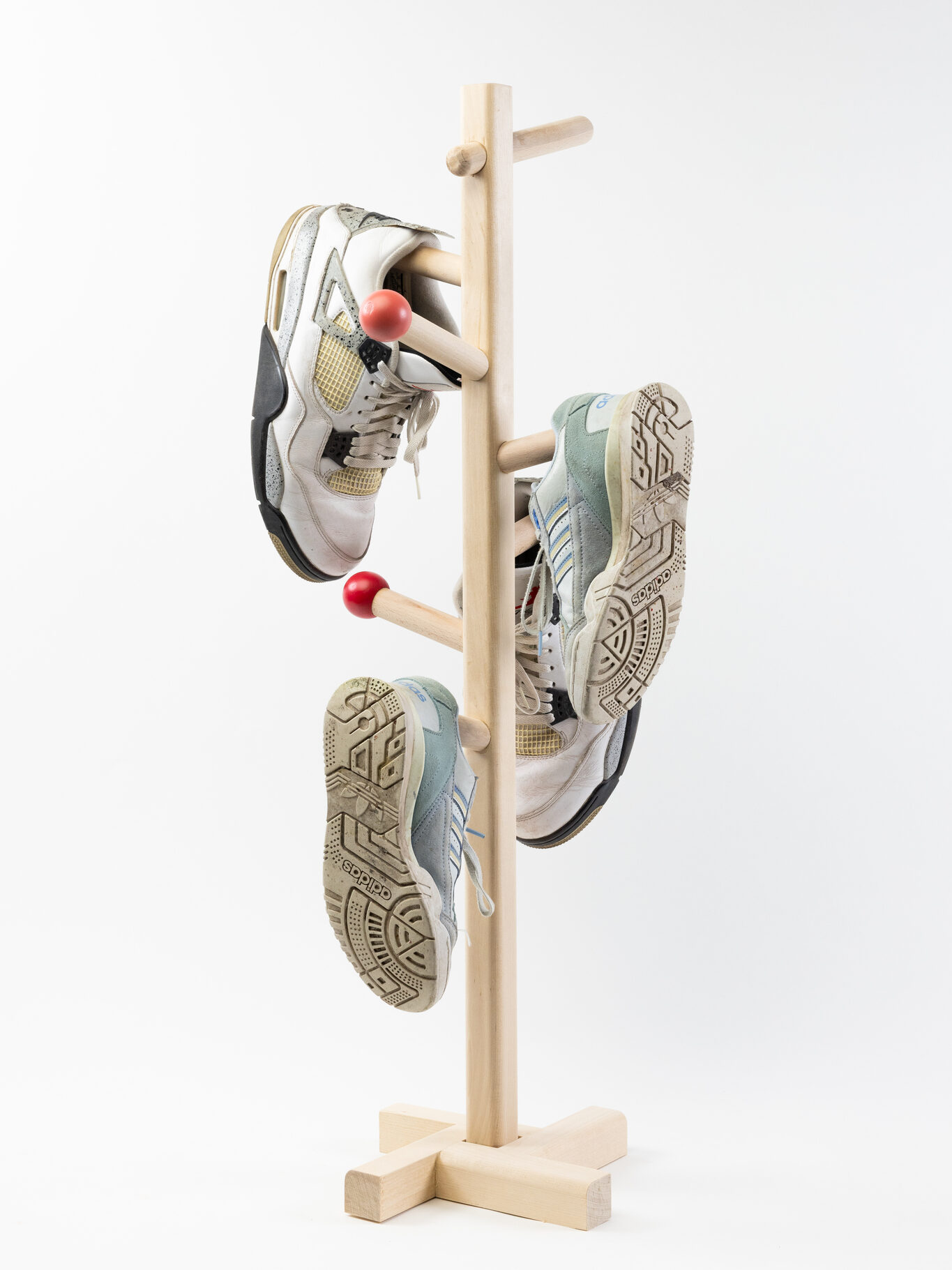
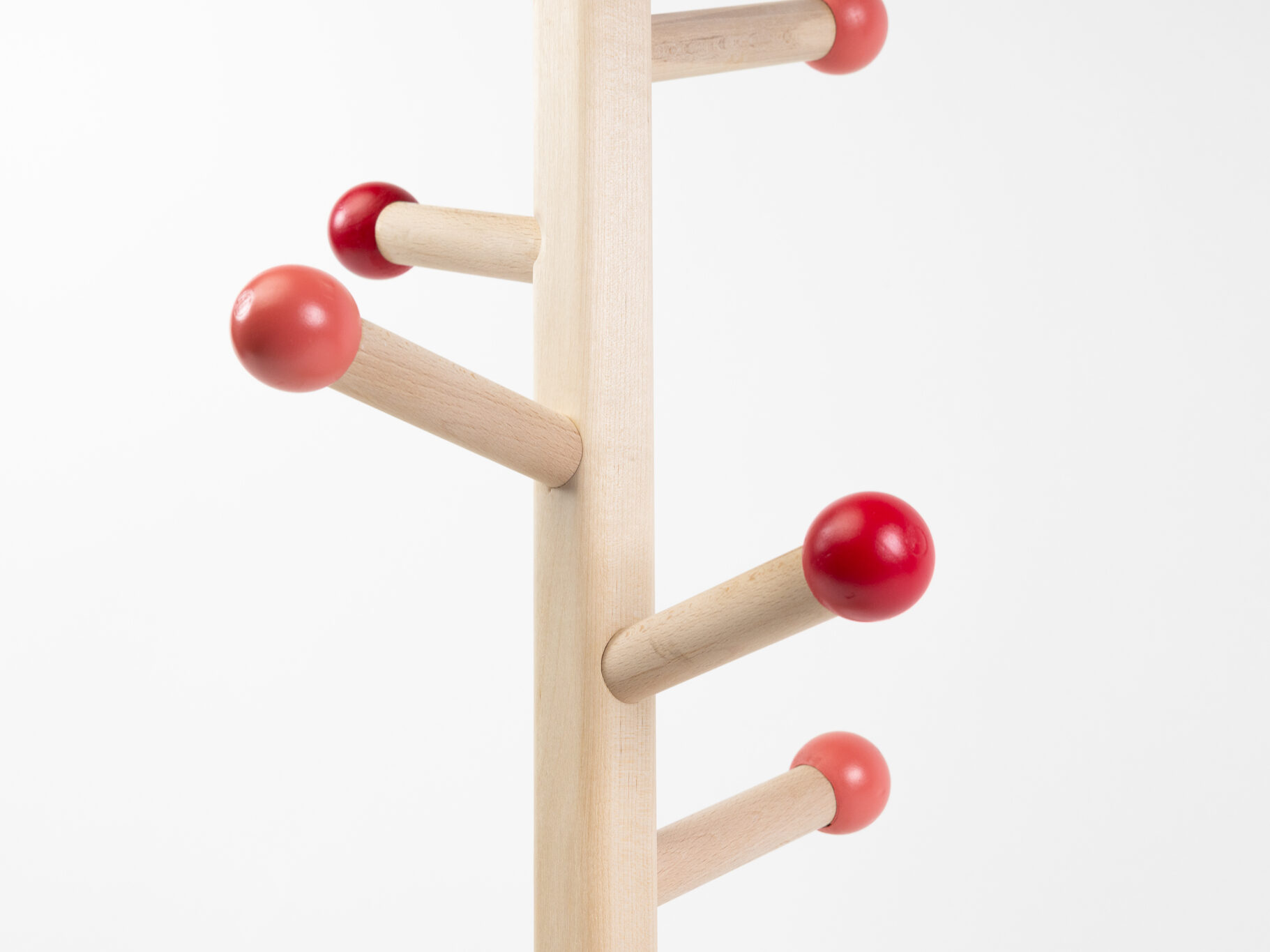
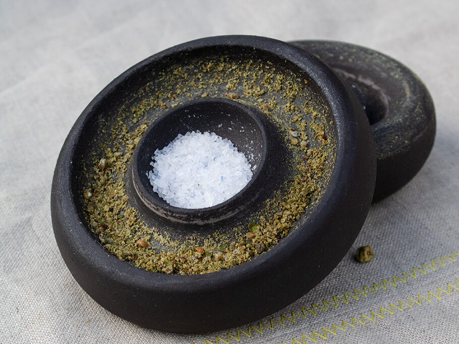
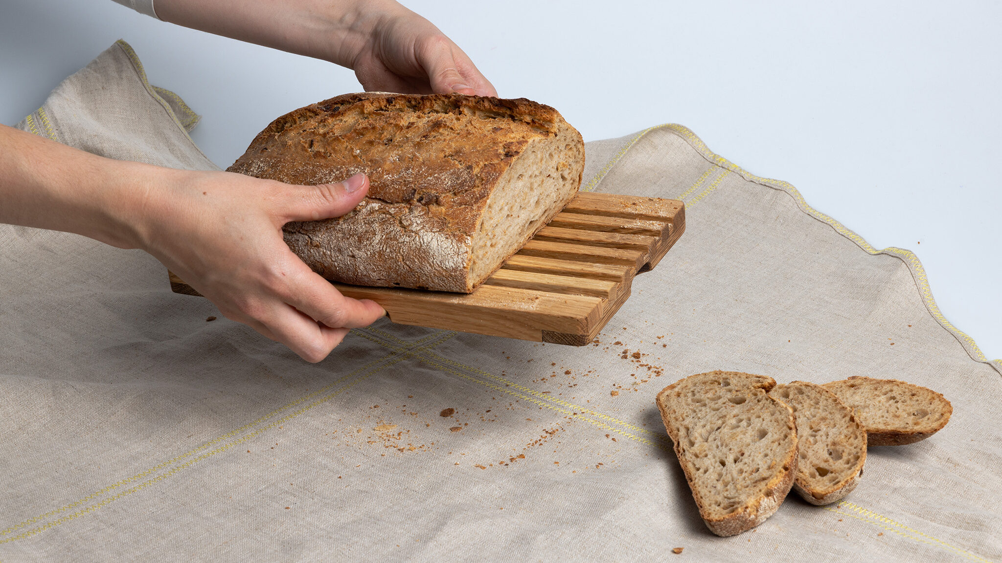
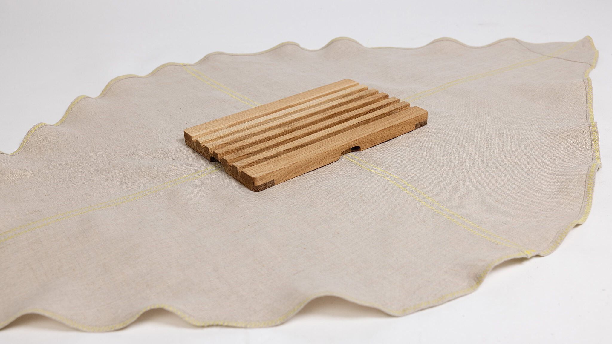
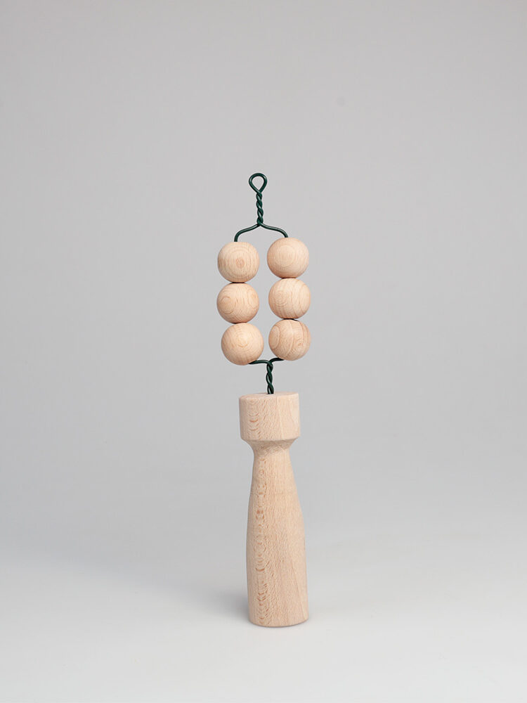
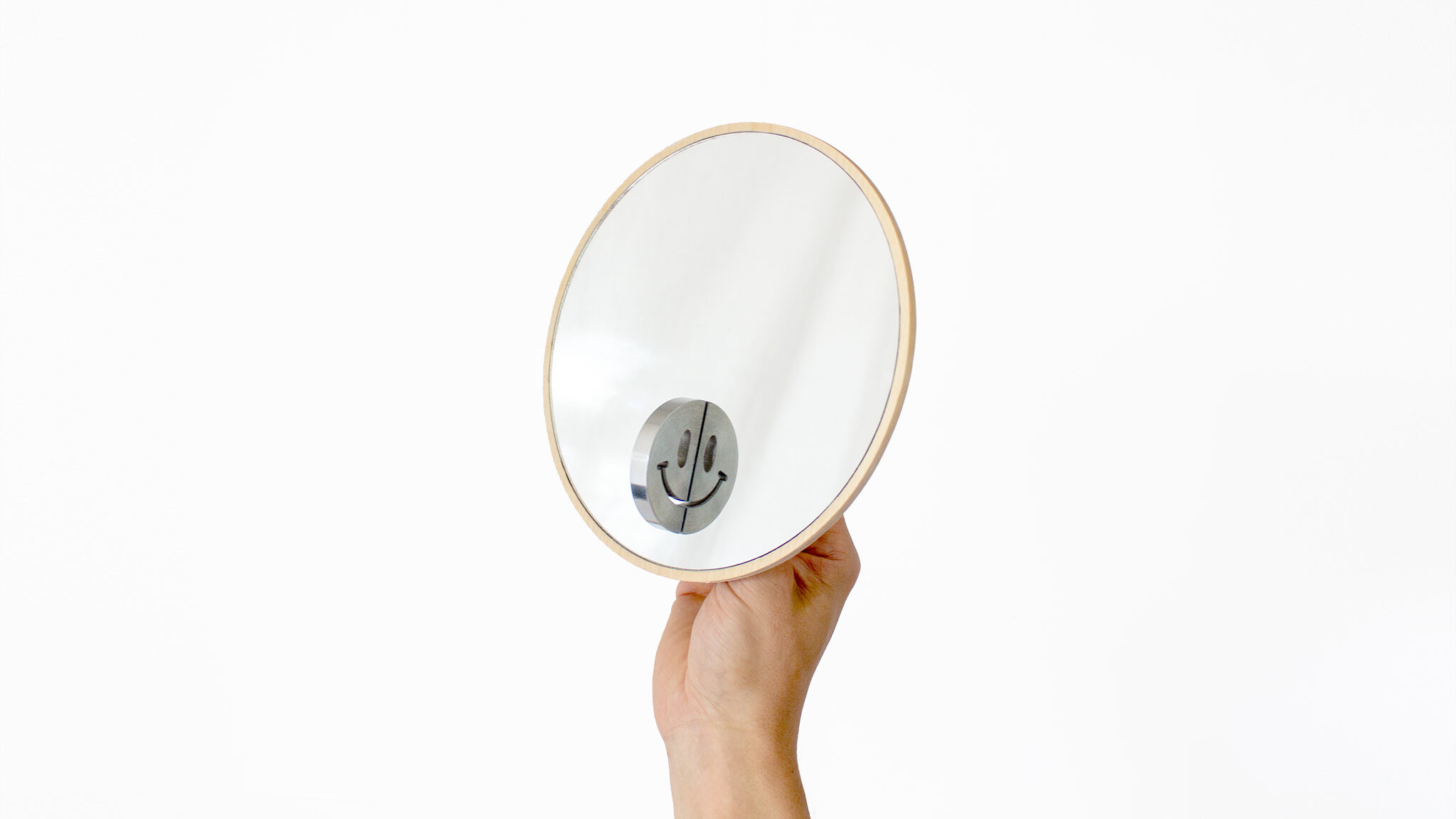
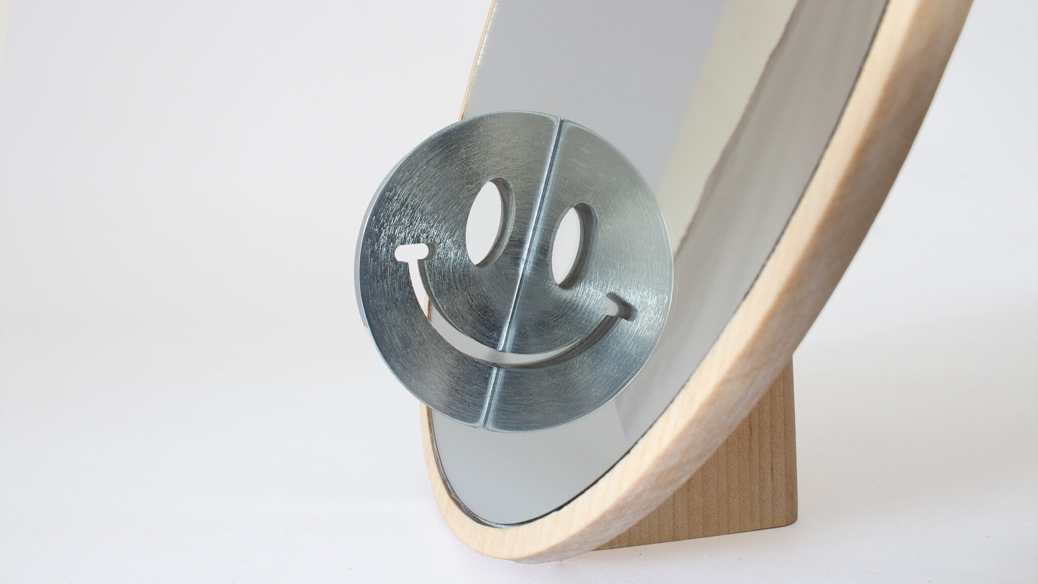
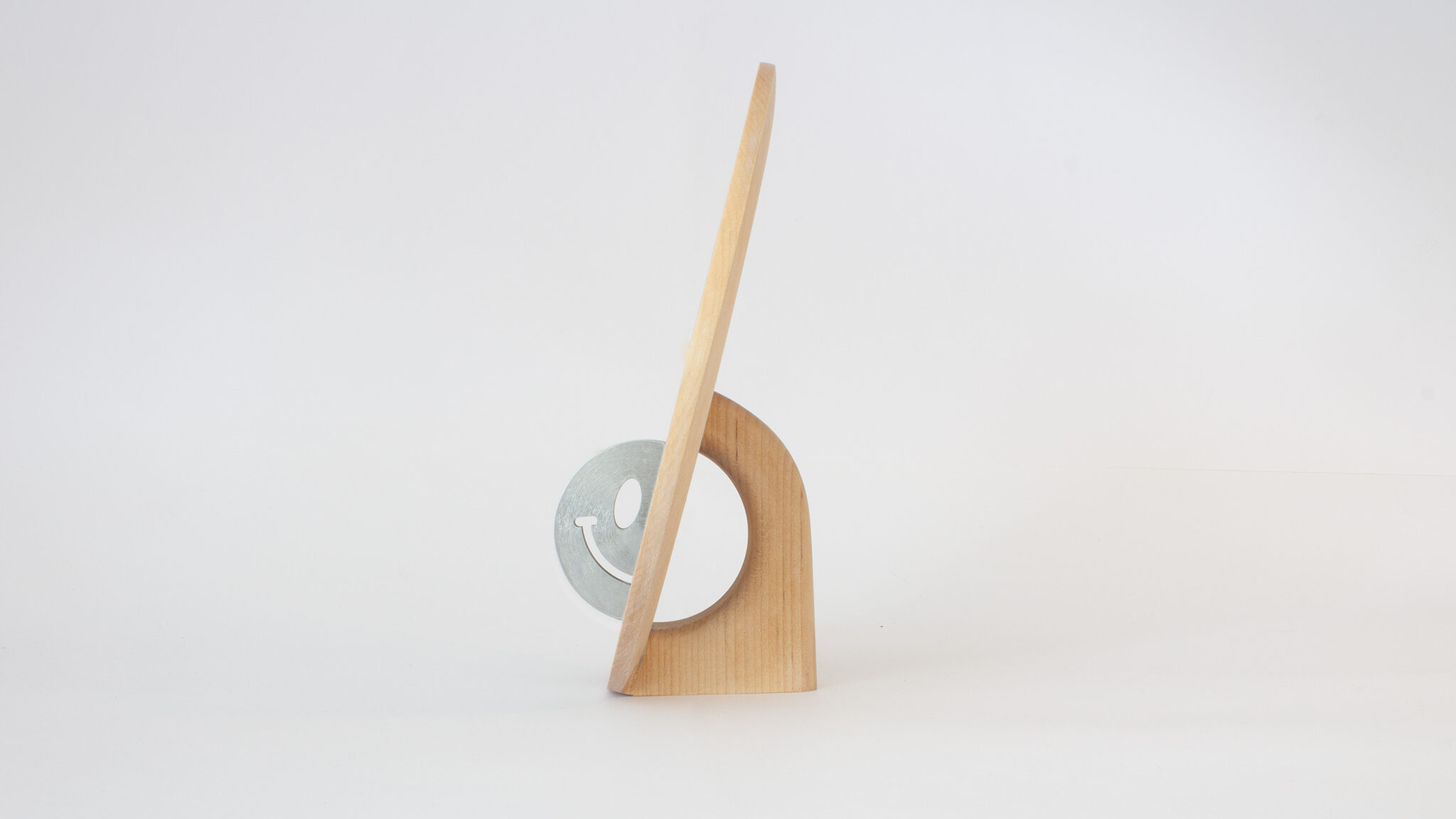
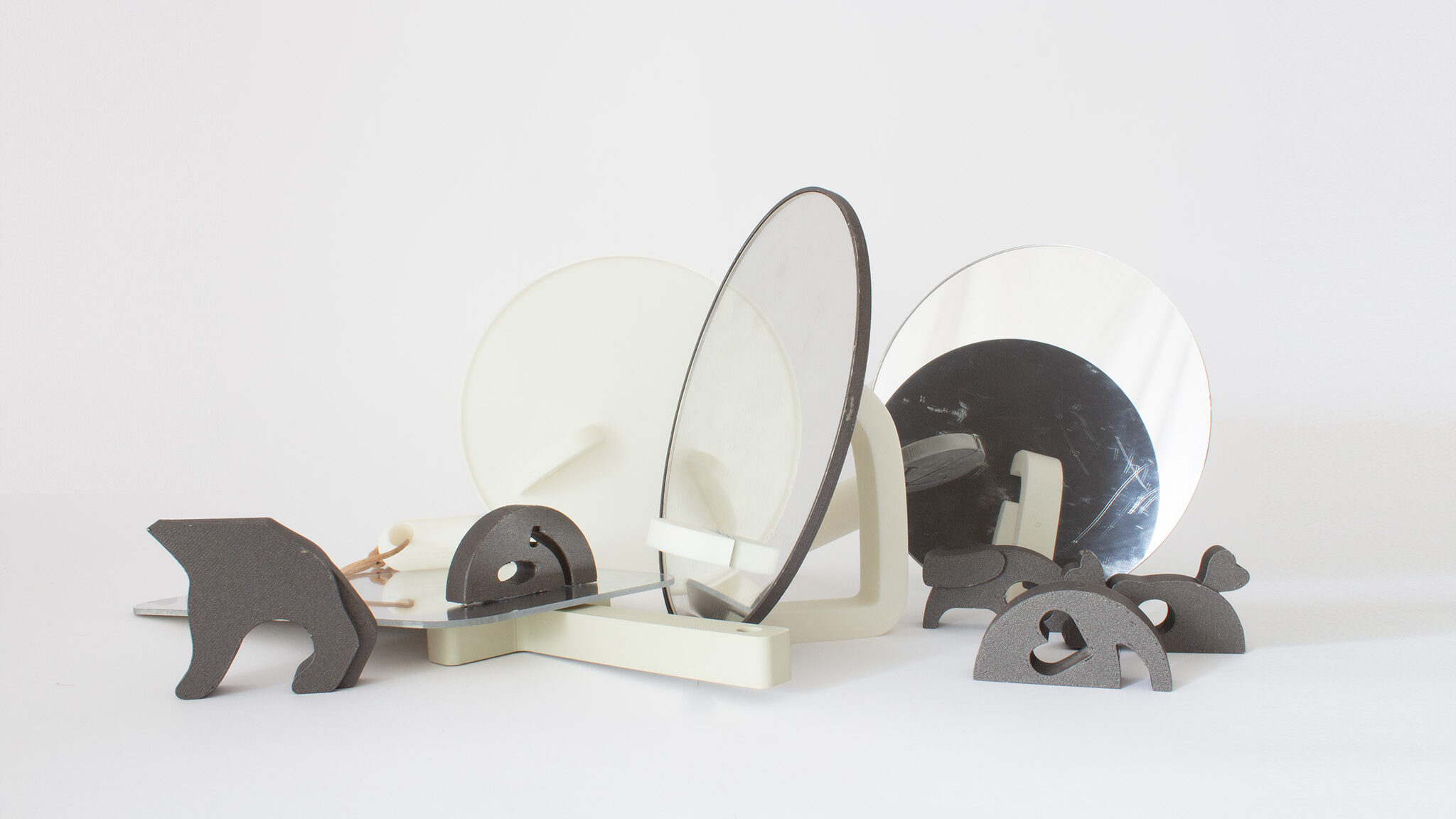
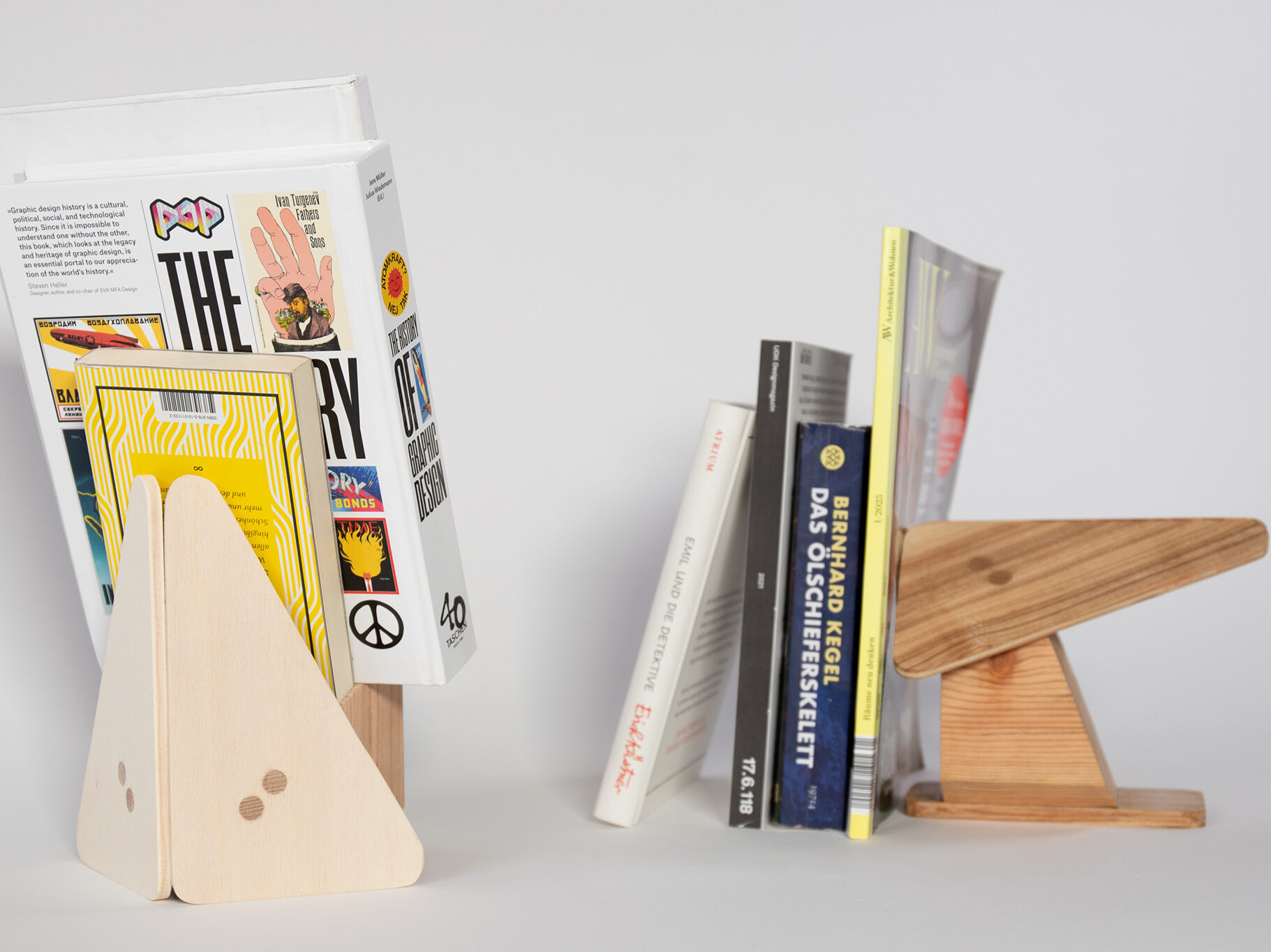
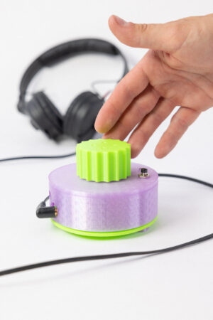
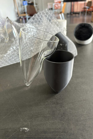
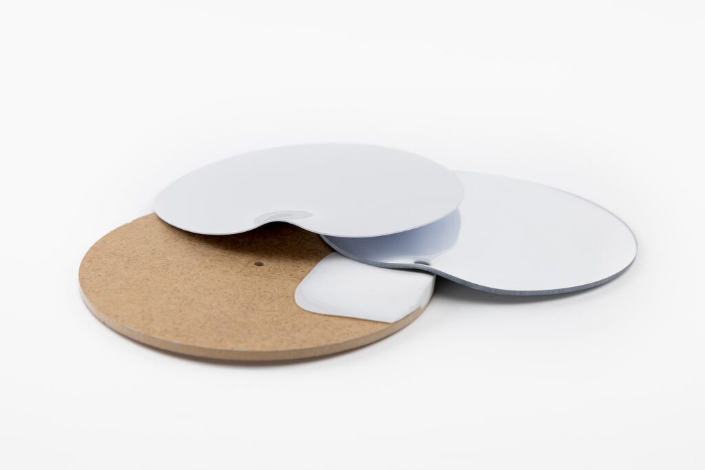
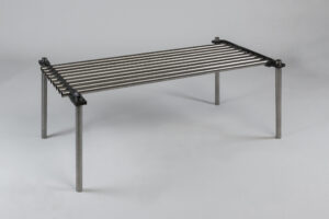
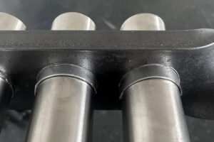
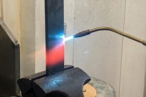
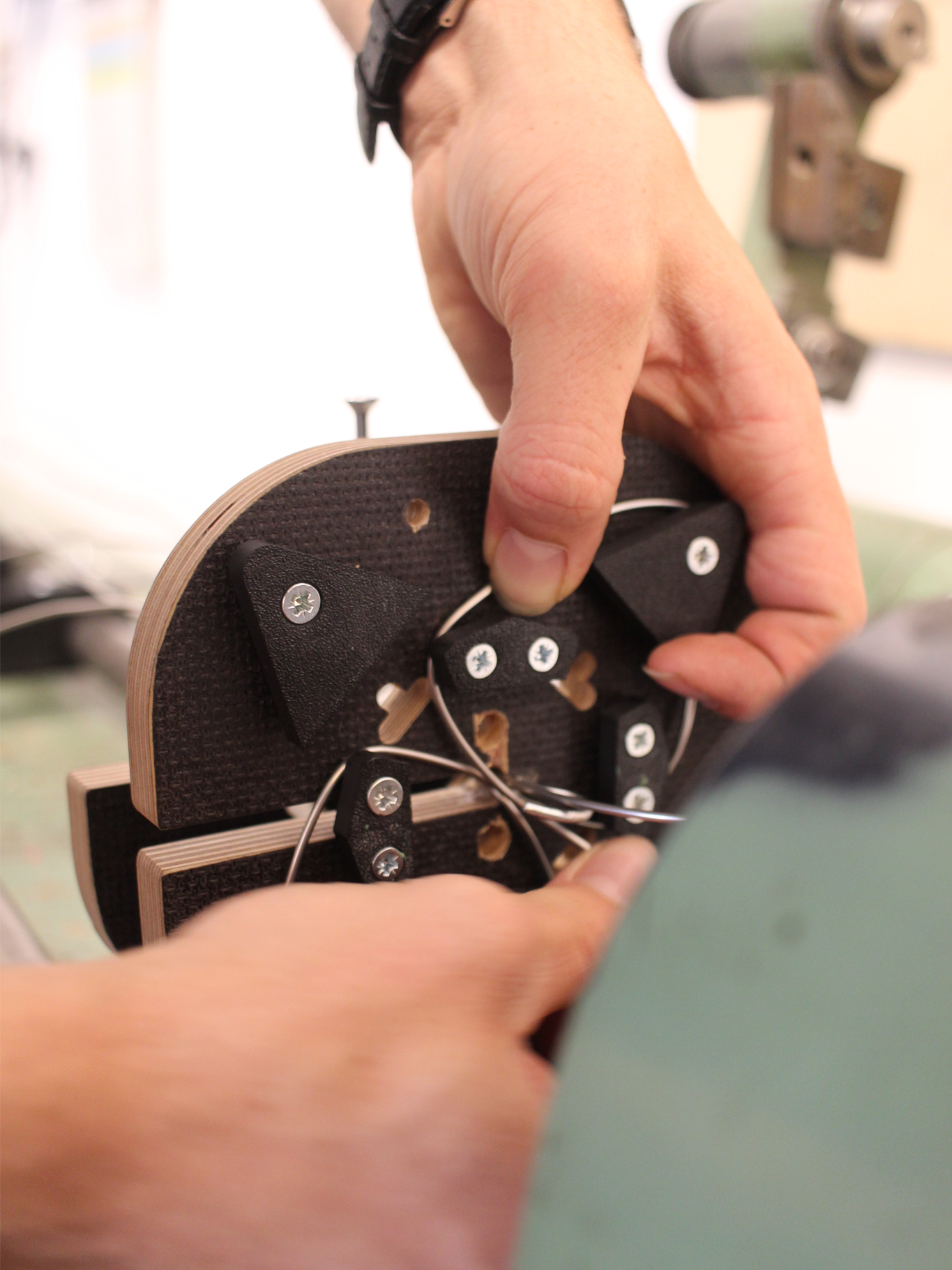
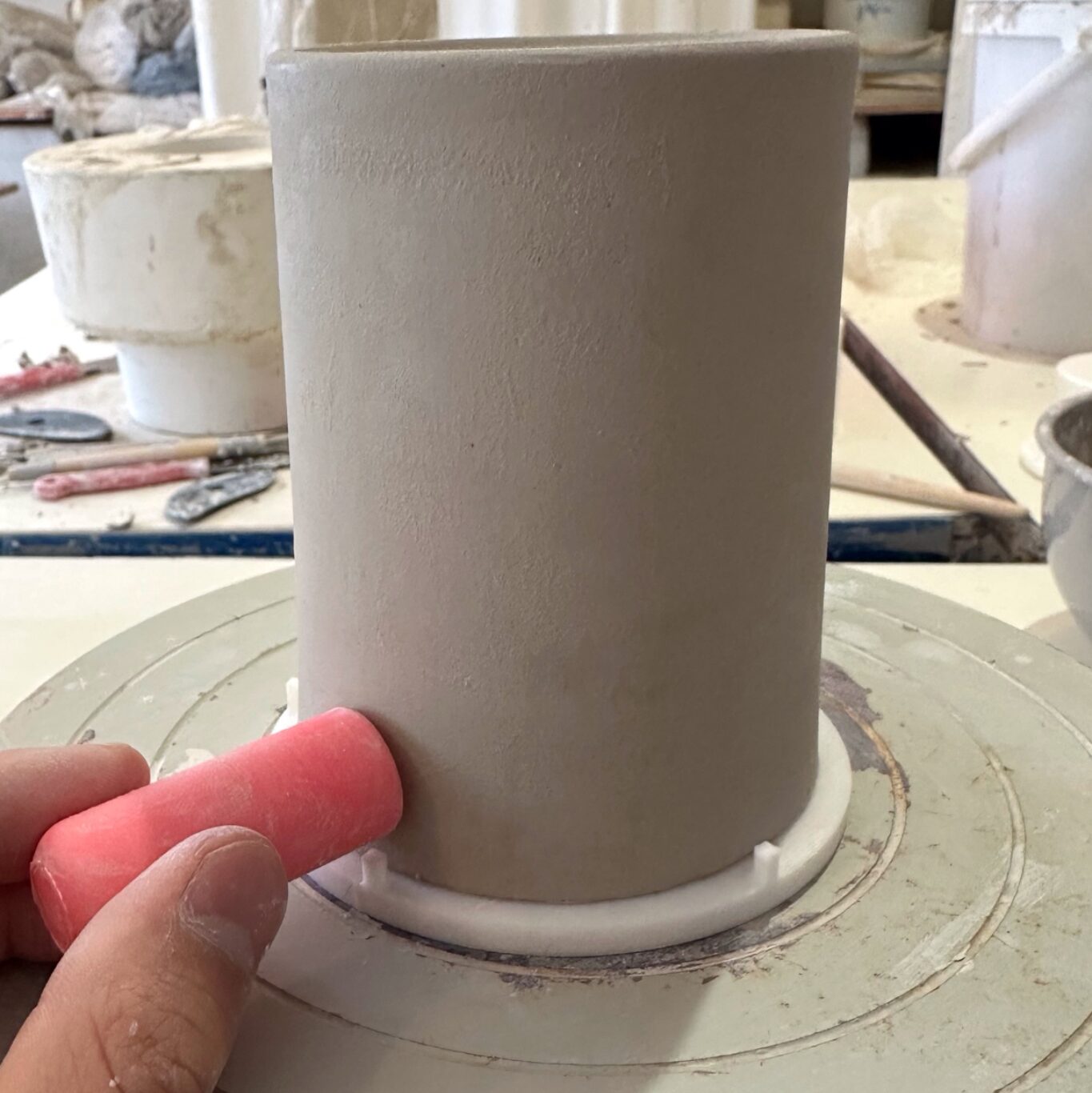
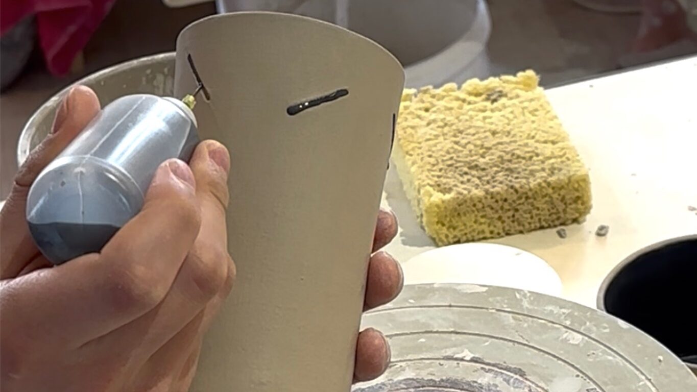
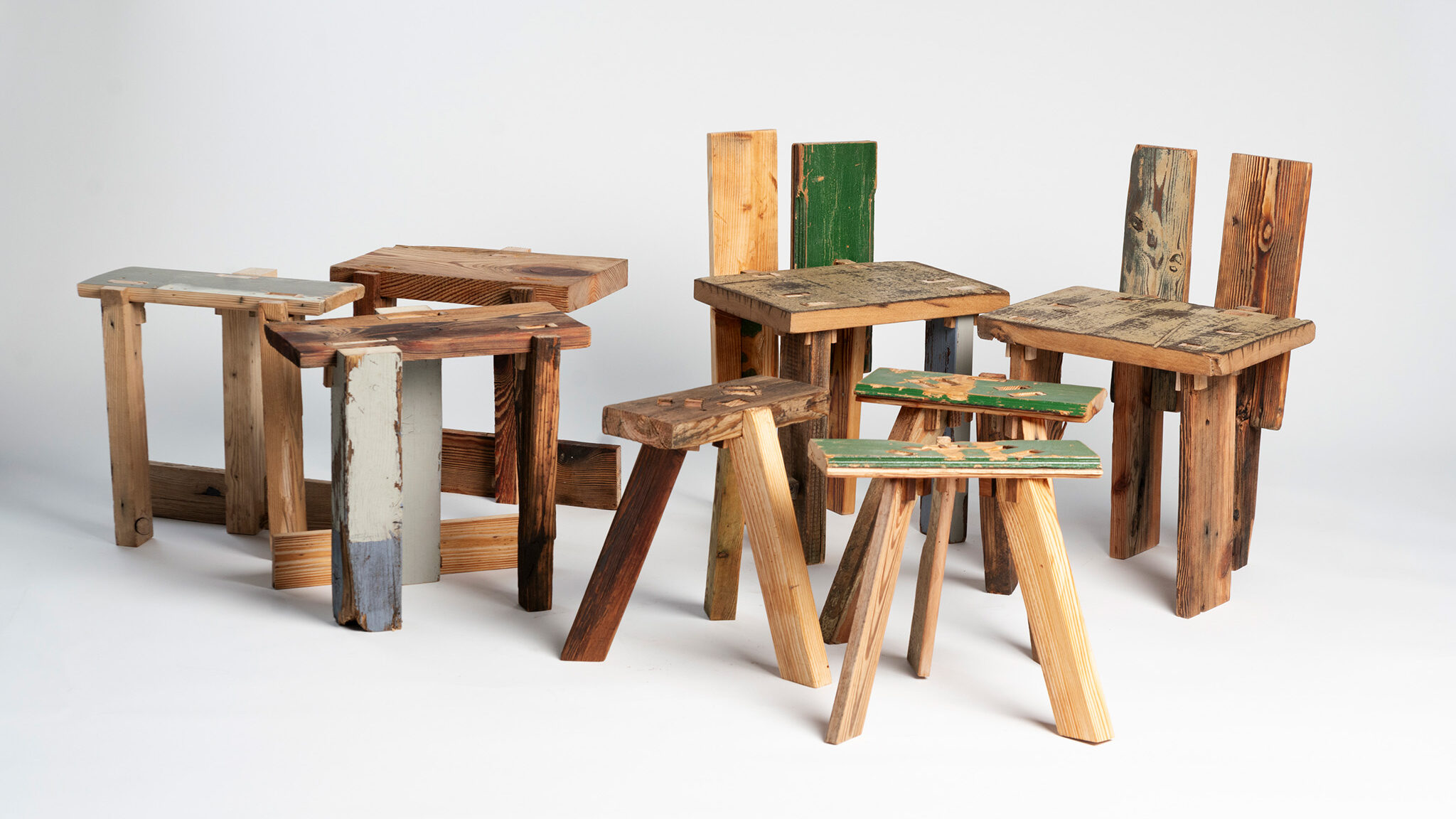
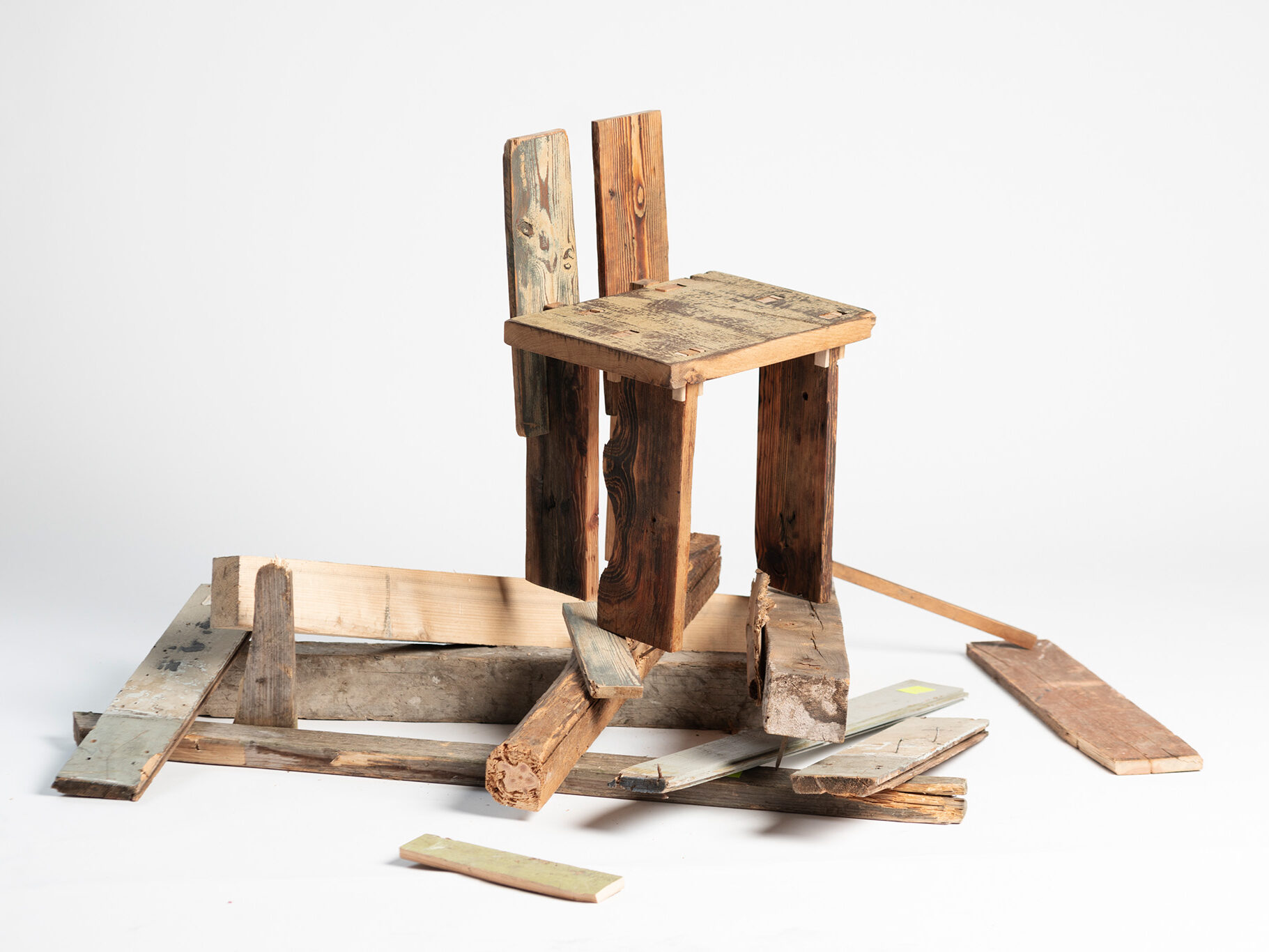
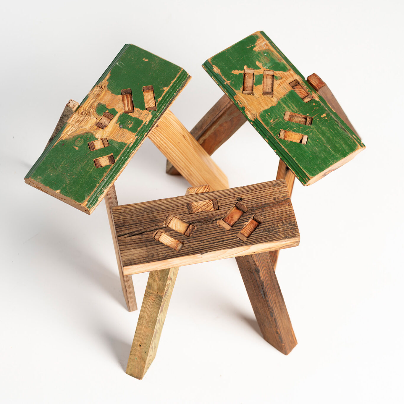
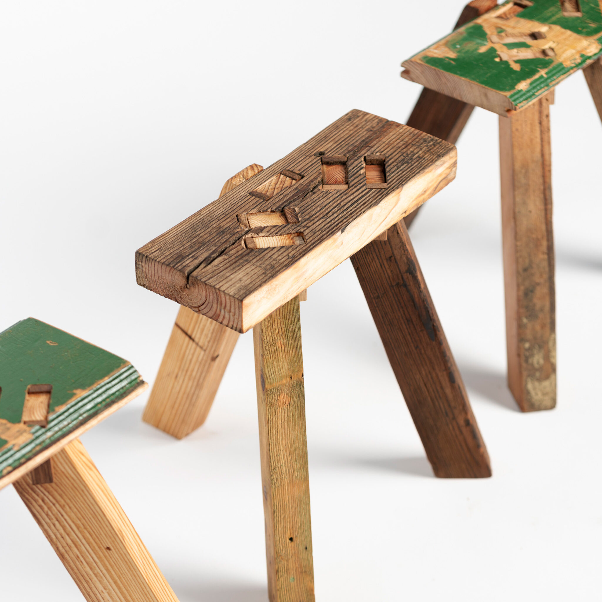
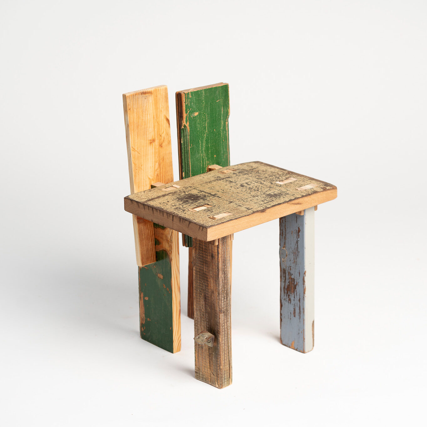
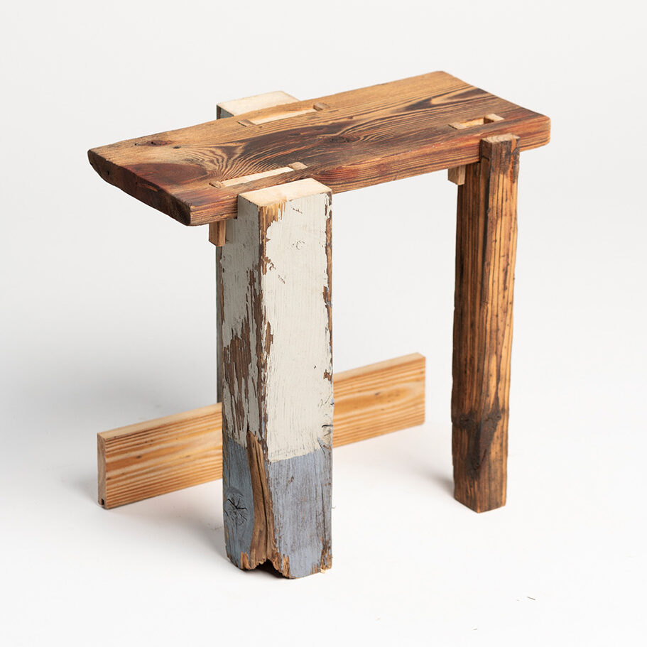
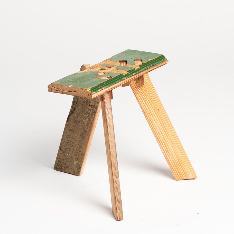
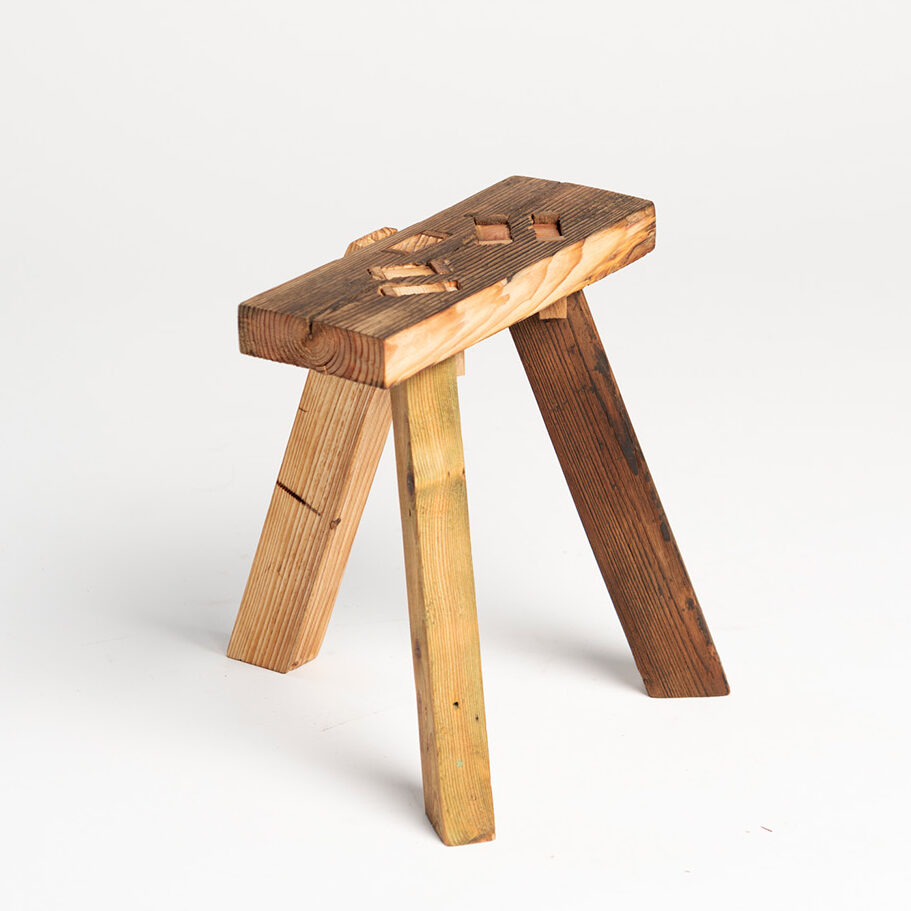
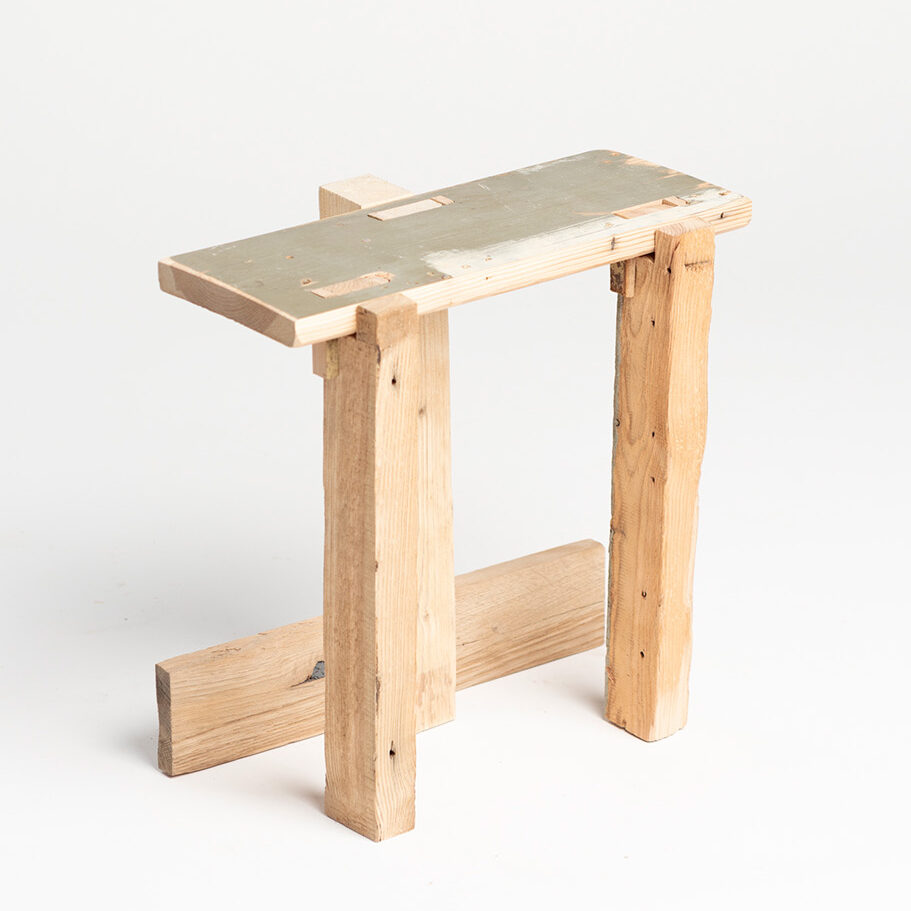
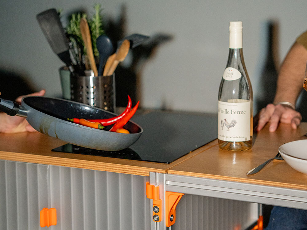
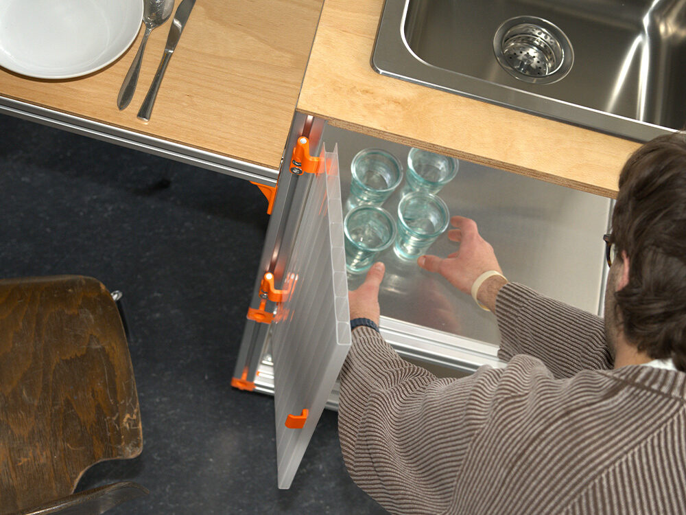
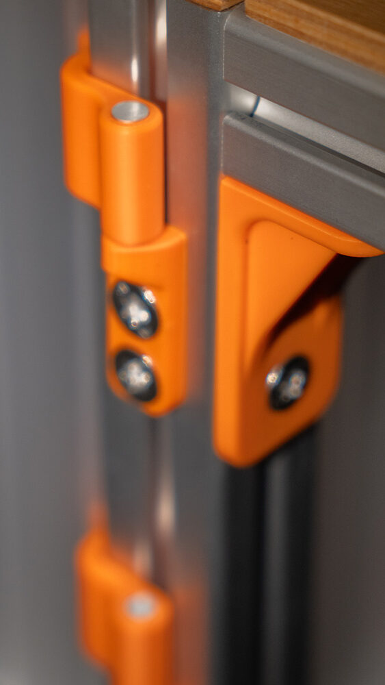
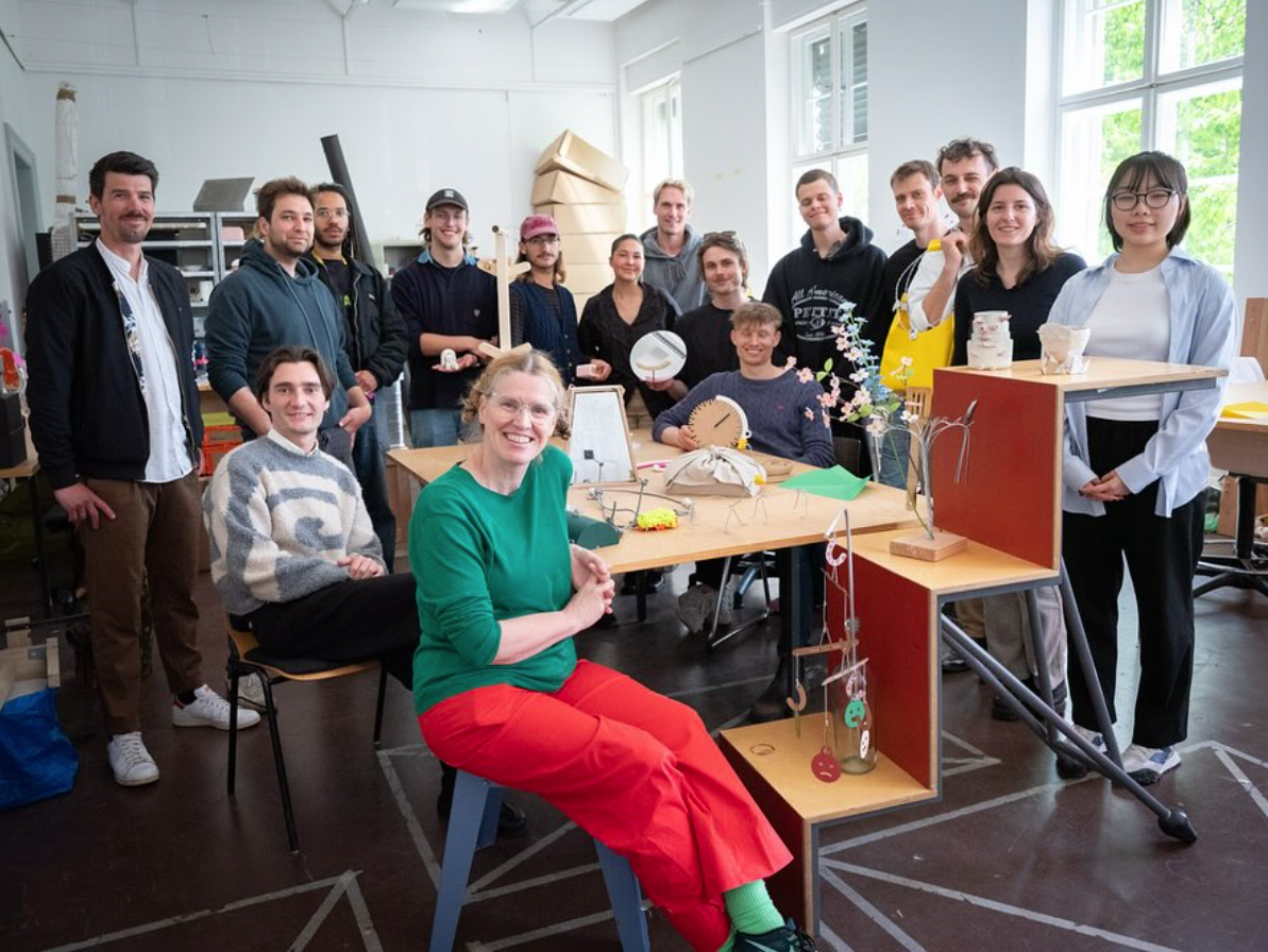 Inclusive Manufacturing Class – photo: Monika Schuerle / AW Architektur & Wohnen
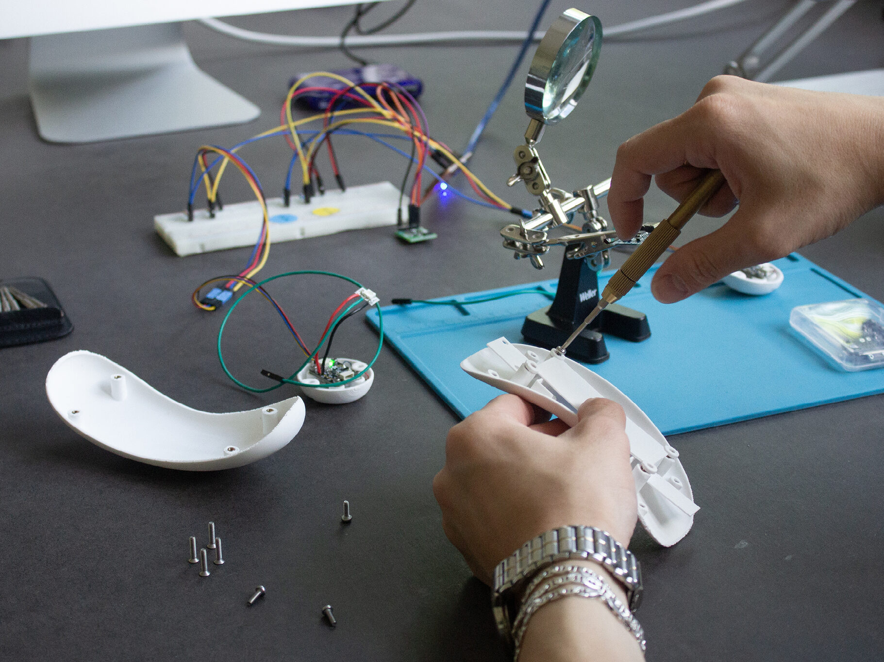
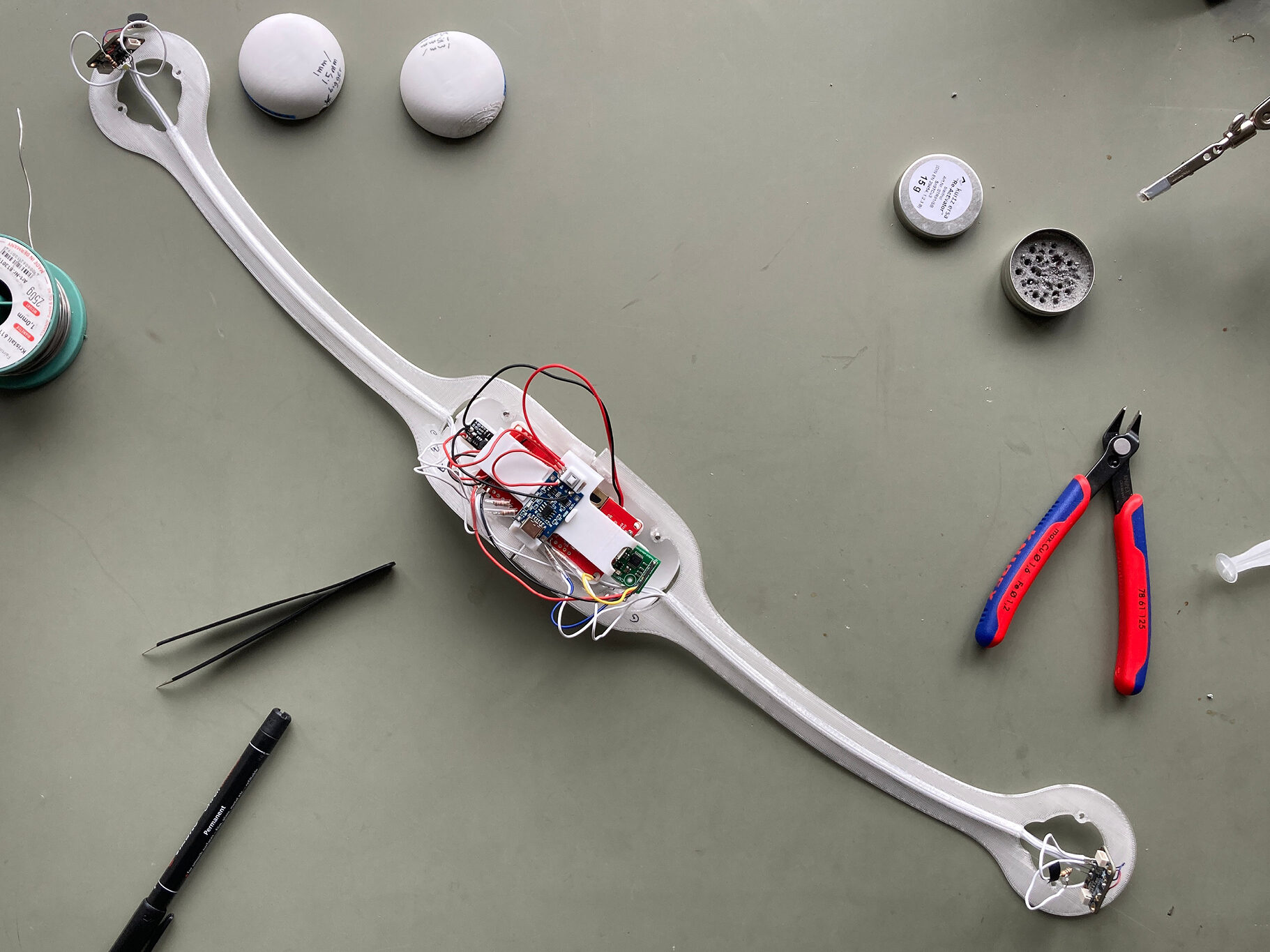
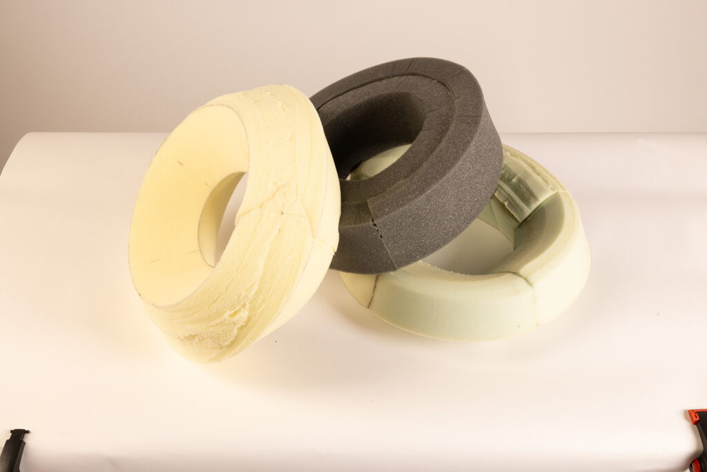
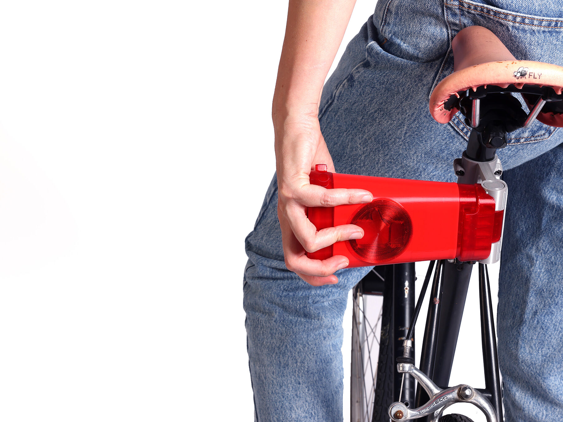
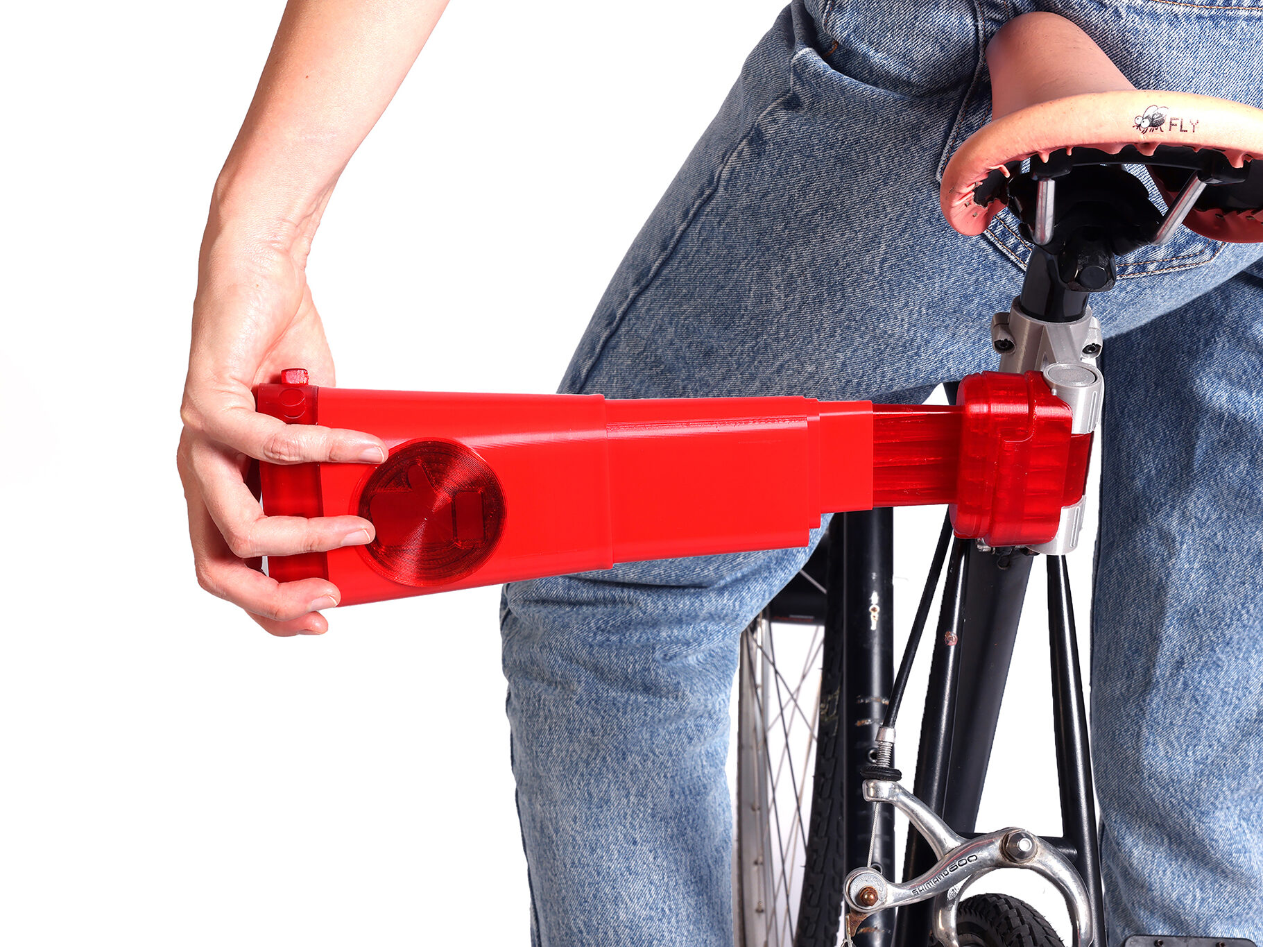
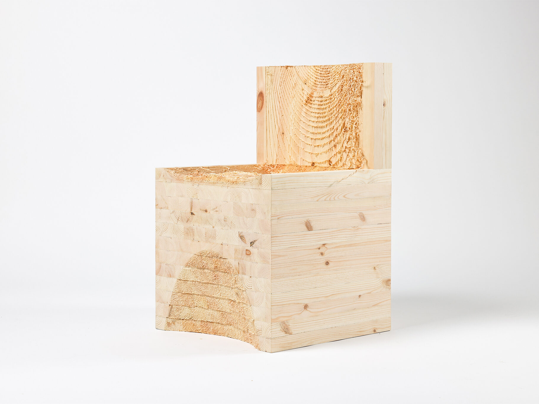
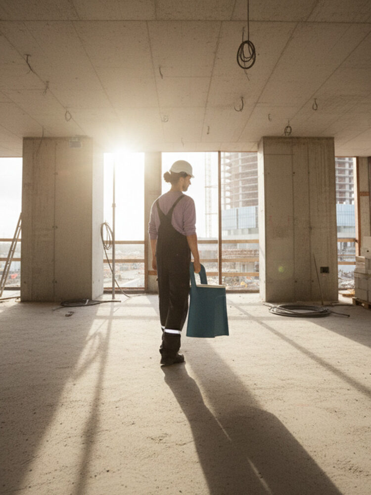
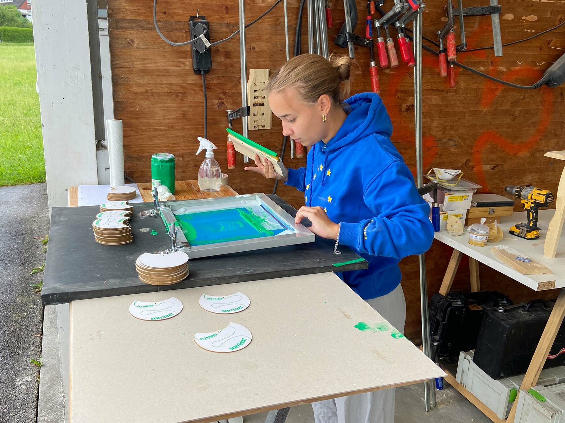
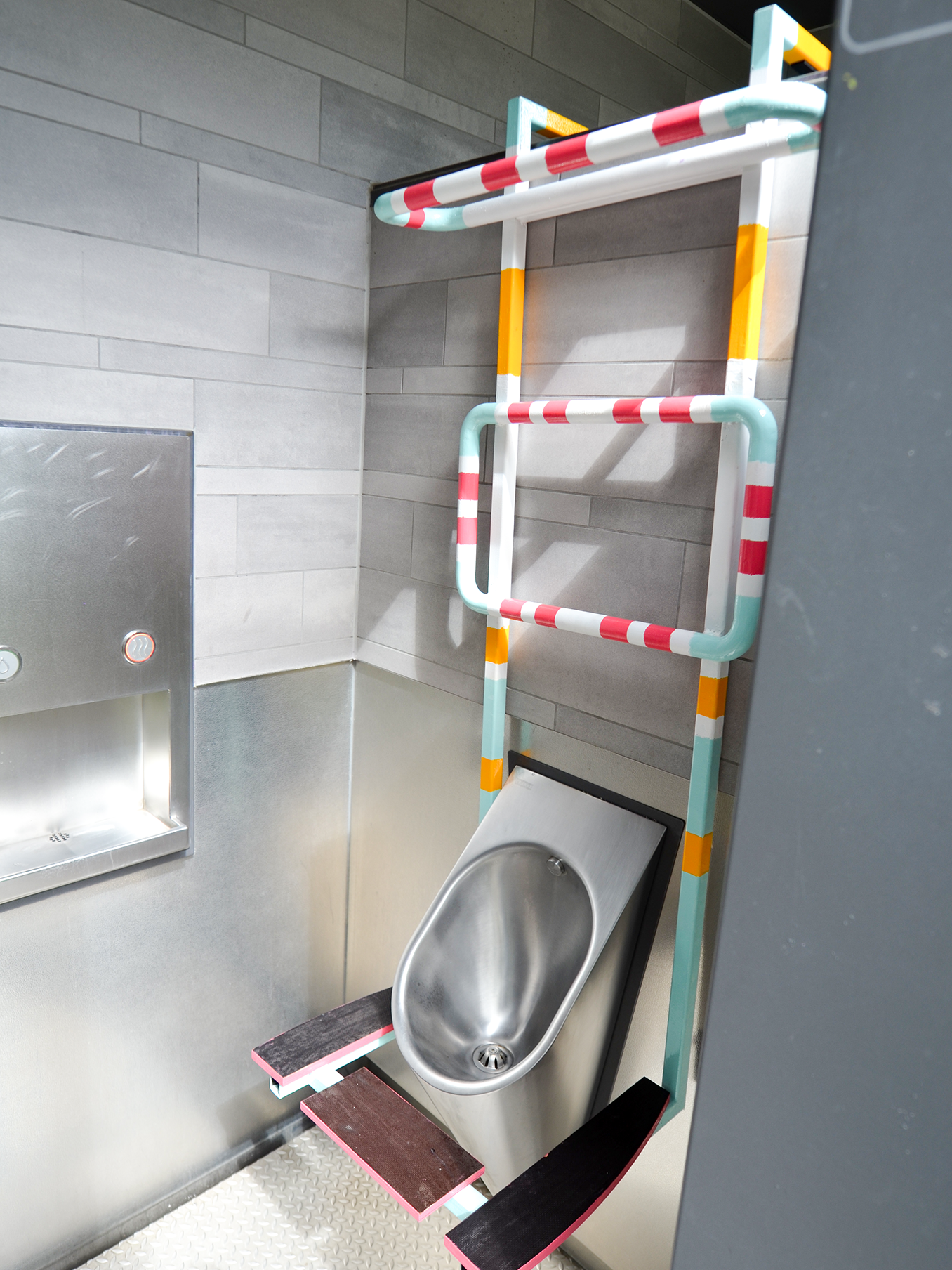
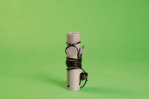
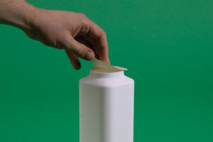
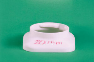
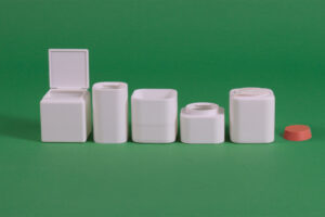
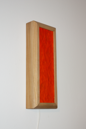
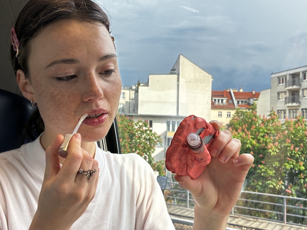
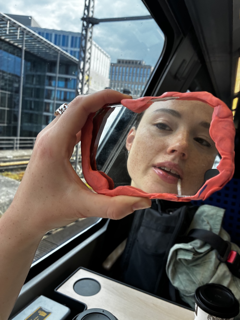
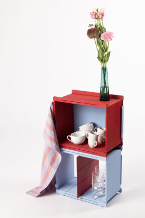
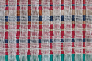
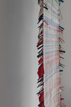
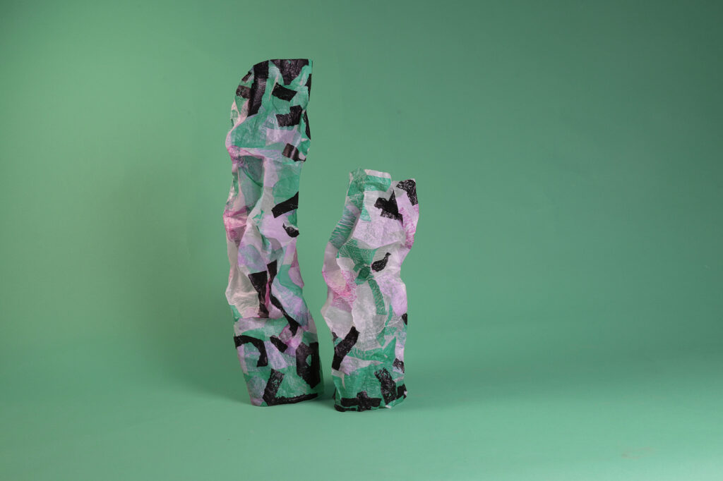
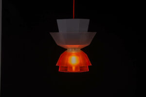
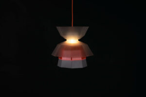
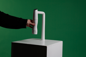
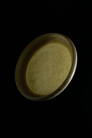
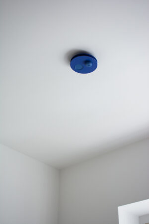
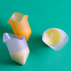
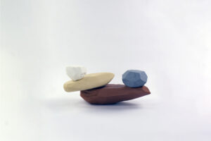
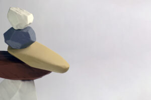
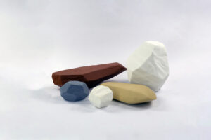
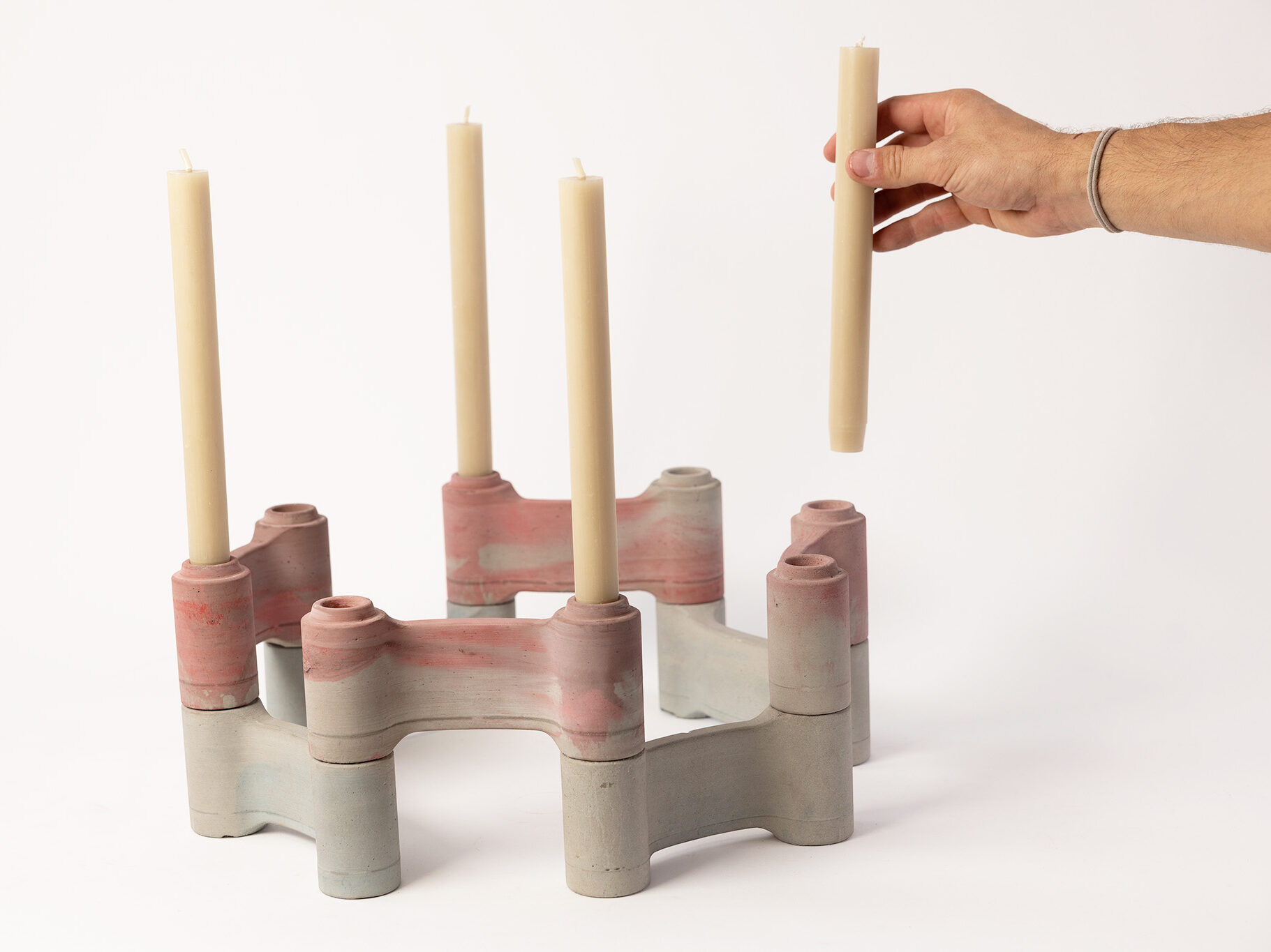
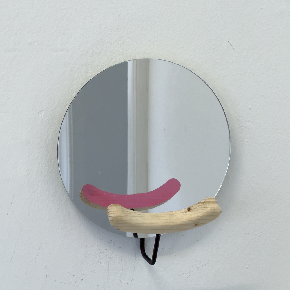
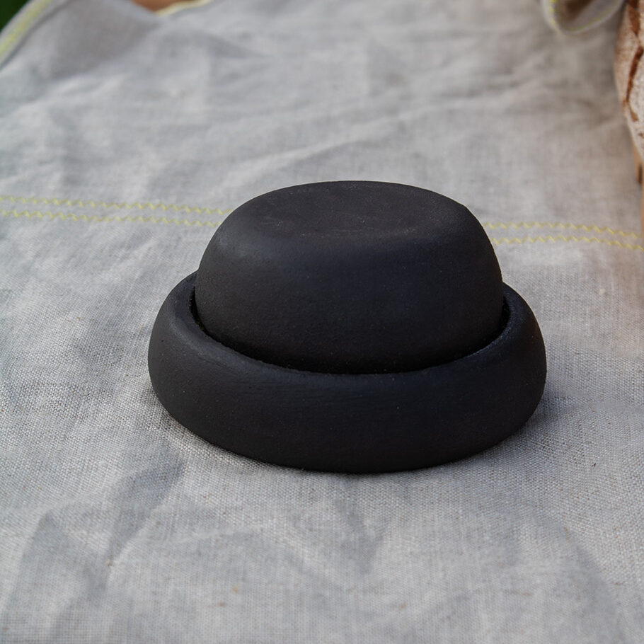
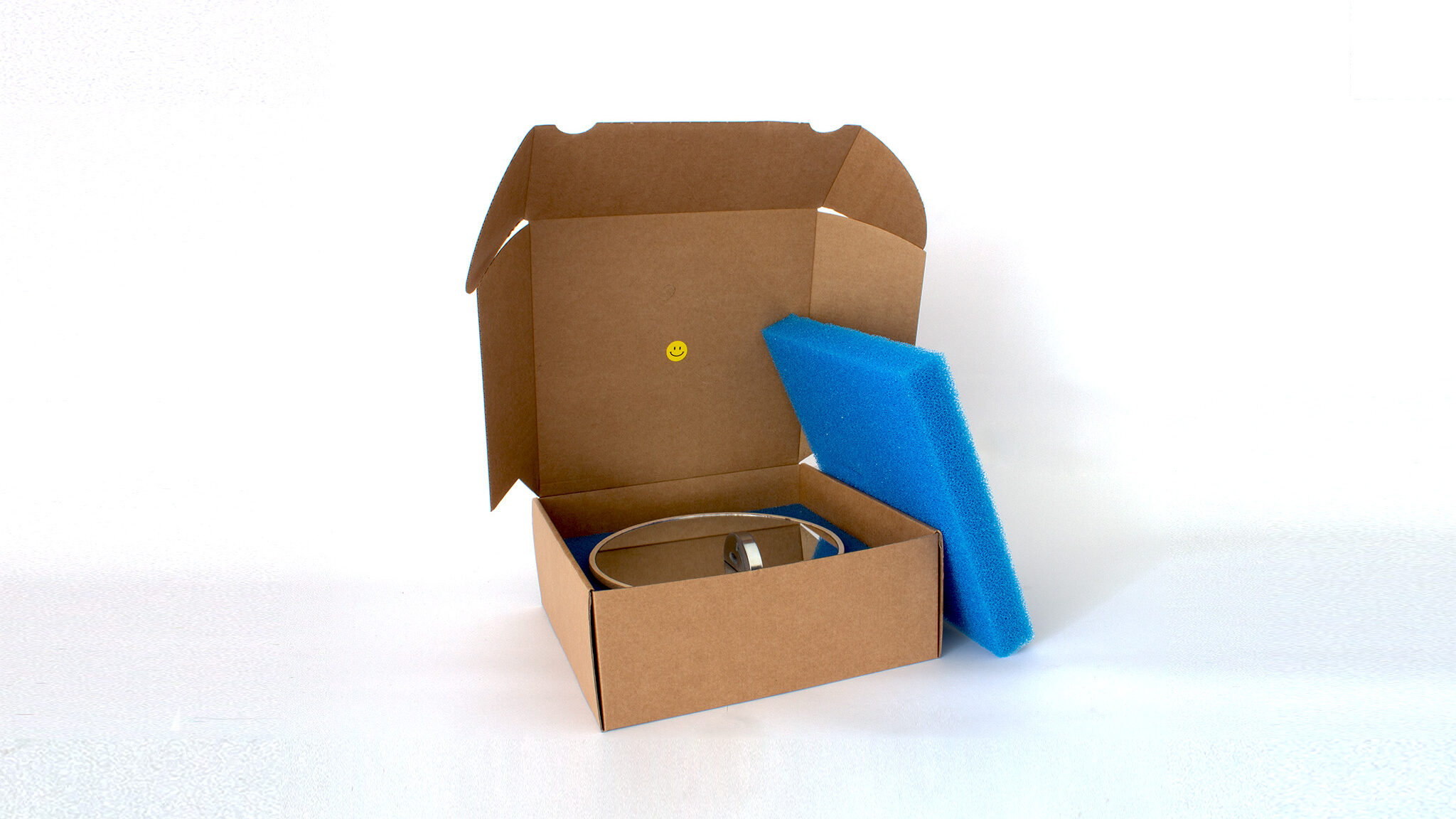
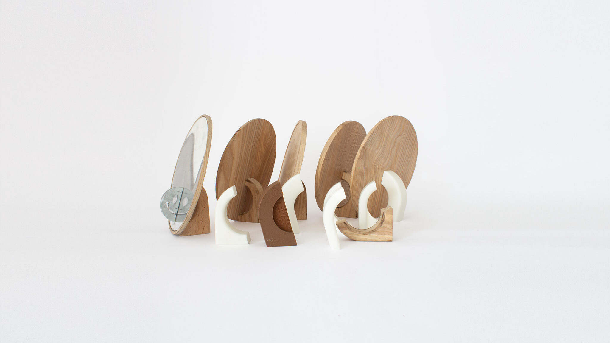
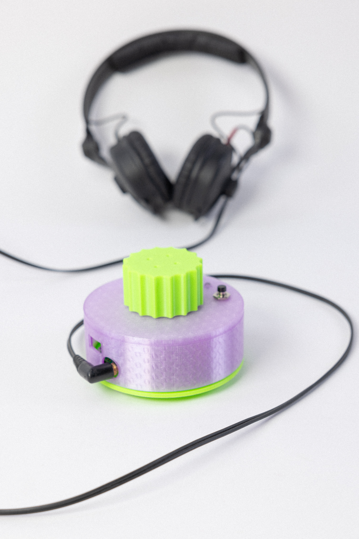
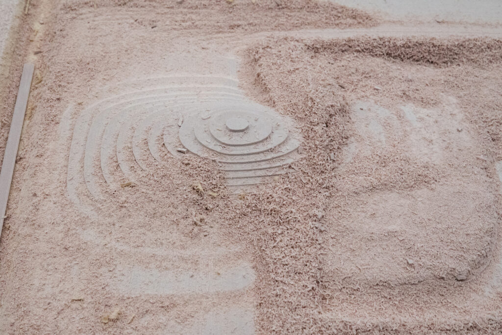
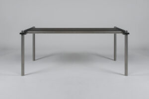
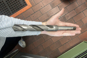
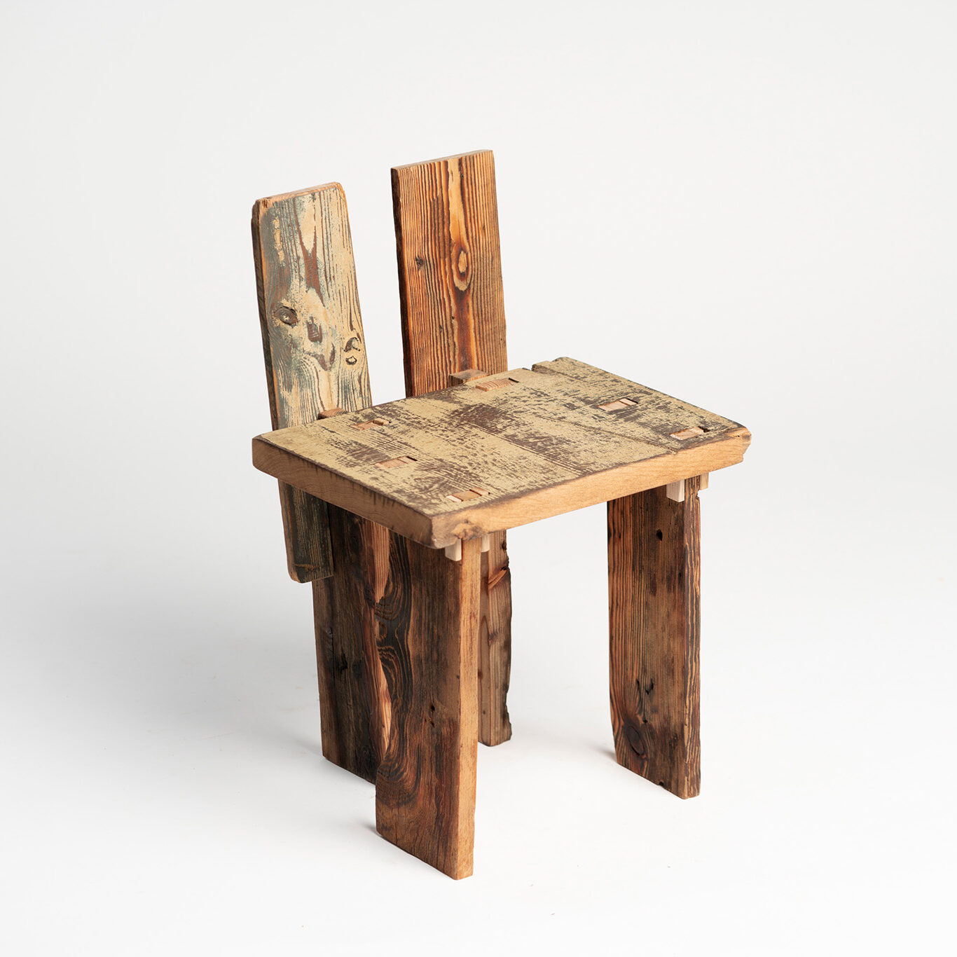
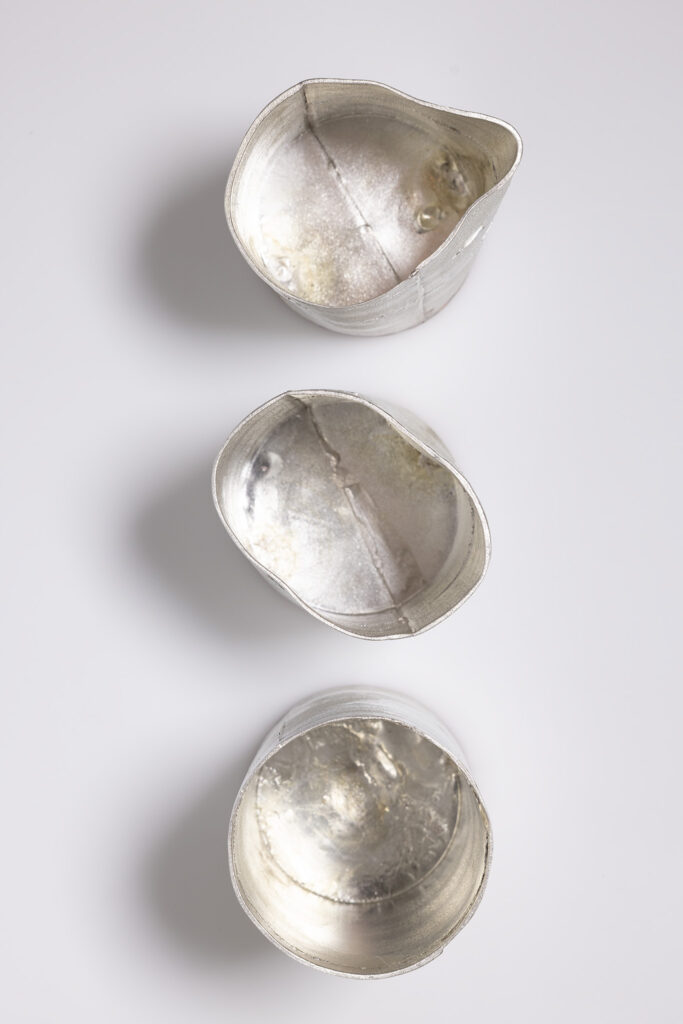
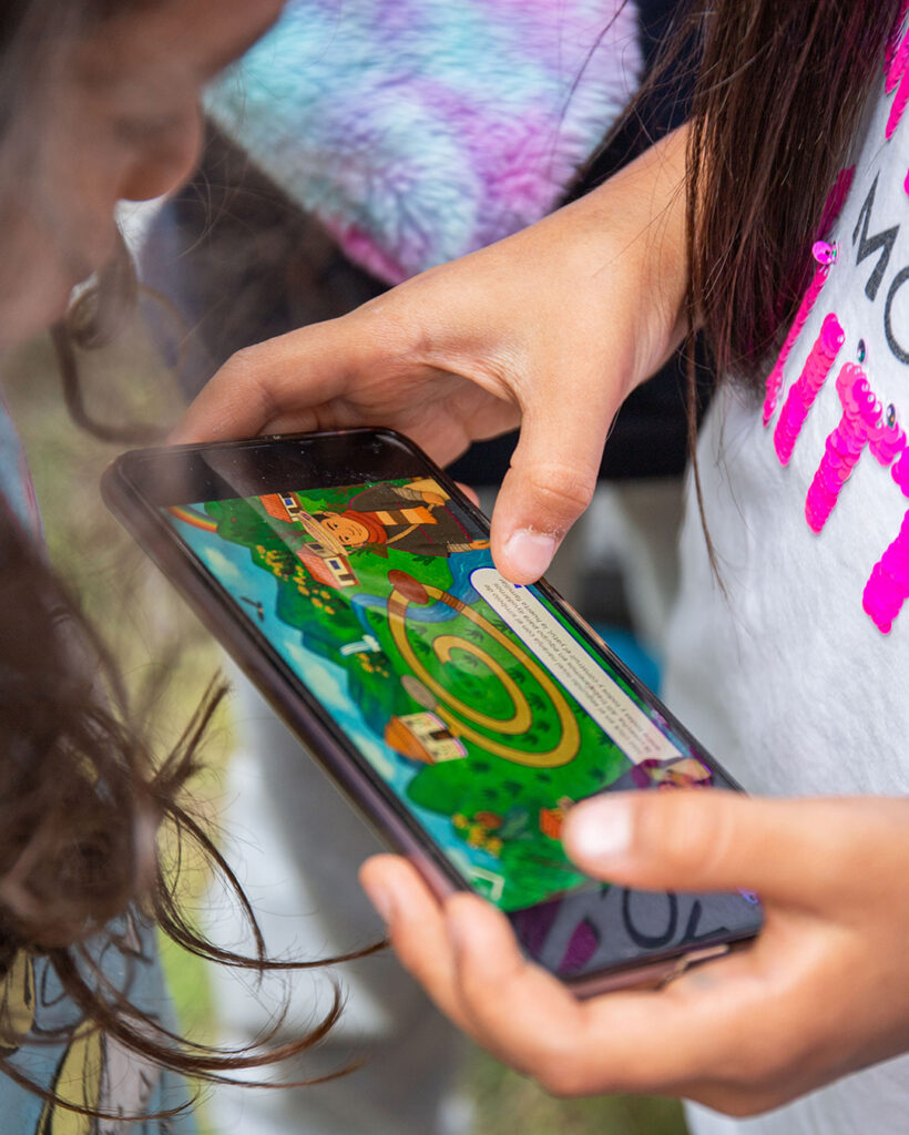
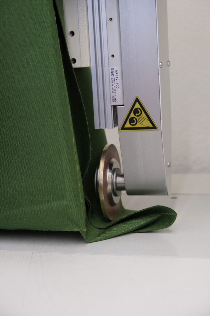
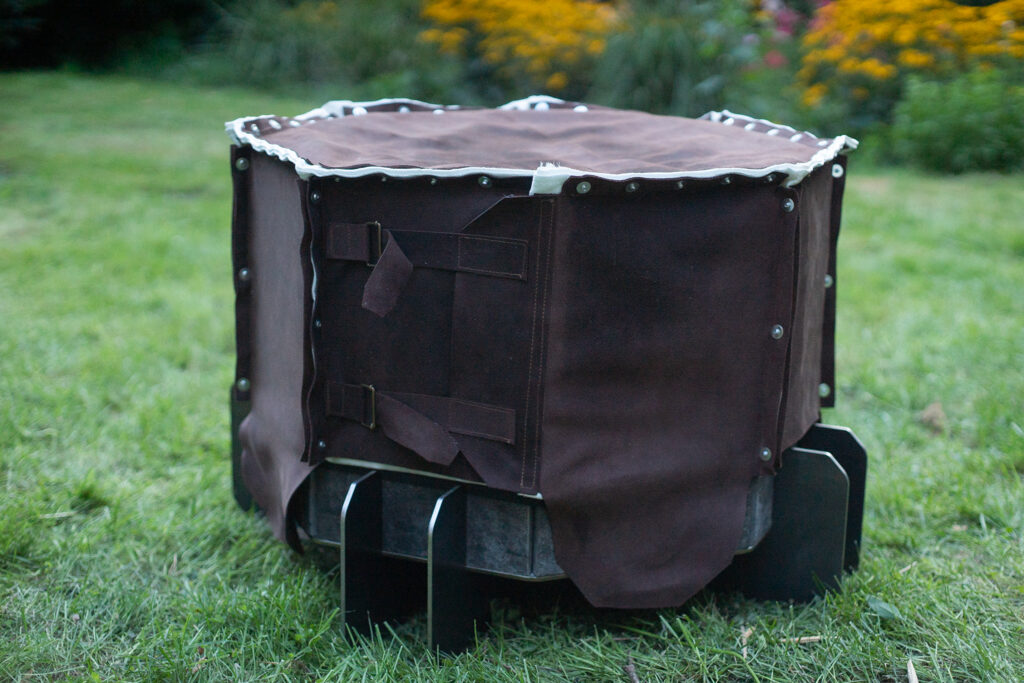
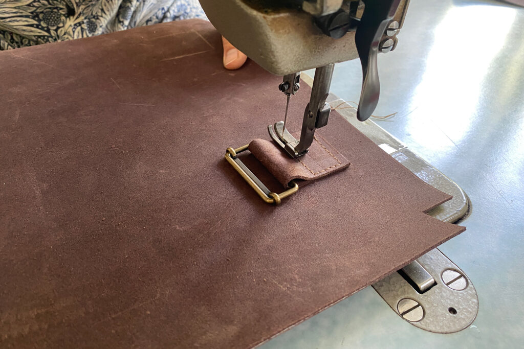